Every long project starts slow, accelerates in the messy middle, and decelerates near hand-off. Plot that journey cumulatively, and you will get an elegant S-curve. Read on to learn how S-curves forecast cash flow, workload, and risk, and how Birdview PSA can build them automatically from the hours and expenses your team already logs.
What is an S-curve?
An S-curve is a cumulative line chart that plots a single metric–usually cost, labour hours, or earned value–against time. The shallow start reflects planning ramp-up, the steep middle shows execution, and the upper plateau signals close-out.
Why S-curves matter to professional services teams
For professional services firms, where margins are tight and client expectations are high, S-curves are essential tools for managing projects more predictably and transparently. By comparing planned value (PV) with actual cost (AC) at a glance, S-curves provide quick insights into budget certainty, improve forecasting, and strengthen client reporting.
They help teams move from reactive problem-solving to proactive project control, ensuring better delivery timelines and healthier profitability.
Key benefits of S-curves:
- Budget certainty – Compare planned value (PV) with actual cost (AC) at a glance.
- Resource smoothing – Forecast peak staffing months before they hit.
- Stakeholder trust – Replace dense spreadsheets with a one-image health check.
- Risk mitigation – Divergence between baseline and actual curves exposes schedule or cost drift early.
The five most common S-curve types
Understanding different types of S-curves helps project management teams track progress, forecast performance, and optimize delivery. Here‘s a quick overview of the five most common S-curve types and what they measure.
| Curve | Metric | Best for |
| Baseline (planned) | Cumulative planned value | Initial forecast |
| Actual cost | Real spend to date | Burn rate control |
| Earned value | Value of work performed (EV) | Schedule variance |
| Labour hours | Staff effort | Staffing optimisation |
| Quality maturity | Defect closure rate | QA forecasting |
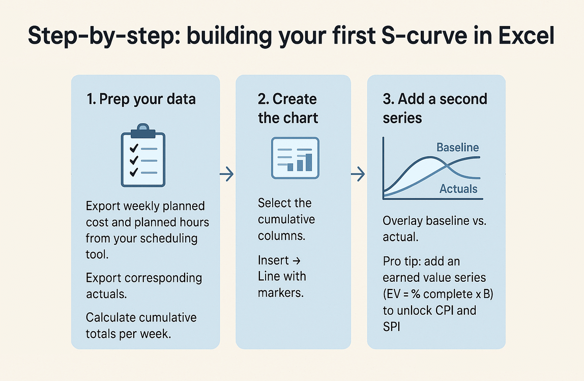
Step-by-step: building your first S-curve in Excel
Ready to build your first S-curve? Here‘s a quick, step-by-step guide to creating a simple, effective project performance chart right inside Excel
Prep your data
- Export the weekly planned cost and planned hours from your scheduling tool.
- Export corresponding actuals.
- Calculate cumulative totals per week.
Create the chart
- Select the cumulative columns.
- Insert → Line with markers.
- Format X-axis as dates, Y-axis as currency or hours.
- Add a second series for actuals to overlay baseline vs actual.
Pro tip: add an earned value series (EV = % complete × BAC) to unlock CPI and SPI.
Formula crib sheet
- CPI = EV / AC (cost efficiency)
- SPI = EV / PV (schedule efficiency)
Reading the curve–variance, inflection, and earned value
Understanding how to read an S-curve helps project teams spot problems early. Here‘s a quick guide to interpreting key patterns like variance, inflection points, and earned value trends.
- Early flat-lining – Under-mobilization or delayed start.
- Steeper actual than baseline – Spending or working faster than planned.
- Gap widening after inflection – Likely over-run; investigate scope creep or inaccurate % complete data.
- Actual flattening too soon – Resources re-allocated away, risk to scope completion.
Troubleshooting: seven red flags and quick fixes
Even the best projects hit bumps along the way. Here‘s a quick guide to spotting common S-curve red flags–and what you can do to fix them before they derail your project.
| Symptom | Likely cause | Corrective action |
| Actual cost line leaps above baseline suddenly | Large unplanned purchase | Re-forecast BAC, issue change order |
| Actual hours below baseline for 3 periods | Staffing shortage | Reassign resources or extend schedule |
| PV curve unrealistically steep | Front-loaded plan | Re-baseline with progressive elaboration |
| Earned value stalls while cost climbs | Low productivity | Root-cause analysis on blockers |
| Curves cross (AC > EV > PV) | Severe over-budget and behind schedule | Executive escalation |
| Hours curve flat but cost rises | High-rate specialists added | Check rate tables, renegotiate scope |
| All curves trend flat mid-project | Data not updated | Automate timesheet and expense feeds |
S-curve project management example: 6-month SaaS software implementation
To see S-curve project management in action, let‘s walk through a real-world example. Here‘s how a 6-month SaaS software implementation project used S-curves to track progress, spot risks early, and stay on budget.
Project scope – Configure LMS SaaS app for 2,000 users, integrate SSO, train admins.
Budget at completion (BAC) – 2,600 hours, CAD 310 K.
| Month | PV (hrs) | EV (hrs) | AC (hrs) | CPI | SPI |
| Oct 25 | 400 | 380 | 420 | 0.90 | 0.95 |
| Jan 26 | 1 800 | 1 650 | 1 900 | 0.87 | 0.92 |
Inflection arrived in mid-January. The gap between EV and PV signalled a schedule slip. Managers pulled two additional consultants for February, realigning EV with PV by March and closing on budget.
Automating live S-curves in Birdview PSA
Building and updating S-curves manually can be time-consuming, but with Birdview PSA, the process is fully automated. Here‘s how the platform makes live S-curve tracking easy and effortless.

With Birdview PSA you do not need to export spreadsheets. The platform:
- Captures time entries, expense claims, and fixed-fee milestones in real time.
- Generates baseline curves from your WBS budget.
- Overlays actual cost, hours, and earned value on a single chart inside the BI dashboard.
That means less time wrangling formulas and more time steering the project.
Ready to see your own S-curve populate automatically? Start a free 14-day Birdview PSA trial and see the S-Curve in action.
S-curve FAQ
Q1. Does every project form a perfect S?
No. Short, iterative projects often look more like a series of micro curves. The key is analysing deviation, not chasing a shape.
Q2. How often should I update my curve?
Weekly is common for professional services. Birdview PSA updates the moment a timesheet is approved.
Q3. Can I build separate cost and labour curves?
Yes, and you should–cost and effort do not always correlate.
Q4. What if actuals are higher but the schedule is ahead?
Calculate CPI and SPI. If CPI < 1 yet SPI > 1 you are ahead of time but overspending. Decide which constraint matters most.
Q5. Does Birdview support earned-value metrics?
Absolutely. Planned value, earned value, CPI, and SPI are out-of-the-box dashboards.