Ksenia Kartamysheva
 - A service delivery dashboard answers three questions at a glance: are we on track, where’s the risk, and is the business healthy. It is not a smaller version of a full KPI report.
- Keep the executive view to five to seven metrics. Anything beyond that belongs in drill-down, not the front screen.
- Sequence the dashboard by how attention actually moves: reassurance first (on-time rate, budget variance), triage second (a threshold-filtered at-risk list), strategy last (portfolio margin and utilization trend).
- Glance 2, the at-risk list, is the section leadership should read every time. It’s the one that changes the next meeting’s agenda.
- Industry-wide, billable utilization fell to 66.4% in 2025, the lowest point in SPI Research’s survey history and well below the 75% benchmark SPI considers optimal, even as project margins hit a five-year high (SPI Research / Deltek, 2026).
- A dashboard is only as reliable as the data under it. Inconsistent time-entry compliance undermines any layout, however well designed.
A service delivery dashboard should answer three questions in the time it takes to open it: are we on track, where is the risk concentrated, and is the business healthy. Executives need five to seven metrics arranged by urgency, not a full KPI list. Depth belongs in drill-down, not the front screen.
Most professional services firms end up in one of two places before they fix this. Either delivery status arrives as a narrated update in a Monday meeting, pieced together from memory and whatever spreadsheet someone updated last, or a dashboard exists but nobody opens it because it tries to show everything at once. Neither gives a managing partner a real answer to “are we okay?”
The firms that get past this don’t just automate the old status spreadsheet. They redesign what leadership actually needs to see on a single screen, then push everything else one level down. This article covers what earns a place on that screen, why, and how to lay it out. It builds on our service delivery KPIs guide, which defines and justifies the full metric set in detail. This article answers a narrower question: of those metrics, which ones belong on the executive dashboard, and how should they be arranged.
What a delivery dashboard is for (and isn’t)
A delivery dashboard’s job is triage, not analysis. It tells leadership where to look. It does not tell them the full story of why a project slipped, and it shouldn’t try to.
Two failure modes show up repeatedly. The first is the empty dashboard: no live system, so status is narrated in a meeting instead of read off a screen, and the accuracy of the update depends on whoever is presenting it that week. The second is the overloaded dashboard: thirty or forty tiles, one for every stakeholder’s pet metric, that nobody actually reads because absorbing it takes longer than the meeting it was built for.
Both failures come from the same missing rule. If a number would not change what someone does in the next leadership meeting, it belongs in drill-down, not the front screen. Industry dashboard-design guidance converges on the same ceiling: keep a strategic executive dashboard to five to seven critical metrics, and route anything beyond that into a secondary view (UXPin, 2026). That constraint is what makes the three-glance framework below work.
The three-glance framework
A well-built executive dashboard answers three questions, in this order, before anyone clicks into a single project.
Glance 1, are we on track: aggregate schedule and budget health across the portfolio, not per-project detail.
Glance 2, where’s the risk: a short list of engagements that have crossed a defined threshold and need attention now.
Glance 3, is the business healthy: portfolio margin and utilization trend, the board-level view.
This order mirrors how an executive’s attention actually moves through a status check: reassurance first, then triage, then strategy. A dashboard built backwards, margin tile at the top, at-risk list buried at the bottom, gets read once and then ignored.
| Glance | Question answered | Review cadence | What it should never be |
| 1. On track | Is delivery meeting plan across the portfolio? | Weekly | A per-project status list |
| 2. Risk | Which engagements need attention right now? | Weekly | A color-coded list of every project |
| 3. Business health | Is the delivery business financially sound? | Monthly | The first thing on the screen |
Glance 1: are we on track?
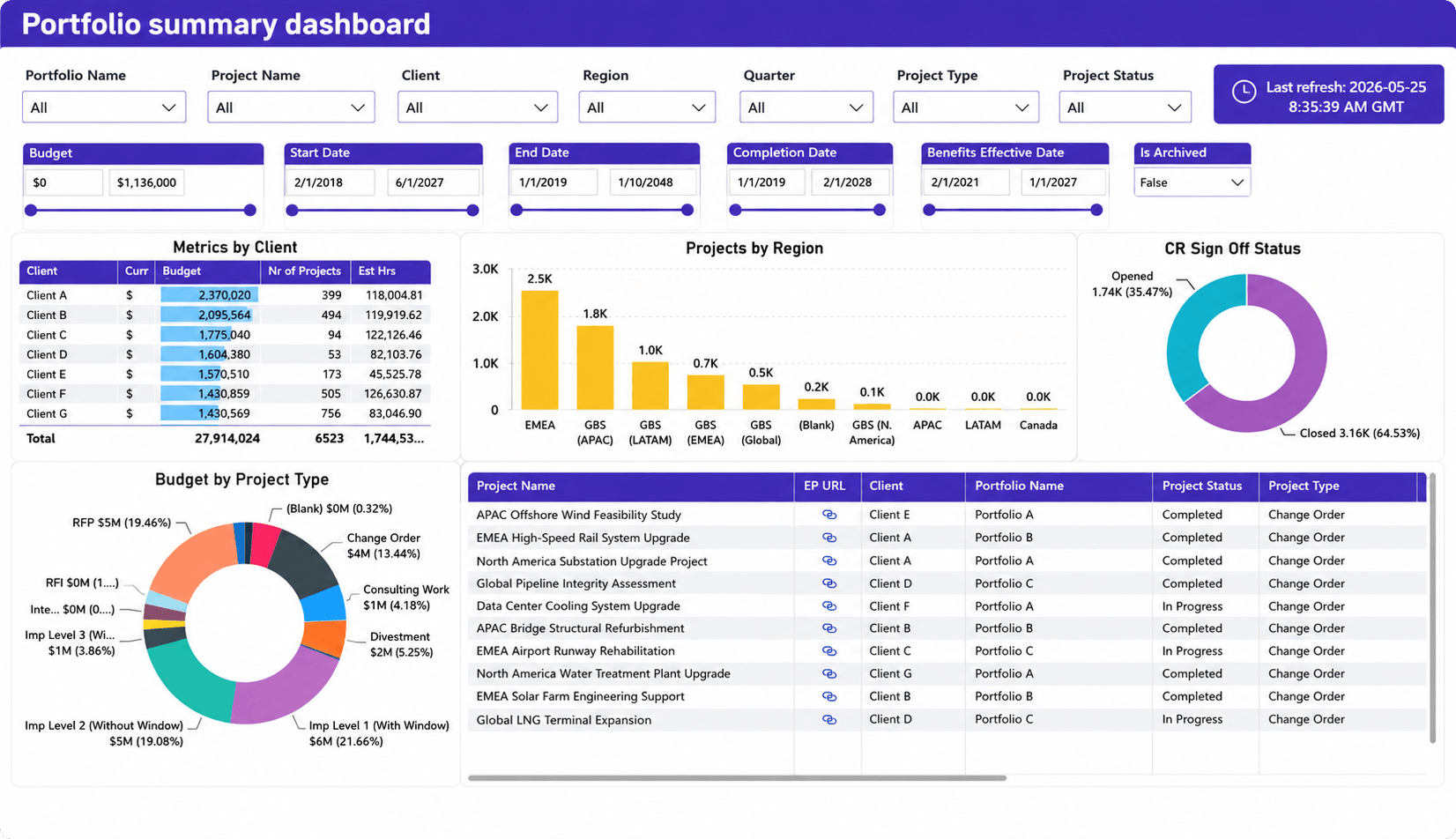
The direct answer is two aggregate numbers: portfolio on-time delivery rate and portfolio budget variance, shown as single summaries, not broken out project by project.
These two lead the delivery KPI set for a reason (see the service delivery KPIs guide for the formulas and target ranges; we won’t restate them here). Between the two, they answer the single most common question a delivery dashboard exists to answer, using the fewest numbers possible: is the portfolio, taken as a whole, doing what it said it would do.
Layout matters more here than metric choice. A single-number tile with a trend arrow beats a gauge chart or a stacked bar for this glance. The goal is a number an executive absorbs in under a second, with a direction indicator that shows whether it moved the right way since last review, not a chart that requires interpretation.
Glance 2: where’s the risk?
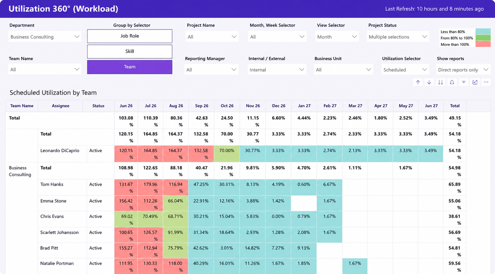
The direct answer is a short, threshold-filtered list of at-risk engagements, not the full project roster with status colors attached to each row.
The threshold logic matters more than the list itself. Flag an engagement when it crosses a defined line, for example budget burn running ahead of schedule progress, rather than color-coding every project green, yellow, or red. A wall of green trains the eye to stop checking. A short list of exceptions does not.
This is the glance that actually changes a meeting’s agenda. Glance 1 delivers reassurance and glance 3 moves slowly enough to check monthly, but glance 2 is the section leadership should read every single time, because it is the one that surfaces something to act on today.
Scope risk belongs here too, not tucked into a separate report. If the firm tracks change-order or absorbed-scope volume (see the capture-rate metric in the service delivery KPIs guide), it is a leading risk signal on the same order as budget burn, not a back-office metric to check quarterly.
Glance 3: is the business healthy?
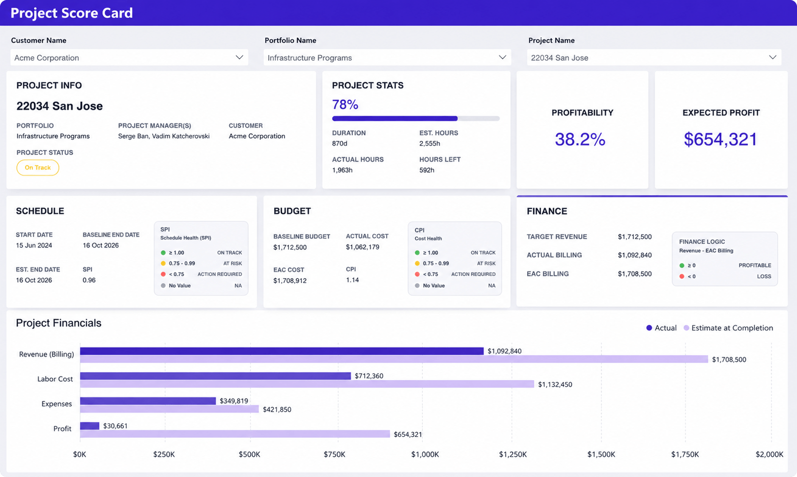
The direct answer is portfolio-level margin and a utilization trend line, the slower-moving, board-relevant view that does not need daily attention but has to be visible at least monthly.
This glance goes last, not first, because both metrics are lagging indicators. Leading with margin on the front tile buries the operational signal executives need weekly under a number that only moves meaningfully once a month. This sequencing mistake is common enough that it’s worth naming directly: a financial summary at the top of the dashboard feels authoritative, but it answers the wrong question first.
The stakes for getting this right are visible in the wider industry data. SPI Research’s 2026 Professional Services Maturity Benchmark, based on 509 firms managing roughly $63 billion in combined PS revenue, found billable utilization fell to 66.4% in 2025, the lowest point in the survey’s history and well under the 75% level SPI considers optimal, even as project margins climbed to a five-year high of 37.7% (Deltek, 2026, summarizing SPI Research). Firms can improve on one financial metric while losing ground on the operational one feeding it, which is exactly why utilization needs its own trend line rather than being inferred from margin alone.
The same benchmark found executive real-time visibility into delivery data declining industry-wide, from a score of 3.65 in 2024 to 3.53 in 2025, while high-performing firms scored 19% higher on that same visibility measure than the rest of the field (Deltek, 2026). A dashboard is one of the more direct ways to close that gap.
For firm-wide margin and utilization definitions that extend past delivery into resourcing, see the professional services operations guide.
What to leave off the executive dashboard
The direct answer: task-level detail, per-person timesheets, and the full nine-metric KPI list all belong in drill-down or in a delivery manager’s working dashboard, not the executive front screen.
Apply an audience test before adding anything. This article covers the executive view specifically. A delivery manager needs a denser dashboard, and that’s appropriate for that audience (see the service delivery KPIs guide, which serves that job). Naming the difference explicitly stops readers from loading their exec view with operational detail that belongs one level down.
One honest constraint worth stating plainly: a dashboard is only as good as the data feeding it. If time-entry compliance is inconsistent, no amount of layout work fixes a dashboard built on incomplete numbers. Fix the adoption problem first (see our guide on driving PSA adoption in the first 90 days); a well-designed dashboard on top of unreliable data just makes the gaps easier to see, not easier to trust.
Building the dashboard: two real examples
Picture a leadership team opening the dashboard on a Monday morning. Glance 1 shows portfolio on-time delivery at 88%, unchanged from last week, and budget variance holding within range. Nothing here demands a conversation. That reassurance, delivered in under two seconds, is the entire point of glance 1.
Glance 2 is different. One engagement has crossed the budget-burn threshold: spend is running 14 points ahead of schedule progress. That single flagged row is what changes the meeting’s agenda. The team clicks into that engagement, not the other eleven, and the drill-down view shows exactly where the burn accelerated and which task drove it. This is what “triage, not analysis” looks like in practice: the dashboard says where to look, and the drill-down explains why.
Both views are assembled from the same time, budget, and project data already living in one system, rather than pulled from three separate spreadsheets and reconciled by hand. That data-unification piece is a systems question more than a dashboard-layout question; see our professional services reporting overview for the underlying mechanics.
The takeaway
A service delivery dashboard is not a smaller KPI report. It is a different artifact, built to answer three questions in order: are we on track, where’s the risk, is the business healthy. Keep it to five to seven metrics, sequence them by how attention actually moves, and push everything else into drill-down.
Our service delivery KPIs guide covers the full metric set, formulas, and target ranges if you’re building this out for your own team. If you’d rather see a live example, schedule a demo and we’ll walk through a portfolio dashboard built around your own three questions.
FAQ
What metrics should be on an executive project dashboard? Five to seven metrics, arranged by urgency: aggregate on-time delivery rate and budget variance for the “are we on track” glance, a threshold-filtered at-risk engagement list for the “where’s the risk” glance, and portfolio margin plus a utilization trend for the “is the business healthy” glance.
How is a delivery dashboard different from a detailed KPI report? A dashboard is a triage tool: it flags where to look, using a handful of aggregate numbers and exceptions. A KPI report defines the full metric set, with formulas, targets, and gaming risks. Executives need the dashboard; delivery managers need both.
How often should an executive delivery dashboard be reviewed? Weekly for the on-track and at-risk glances, since those change what happens in the next meeting. Monthly is sufficient for the business-health glance, margin and utilization move slowly enough that daily checks add noise rather than insight.
Sources
- Deltek, “2026 PSO Benchmarks: Insights from SPI Benchmark Maturity Report,” 2026. https://www.deltek.com/resources/articles/professional-services-benchmarks/
- UXPin, “Dashboard Design Principles: The Definitive Guide,” 2026. https://www.uxpin.com/studio/blog/dashboard-design-principles/