Ksenia Kartamysheva
 - Nine delivery KPIs answer four questions: on schedule, on scope, on budget, and client health. Start by instrumenting five.
- Every KPI needs a formula, a data source, an owner, and a decision it triggers. A number nobody acts on is reporting theater.
- Every metric tracked alone teaches a bad behavior. Pair each KPI with its companion metric before setting targets on it.
- A live dashboard that reads time, budgets, and milestones beats a monthly spreadsheet rebuild once you run 15-plus concurrent projects.
- All nine KPIs sit on top of complete time data. If time-entry compliance is shaky, fix that before building the dashboard.
Professional services firms should track nine service delivery KPIs across four questions: schedule (on-time delivery rate, milestone slippage), scope (change-order capture rate, scope creep), budget (budget variance, project margin, unbilled time), and client health (satisfaction, time-to-close). Each KPI needs a formula, a data source, and a target range. This guide provides all three, plus the failure each metric detects.
Here is the situation most operations leaders are in. Leadership asks “how is delivery going?” and the honest answer is an anecdote about the two projects everyone is worried about. Across the 40+ professional services firms we’ve interviewed, roughly 70% assembled their delivery answers manually, from time logs exported into Excel and stitched together the night before the meeting.
Firms usually fail in one of two directions. They track nothing, which is management by anecdote. Or they track twenty things, which produces a dashboard nobody reads. This article takes a third position: nine KPIs, grouped under four questions, with a recommendation to start with five.
One more thing you will not find in most KPI lists: every metric here comes with the behavior it accidentally teaches your team when you track it alone, and the metric to pair it with. A KPI without its pairing metric is a target waiting to be gamed. Dan Ariely’s HBR column put the same rule in six words: you are what you measure [1].
How to choose delivery KPIs
A delivery KPI earns its place only if it has four things: a formula, a system of record where the number lives, an owner, and a decision it triggers. A number that nobody acts on is reporting theater, and reporting theater is worse than no reporting because it costs hours and changes nothing.
The four questions do the selection work for you. Every delivery conversation with an executive reduces to: are we on schedule, are we on scope, are we on budget, and is the client happy? If a candidate metric does not help answer one of those questions, it belongs on someone else’s dashboard.
AFP’s FP&A guidance on “the right KPIs” is the same cut: craft a short view of what the audience must act on, build a hierarchy tied to outcomes, and stop reporting metrics nobody uses [2]. A binder of twenty delivery charts is not a control system.
One distinction matters before the list: leading versus lagging indicators. Project margin is a lagging metric, an autopsy you read after the engagement is over. Budget burn rate and change-order capture are leading metrics that let you steer while the project is still in flight. A dashboard built only from lagging metrics tells you accurately how you failed. The list below deliberately mixes both.
Each KPI block below includes a data source column for a practical reason: at portfolio scale, most of these numbers are hard to produce from spreadsheets. Knowing where each number should live is half the instrumentation work.
Are we on schedule?
Two metrics answer the schedule question. One tells you how often you miss, the other tells you how badly.
1. On-time delivery rate
On-time delivery rate is the percentage of milestones or engagements delivered by their committed date.
- Formula: milestones delivered on or before the committed date ÷ milestones due in the period × 100
- Data source: milestone status and baseline dates in your project management system
- Target range: across the firms we work with, disciplined teams sustain 80–90%. A firm holding 100% for two quarters is usually padding estimates, not delivering flawlessly.
A miss signals scoping problems, resource conflicts, or client-side delays, and the metric alone will not tell you which. That is the first reason it needs companions.
Gaming risk: teams pad estimates or quietly re-baseline committed dates, so the rate stays green while clients wait longer. Pair it with budget variance and a simple re-baseline count per project. Schedule read alone also rewards heroic overspend: a project delivered on time at 140% of budgeted hours is not a success story.
2. Milestone slippage
Milestone slippage measures how late the late milestones actually are, in days, tracked as an average and a worst case. It is the severity companion to the binary on-time rate, because two days late and two months late are different diseases with different treatments.
- Formula: total days late across missed milestones ÷ number of missed milestones (plus the single worst value)
- Data source: actual versus baseline milestone dates in the PM system
- Target range: no honest universal benchmark exists. Measure your own baseline for a quarter, then set a reduction target.
The leading-indicator use is the valuable one: slippage on the first two or three milestones of an engagement predicts end-date risk while there is still time to add people, cut scope, or reset the client’s expectations.
Are we on scope?
Scope failures rarely announce themselves. They arrive as small polite yeses that individually cost nothing and collectively eat the margin.
3. Change-order capture rate
Change-order capture rate is the percentage of identified scope changes that became priced, approved change orders instead of being absorbed silently. Silent absorption is the single most expensive habit in fixed-fee delivery, and most firms cannot see it because nothing records the yes. It is one of the engagement-stage failures covered in our service delivery management guide.
- Formula: approved change orders ÷ identified scope changes × 100
- Data source: a change log attached to each project. If no change log exists, this metric is unmeasurable, and creating the log is the first step.
- Target range: most firms start near zero capture, because uncaptured changes were never written down. The first win is not a percentage. It is making absorption visible at all.
Gaming risk: if capture rate becomes a bonus metric, teams stop identifying changes so the denominator stays small. Pair it with scope creep percentage, which catches the effort those unlogged changes consume.
4. Scope creep percentage
Scope creep percentage compares delivered effort against originally scoped effort on fixed-fee work.
- Formula: (actual hours − originally scoped hours) ÷ originally scoped hours × 100
- Data source: time entries against the project, compared with the estimate that priced the deal
- Target range: measure your own baseline for a quarter. Across firms we work with, sustained creep above 15–20% means your estimating model or your change discipline is broken.
Gaming risk: the easiest way to look disciplined on this metric is to inflate original estimates. Pair it with your win rate: if creep drops while proposals start losing on price, the estimates moved, not the delivery. The sales-side mechanics are a separate topic; the pairing is the point here.
Are we on budget?
The budget question has three metrics because money leaks from delivery in three different places: mid-project overspend, structural underpricing, and hours that never reach an invoice.
5. Budget variance percentage
Budget variance is actual cost against planned cost per engagement, read mid-flight rather than at the post-mortem. It is the single most steering-relevant metric on this list, because it detects the week-nine surprise: the project that was fine at the last check-in and is suddenly 30% over.
- Formula: (actual cost to date − planned cost to date) ÷ planned cost to date × 100
- Data source: time entries multiplied by cost rates, against the project budget in the same system
- Target range: investigate any project whose budget burn crosses 75% before 75% of its timeline has elapsed. That mid-flight rule is more useful than a year-end overrun label.
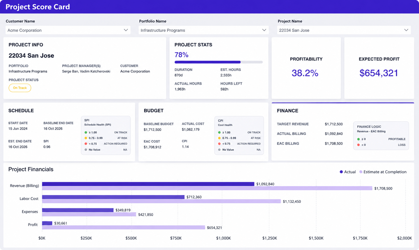
Gaming risk: teams shift hours to whichever project still has budget, so every project looks fine and none is. Pair it with unbilled time (KPI 7), which surfaces hours going missing, and spot-check time entries against actual assignments quarterly.
6. Project margin
Project margin is revenue minus fully loaded delivery cost, per engagement. It is a lagging metric by nature. Its job is not in-flight steering but repricing, portfolio decisions, and deciding which service lines deserve to grow.
- Formula: (project revenue − loaded delivery cost) ÷ project revenue × 100
- Data source: invoiced revenue plus cost rates applied to logged time. This is the catch: about 55% of the firms in our interview corpus did not track labor cost rates at all, which makes project margin the most commonly impossible KPI on this list. As the owner of one digital agency put it on a discovery call: “We don’t track labor costs… we’re undercharging.”
- Target range: if you cannot compute the number yet, get cost rates into the system this quarter. SPI Research’s 2026 Professional Services Maturity Benchmark (509 organizations) reports that Level 5 firms show 250% higher project margins than Level 2 peers [3]. That gap is what cost rates plus delivery KPIs are for.
Gaming risk: margin improves instantly when senior time gets logged against overhead codes instead of projects. Pair it with a utilization view so hidden hours have nowhere to go.
Sister page for the finance cuts of the same numbers: project financial KPIs to track in professional services.
7. Unbilled and uncaptured time
Unbilled time is billable work that was performed but never logged, or logged but never invoiced. It is revenue leakage at the delivery seam, and it is invisible precisely because the missing hours leave no record.
- Formula (conservative method): sample one week; compare actual hours worked (from calendars and standups) against logged billable entries, then extrapolate
- Data source: time entries versus the sampling exercise; invoiced hours versus approved billable hours for the invoicing half
- Target range: firms measuring for the first time routinely find more leakage than they expected. Treat the first sample as a baseline, then cut it. How to reduce revenue leakage is the finance-side companion.
Gaming risk: pressure to close the gap teaches people to log everything as billable, which degrades data truth and shows up later as client disputes. Pair it with realization (the ratio of billed value to standard value of hours worked), which catches billable-labeled hours that never survive invoicing. Realization is a finance metric; the definition lives in our professional services operations guide.
Is the client healthy?
A project can be on time, on scope, and on budget while the relationship quietly dies. Two metrics keep the client in the picture.
8. Client satisfaction at milestones
Client satisfaction for delivery work means a short CSAT or NPS pulse at kickoff plus 30 days and at major milestones, not only at closure. A closure-only survey measures the client’s memory of the engagement, filtered through however the last week went.
- Formula: standard CSAT (% of 4–5 ratings) or NPS (% promoters − % detractors), segmented by engagement stage
- Data source: a two-question survey tied to milestone completion, logged against the project
- Target range: treat your own first two quarters as the baseline. A flat trend with a rising response rate is a healthier signal than one glowing quarter from three friendly contacts.
One honesty note: response rates on professional services client surveys run low, often under a third of contacts. Small-sample scores are directional. Read trends, not points, and never bonus anyone on a single quarter’s number.
Gaming risk: teams survey only the contacts who like them. Pair the score with response rate and require the economic buyer, not just the day-to-day contact, in every pulse.
9. Time-to-close after final deliverable
Time-to-close measures the days between the last deliverable and a reconciled final invoice plus formal project closure. It is the zombie-project detector: engagements that are finished in reality but open in every system, holding budget, distorting utilization, and delaying cash (the closure failure mode from the service delivery management guide).
- Formula: closure date − final deliverable date, in days, averaged per quarter
- Data source: deliverable completion dates and project status in the PM system; final invoice date from accounting
- Target range: across firms we work with, under 15 business days is achievable once closure has an owner. Beyond 30 days, the delay is usually process, not client.
The CFO will recognize this one immediately, because it feeds days sales outstanding. Delivery closes the project; finance collects the cash; this metric measures the handoff between them (DSO is defined in the operations guide).
Gaming risk: closing projects administratively before punch-list items are done moves the problem into next quarter’s support tickets. Pair it with post-closure rework hours.
The nine KPIs in one table
| KPI | Formula | Target range | Pairs with |
|---|---|---|---|
| On-time delivery rate | on-time milestones ÷ due milestones | 80–90% (first-party observed) | Budget variance, re-baseline count |
| Milestone slippage | days late ÷ late milestones (+ worst case) | Own baseline, then reduce | On-time rate |
| Change-order capture rate | approved COs ÷ identified changes | Start: make it measurable | Scope creep % |
| Scope creep % | (actual − scoped hours) ÷ scoped hours | Own baseline; investigate >15–20% | Win rate |
| Budget variance % | (actual − planned cost) ÷ planned cost | Investigate 75% burn before 75% time | Unbilled time |
| Project margin | (revenue − loaded cost) ÷ revenue | Get cost rates in this quarter; Level 5 firms +250% vs Level 2 (SPI 2026) | Utilization |
| Unbilled time | sampled actuals vs. logged billable | First sample = baseline, then cut | Realization |
| Client satisfaction | CSAT/NPS at milestones | Own baseline; read trends | Response rate |
| Time-to-close | closure date − final deliverable | <15 business days | Post-closure rework |
Start with five: a rollout sequence
Instrument in this order: budget variance, on-time delivery rate, unbilled time, change-order capture rate, then project margin. The logic is practical. The first three come almost free once time tracking is reliable, because they are arithmetic on data you already collect. The last two force the process fixes, a change log and cost rates in the system, that make every other number honest.
Cadence matters as much as selection. Review the leading trio (budget variance, on-time rate, change-order capture) in a weekly ops meeting, because those are the ones you can still steer. Review margin and client health monthly, because they move slowly and weekly readings just add noise. Put all of it on one dashboard rather than five reports; the reports get skipped the first busy week.
One prerequisite before any of this: all nine KPIs sit on top of complete time data. If time-entry compliance at your firm is shaky, fix that first, or every number below it inherits the gaps. Our 90-day PSA adoption playbook covers how to lock in the time-entry habit.
Why spreadsheets stop being enough for delivery KPIs
Every KPI in this article is computable in a spreadsheet for one project. The problem is scale: at 15 to 30 concurrent engagements, the assembly cost exceeds the insight. This is the manual-reporting ritual that roughly 70% of the firms we interviewed described, exporting time logs, reconciling them against budgets, and rebuilding the same workbook monthly. Worse, hand-assembled metrics arrive after the fact, which turns the steering metrics on this list into autopsies.
The alternative is mechanical, not magical: a live dashboard that pulls from the same system where time entries, budgets, milestones, and change orders already live, so budget variance updates when a timesheet is approved rather than when someone rebuilds the export. If you are evaluating that move, start with our professional services software requirements checklist, or with the basics in the PSA software guide.
Delivery KPIs that belong on a services dashboard
A services dashboard is not a dump of every column in the project table. AFP’s rule for FP&A packs applies here: one view that tells ops what to do this week, customized to the audience, with a hierarchy that ties back to outcomes [2].
Put the leading trio on the default screen: budget variance, on-time delivery rate, change-order capture. Add milestone slippage and unbilled time as the next row, because they explain why a green or red cell moved. Park project margin and client satisfaction on a monthly tab so they do not drown the weekly meeting.
If a widget cannot name the project, the owner, and the decision, it is decoration. Service delivery dashboards for managed services teams is the layout companion; this page is the metric list those widgets should read.
How delivery KPIs connect to utilization
Delivery KPIs measure engagements. Utilization measures people. They meet when the same named hours are both “billable capacity” and “work against a project budget.”
A team at 90% billable utilization with slipping milestones and rising budget variance is not healthy delivery. It is a firm converting overtime into a green utilization chart. SPI Research’s 2026 benchmark (509 professional service organizations) reports Level 5 firms at 42% more billable utilization than Level 2 peers [3]. That gap only helps if the extra billed hours land inside scoped, on-time work. Pair utilization with on-time rate and budget variance in the same weekly review, or you will staff the heroes and starve the plan.
Resource-side definitions live in the resource management guide. Do not replace the nine delivery KPIs with a single utilization tile.
PSA tracking from live assignments and remaining work
PSA can compute most of this list when time entries, remaining work, baselines, change orders, and billing sit in one model. Out of the box, that usually means:
- On-time rate and slippage from baseline vs actual milestone dates
- Budget variance and margin from logged hours × cost rates vs the project budget
- Unbilled time from approved billable hours that have no invoice
- Change-order capture only if a change log exists in the same system
Birdview PSA already ties time, budgets, and project financials on the sister project financial KPIs page. What it cannot invent: a CSAT pulse you never sent, or a change order nobody wrote down. Those two still need a process, then a field.
If ops rebuilds the nine KPIs from last Friday’s export, the PSA is a filing cabinet. Live remaining work is the test: can you see this week’s budget burn without opening a spreadsheet.
FAQ
What is a good on-time delivery rate for professional services?
Across firms we work with, disciplined delivery teams sustain an on-time rate of 80–90% of milestones. A sustained 100% is usually a warning sign rather than an achievement: it typically means estimates are padded or committed dates are being quietly re-baselined, so check the re-baseline count before celebrating.
How do you calculate budget variance on a project?
Budget variance is (actual cost to date − planned cost to date) ÷ planned cost to date × 100, using time entries multiplied by cost rates. Read it mid-flight, not at closure: a useful trigger is investigating any project whose budget burn passes 75% before 75% of the timeline has elapsed.
How many KPIs should a delivery team track?
Five to nine. Fewer than five leaves one of the four core questions (schedule, scope, budget, client health) unanswered. More than nine produces reporting theater: dashboards that cost hours to maintain and change no decisions. Start with five, add the rest once the underlying data (change log, cost rates) exists.
What is the difference between delivery KPIs and utilization?
Delivery KPIs ask whether the engagement landed on time, on scope, on budget, with a client who will buy again. Utilization asks what share of a person’s week was billable. Run both. Do not let a high utilization number excuse late milestones.
Which service delivery KPIs can PSA track out of the box?
Dates, hours, rates, and invoices: on-time rate, slippage, budget variance, margin, unbilled time. Change-order capture needs a log in that same system. CSAT needs a survey you actually send. Birdview PSA already joins time and project financials; it will not invent a pulse or a change order you never recorded.
What KPIs show if service delivery is healthy?
A healthy week is on-time rate in the 80–90% band, budget burn in line with elapsed time, change orders written down instead of absorbed, and unbilled hours not growing. Margin and CSAT confirm the story monthly. Green utilization alone is not a health reading.
Sources
- Dan Ariely. You Are What You Measure. Harvard Business Review, June 2010. https://hbr.org/2010/06/column-you-are-what-you-measure
- Bryan Lapidus, Association for Financial Professionals. 12 Tips to Fix the Metric System and Deliver the Right KPIs (2018). https://www.financialprofessionals.org/training-resources/resources/articles/Details/12-tips-to-fix-the-metric-system-and-deliver-the-right-kpis
- SPI Research. 2026 Professional Services Maturity Benchmark (509 professional service organizations; Level 5 vs Level 2 billable utilization and project margins). https://spiresearch.com/reports/2026-ps-maturity-benchmark/