If you’re running a service firm, you know the pain of scattered data. This is where a PSA performance dashboard becomes essential. It’s your command center. A single place where financial health, project performance, and resource capacity all come together. Throughout this guide, I’ll walk through what actually belongs in a PSA dashboard and how to build one that works. We’ll use Birdview PSA as our reference point since it handles the full spectrum of what service firms need to track.
What is a PSA performance dashboard, and why it matters for service firms
A PSA dashboard is, simply put, a centralized, visual snapshot of your service firm’s operational health. It pulls together data from project management, resource allocation, time tracking, and finance into one easy-to-read screen.
For service firms, these dashboards are critical because they shine a light on complex, moving parts. They provide the visibility needed for fast, informed decision-making. Without a centralized view, firms often struggle with fragmented data. Project overruns sneak up, resource allocation becomes constant firefighting, and decisions are slow because pulling the data takes too long. A well-designed dashboard cuts through that noise.
Core KPIs every PSA dashboard should include
Many service firms track dozens of metrics, but a dashboard should only feature the most powerful Key Performance Indicators (KPIs). These are the metrics that, if managed correctly, directly influence your firm’s profitability, client satisfaction, and growth potential.
Project performance KPIs
These track the health of individual projects against their original plan. This group of KPIs provides immediate, concrete answers to the question: Are we delivering our projects on time and on budget?
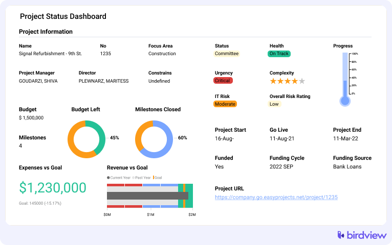
- Budget vs. actuals: This compares the planned financial spend or effort to what has been consumed so far.
- Why it matters: It’s your earliest warning sign for a potential over-budget project.
- Action: When a project deviates past a pre-set threshold (e.g., 85% budget consumed, but only 50% of work done), the project manager needs to review scope or estimates immediately.
- Birdview example: The Project Health widget often uses a simple red/yellow/green indicator to flag projects hitting these thresholds.
- Hours left vs. hours logged: A simple measure of remaining effort versus effort already expended.
- Why it matters: Gives project managers a quick sense of whether the remaining work is commensurate with the remaining budget.
- Birdview example: The Hours Left widget tracks this ratio visually, making it clear when hours logged are accelerating faster than expected.
📚 Read more: Project dashboards: types, examples, and benefits
Resource performance and utilization KPIs
These focus on how efficiently your most expensive asset, aka your people, are being used. They help answer: Are our teams effectively utilized and adequately supported for the pipeline of work ahead?
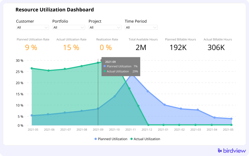
- Billable utilization vs. productive utilization:
- Billable utilization tracks time spent on activities that can be invoiced to clients.
- Productive utilization includes billable time plus essential non-billable time, like training or sales support.
- Why it matters: Billable utilization drives revenue; productive utilization shows the overall efficiency of your workforce.
- Over/under-allocation signals: Indicators that a resource is scheduled for more than 100% or significantly less than their capacity.
- Action: Resource managers should use these signals to shift workloads or pipeline new work.
- Birdview example: The Resource Utilization Chart provides a heatmap view, instantly highlighting individuals or teams that are over- or under-capacity.
📚 Read more: Resource management reporting and dashboards
Financial and profitability KPIs
These are the metrics that keep your business solvent and growing. This group helps answer the fundamental question: Are the services we deliver actually generating a healthy return for the firm?
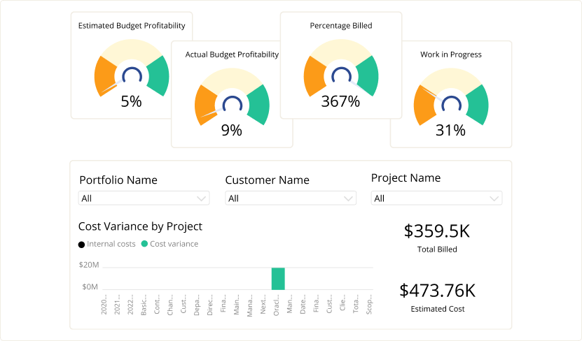
- Gross margin by project: Revenue minus the direct cost of delivery (salaries, expenses).
- Why it matters: The ultimate measure of project success. Low margins signal issues with estimating, pricing, or scope creep.
- Revenue vs. forecast: Tracks actual revenue generated against what was predicted for the period.
- Action: If actual revenue is falling short, sales efforts need to be intensified, or project managers need to accelerate invoicing cycles.
- Birdview example: The Financial Summary widget and Revenue Forecast Dashboards consolidate these numbers across the entire portfolio.
Time-tracking and billability KPIs
Good data starts with good time entry. These metrics are a crucial operational check, answering: Is our data accurate, and are we capturing all billable work for invoicing?
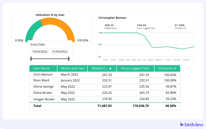
- Time log completeness: The percentage of expected work time that has actually been logged by employees.
- Why it matters: Missing time logs mean inaccurate utilization, billing, and project budget data.
- Invoiced vs. non-invoiced time: Tracks billable time that has yet to be converted into client invoices.
- Action: Finance and project management teams should use this to speed up the billing cycle and improve cash flow.
- Birdview example: The Time & Billing dashboard can show open time entries and their invoicing status.
Portfolio and strategic KPIs
These indicators look beyond individual projects to the firm‘s future health. They answer the top-level question: Is our overall business healthy, and are we prioritizing the right work for future growth?

- Pipeline health: Measures the value and stage of potential future work.
- Why it matters: Essential for planning future capacity and hiring.
- Portfolio-level budget consumption: The aggregate budget health across all running projects.
- Action: Executives use this to spot overall trends, like an organizational tendency toward overruns.
- Birdview example: The Portfolio Status dashboard aggregates risk and financial health across all active projects.
📚 Read more: Project portfolio dashboards: Key metrics & examples
Step-by-step: how to build your PSA dashboard
Theory is nice, but let’s get practical. Here’s how to create a dashboard that people will actually use.
Step 1: Identify who the dashboard is for
Different roles require different views. An executive needs a high-level, financial snapshot, while a project manager needs detail on active projects and resource managers need utilization heatmaps.
Action: Create separate dashboard views tailored to the distinct needs of executives, project managers, resource managers, and finance teams. Birdview allows dashboard personalization per role, ensuring that a Project Manager sees Project Health and a Resource Manager sees the Utilization Chart by default.
Step 2: Define the questions the dashboard must answer
Start with the core business questions. The dashboard must provide measurable answers.
Examples of core questions:
- Are we on track to hit our monthly revenue target? (KPI: Revenue vs. forecast)
- Which projects are at immediate risk of overrun? (KPI: Budget vs. actuals)
- Do we have enough capacity for the work we plan to close next month? (KPI: Capacity vs. demand forecast)
Turn these questions directly into your core measurable KPIs.
Step 3: Select only the KPIs that matter
Resist the urge to include everything. An overloaded dashboard is a confusing dashboard.
Action: Aim for 8–12 core indicators that are truly actionable. If a metric doesn’t lead to a direct action or insight, it belongs in a detailed report, not the dashboard. Keep strategic dashboards (for executives, focused on future and finance) separate from operational dashboards (for project managers, focused on today‘s execution).
Step 4: Build your dashboard structure
Group related KPIs together. Put your most critical metrics at the top where they’re impossible to miss. In a typical Birdview executive dashboard, you might structure it like this:
- Top row: profitability summary, revenue forecast, portfolio health score. These answer “how’s the business doing overall?”
- Middle section: project performance widgets showing budget variance and schedule status across active projects.
- Bottom section: resource utilization and capacity insights so you can plan ahead.
Step 5: Leverage Birdview‘s dynamic filtering and segmentation
A static dashboard is less useful than a dynamic one. Filters allow users to drill down without leaving the core view.
Action: Ensure users can filter the data by:
- Client or industry: View performance trends by customer segment.
- Team or department: See utilization or profitability for a specific delivery group.
- Date range: Compare this month’s performance against the last.
Step 6: Automate alerts and regular dashboard reviews
A dashboard is only useful if it’s regularly consulted and acted upon.
Schedule recurring dashboard reviews. Weekly for operations, monthly for strategy. Make it a calendar event so it actually happens.
Set up automatic alerts for exceptions. If a project goes 10% over budget, flag it. If someone hits 120% allocation, flag it. You shouldn’t have to hunt for problems.
Share dashboards automatically with stakeholders. Birdview can send dashboard snapshots to your leadership team or clients on a schedule. This keeps everyone aligned without manual report-building.
Best practices for maintaining a high-performing PSA dashboard
Building the dashboard is just the start. Here’s how to keep it useful.
Use color indicators strategically. Red, yellow, green status lights work because they’re instantly readable. But overuse them and they lose meaning. Reserve red for things that truly need immediate attention.
Drive decisions, not just reports. When you spot an over-allocated resource, actually reassign work. When margins dip on a project, investigate and adjust. The dashboard is only valuable if it changes what you do.
Configure forward-looking views alongside historical ones. Birdview’s forecast widgets show projected revenue and capacity, not just what already happened. This transforms your dashboard from a rearview mirror into a windshield.
Review and refine quarterly. Business priorities shift. Remove widgets you never look at. Add metrics for new service lines or strategic initiatives. Your dashboard should evolve with your firm.
How Birdview PSA simplifies dashboard creation
Birdview is designed to make these dashboards accessible and actionable for service firms. The system automatically pulls the data from integrated time tracking, resource management, and financial modules. This allows for:
- Customizable widgets that display your key performance indicators exactly how you need them.
- Real-time data ensures that decisions are based on the latest facts, not yesterday‘s numbers.
- Role-based dashboards that minimize clutter and present the most relevant information to executives, managers, and individual contributors.
- Built-in templates for strategic and operational views, giving you a strong starting point without having to build from scratch.
Wrapping up: turn your PSA dashboard into a decision engine
A well-structured PSA dashboard changes how service firms operate. Instead of reacting to problems after they’ve damaged profitability, you spot them early. Instead of guessing about capacity, you know exactly what your team can handle.
Start with the core KPIs we covered: project performance, resource utilization, financials, time tracking, and portfolio health. Build role-specific views. Automate alerts. Review and refine regularly.
Want to see how these dashboards work in practice? Try Birdview PSA free or schedule a demo to explore how role-based dashboards can transform your service firm’s visibility and decision-making.
FAQ
1. What is the difference between billable and productive utilization?
Billable utilization measures hours spent on client-facing, revenue-generating work. Productive utilization includes billable work plus necessary non-billable activities like internal training, administrative tasks, and business development.
2. How often should service firms check their profitability dashboards?
Service firms should check profitability dashboards at least mid-week to identify and course-correct projects showing early signs of margin erosion or cost overruns, preventing major financial surprises.
3. What is resource forecasting and why is it important for hiring?
Resource forecasting uses scheduled project demand to predict future capacity needs. It is vital for hiring because it identifies skill gaps and capacity shortages months in advance, allowing the firm to hire proactively before a project delivery crisis occurs.
4. What is a healthy utilization rate for a billable role?
A healthy utilization rate for a dedicated billable role often falls between $80\%$ and $90\%$. Rates consistently above $90\%$ can lead to burnout, poor data quality, and operational risk.
5. How does project profitability link to resource utilization?
Project profitability is directly linked to utilization. Low utilization means idle staff, increasing fixed labor costs. Over-utilization can lead to unrecorded overtime or reduced quality, which also erodes profitability through unexpected costs.