Leonid Kostin
 - PMOs often struggle with reporting because project, resource, financial, and time-tracking data live in disconnected systems instead of one operational structure.
- The best Power BI dashboards help teams identify delivery risks, utilization gaps, budget overruns, and staffing issues before they become larger operational problems.
- Portfolio dashboards give executives centralized visibility into project health, financial performance, strategic priorities, and delivery trends across the organization.
- Resource management dashboards help organizations reduce spreadsheet-based planning and improve utilization, workload balancing, and capacity forecasting.
- Financial dashboards connect project delivery with profitability by tracking margins, revenue recognition, billable utilization, labor costs, and project performance.
- Missing or inconsistent time entries often create reporting inaccuracies that affect invoicing, forecasting, profitability analysis, and utilization tracking.
- Capacity planning dashboards help operations teams compare future demand against available resources so hiring and staffing decisions become more proactive.
- Executive dashboards reduce dependency on manual reporting by centralizing portfolio health, pipeline performance, project status, and operational risk reporting.
- Different stakeholders need different reporting layers. Executives usually need summarized portfolio visibility, while PMOs, finance teams, and delivery managers require more operational detail.
- Organizations using centralized PSA platforms usually build more reliable Power BI dashboards because project, resource, financial, and time-tracking data already share the same structure.
Power BI dashboard examples help project-based organizations turn scattered operational data into clear reporting for projects, resources, finances, and portfolio performance. In consulting firms, engineering companies, IT services teams, and PMOs, dashboards help leaders understand delivery risks, utilization trends, profitability, and capacity constraints without relying on manual spreadsheet reporting.
Most organizations struggle because the data lives in too many places. Project plans sit in one system, time tracking in another, budgets in spreadsheets, and resource schedules inside disconnected files or tribal knowledge. The result is delayed reporting, inconsistent metrics, and decisions based on assumptions instead of operational visibility.
A well-structured Power BI environment changes that. Instead of exporting data into Excel every week, teams can connect project, resource, financial, and portfolio information into centralized dashboards that update automatically and support faster decisions.
What makes a useful Power BI dashboard
A useful Power BI dashboard provides clear visibility into project performance, resource utilization, financial metrics, and portfolio health without requiring manual reporting work.
The best dashboards are not the ones with the most charts. They are the ones that help teams make decisions faster.
In project and portfolio management, dashboard quality usually depends on four things:
- Clarity over complexity
- Real-time or near-real-time data
- Actionable insights
- Alignment with decision-making responsibilities
Many dashboards fail because they try to show everything at once. Teams overload reports with KPIs and visualizations until the important signals disappear.
Good dashboards focus on what each audience actually needs. Executives usually care about portfolio health, delivery risks, and resource capacity. Project managers need operational visibility into schedules, workload, and blocked work. Finance stakeholders focus more on margins, utilization, and forecasting.
A useful project management dashboard Power BI setup also highlights exceptions instead of raw activity. Leaders rarely need every project detail. They need visibility into delivery, budget, or resource risks before those issues become larger operational problems.
Power BI dashboard examples (gallery)
Different dashboards support different operational decisions. Some dashboards help executives monitor portfolio health and profitability, while others focus on resource utilization, project delivery, time tracking, or future capacity planning.
The examples below show how organizations use Power BI dashboard examples for business to centralize reporting across projects, resources, finances, and operations. Each dashboard focuses on a specific operational area and highlights the type of visibility PMOs, finance teams, and delivery leaders typically need.
Project portfolio dashboards
Project portfolio dashboards help organizations monitor delivery performance, portfolio health, project distribution, and financial trends across multiple projects and business units. These dashboards are commonly used by PMOs and executive teams that need centralized visibility into active portfolios.
Portfolio summary dashboard
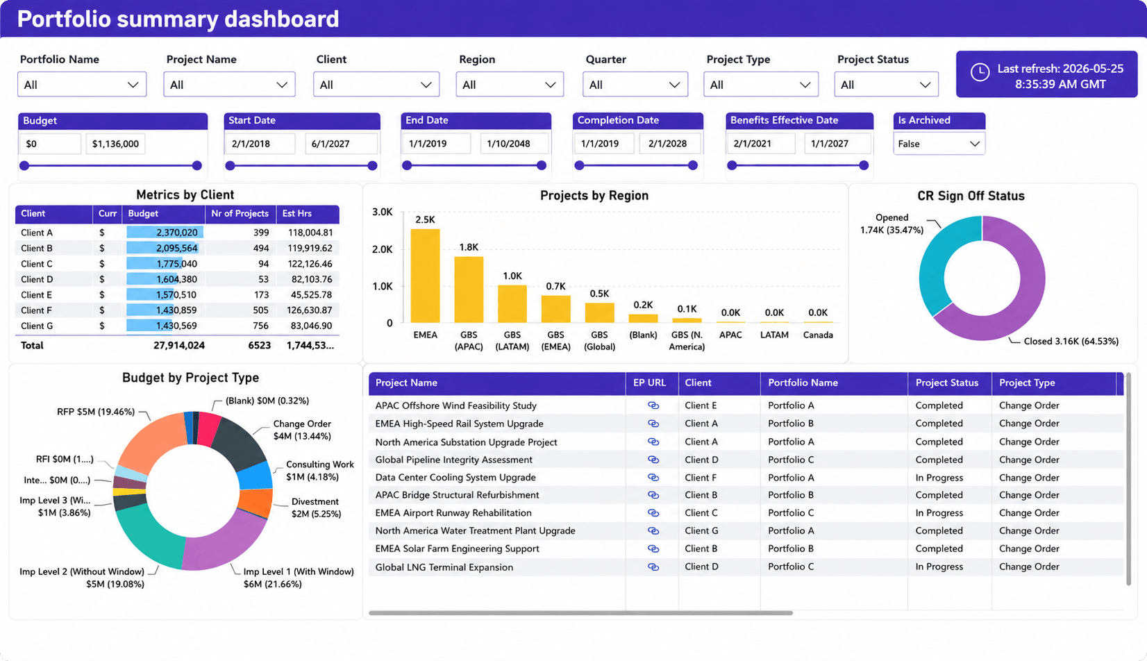
What it shows: This dashboard provides a high-level overview of portfolio performance across clients, regions, project types, and project statuses. It combines financial and operational reporting into one centralized portfolio view.
Why it matters: Portfolio reporting often becomes fragmented across spreadsheets and disconnected systems. This type of portfolio dashboard Power BI report helps leadership quickly identify delivery trends, budget distribution, and project concentration across the organization.
Key metrics
- Portfolio budget distribution
- Project count by client and region
- Estimated project hours
- Project status distribution
- Budget by project type
- Portfolio and client-level project tracking
Target audience: PMO directors, portfolio managers, operations leaders, executive stakeholders, and regional delivery managers.
Product analysis dashboard
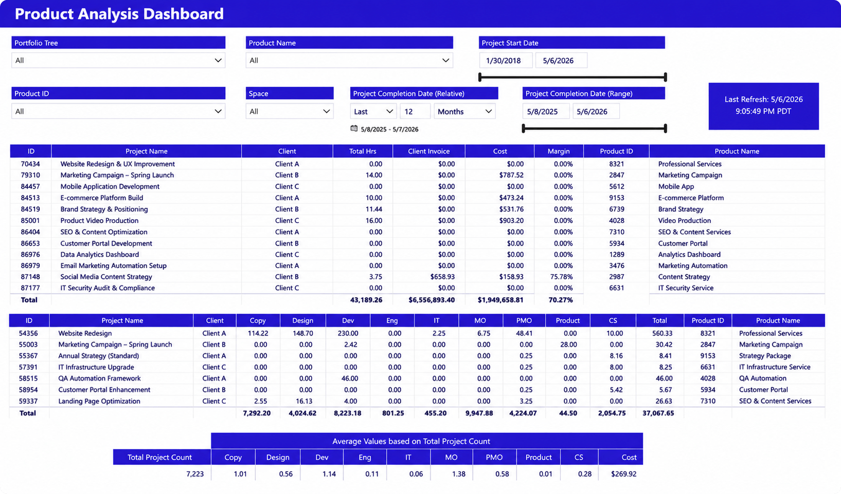
What it shows: This dashboard focuses on project profitability, delivery effort, and product-level financial analysis. It combines invoice values, labor costs, margins, and departmental effort into a single reporting view.
Why it matters: Many organizations struggle to connect delivery effort with financial outcomes. This dashboard helps operations and finance teams understand which services, projects, or products generate the strongest profitability and resource efficiency.
Key metrics
- Client invoice values
- Project costs
- Margin percentages
- Total project hours
- Delivery effort by department
- Average operational cost per project
- Product and service profitability
Target audience: Finance leaders, PMO directors, operations teams, business analysts, professional services leaders, and portfolio managers.
Resource management dashboards
Resource management dashboards help organizations understand how people, skills, capacity, and workload are distributed across projects and teams. These reports are especially important for service organizations where utilization and staffing directly affect delivery performance and profitability.
Timesheets overtime dashboard
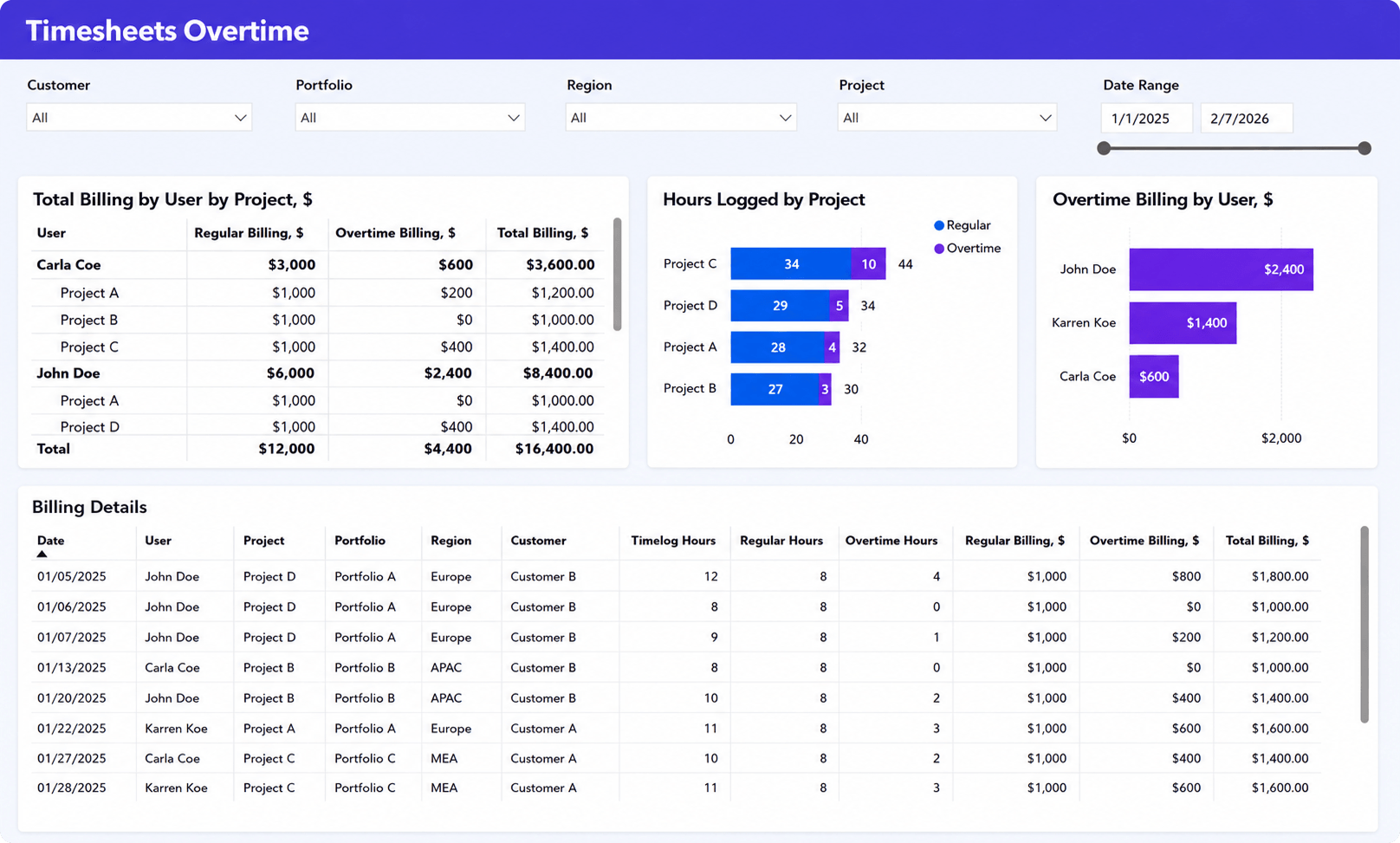
What it shows: This dashboard tracks overtime hours, overtime billing, and time log distribution across users, projects, portfolios, and customers. It combines operational time-tracking data with billing visibility.
Why it matters: Overtime often affects both profitability and resource health. This dashboard helps managers identify where overtime is increasing, which projects drive extra billing, and which teams may be overloaded.
Key metrics
- Regular vs overtime billing
- Overtime billing by user
- Logged hours by project
- Timelog hours
- Total billing values
- Regular vs overtime hours
Target audience: Resource managers, operations leaders, PMO teams, finance stakeholders, and delivery managers.
User management dashboard
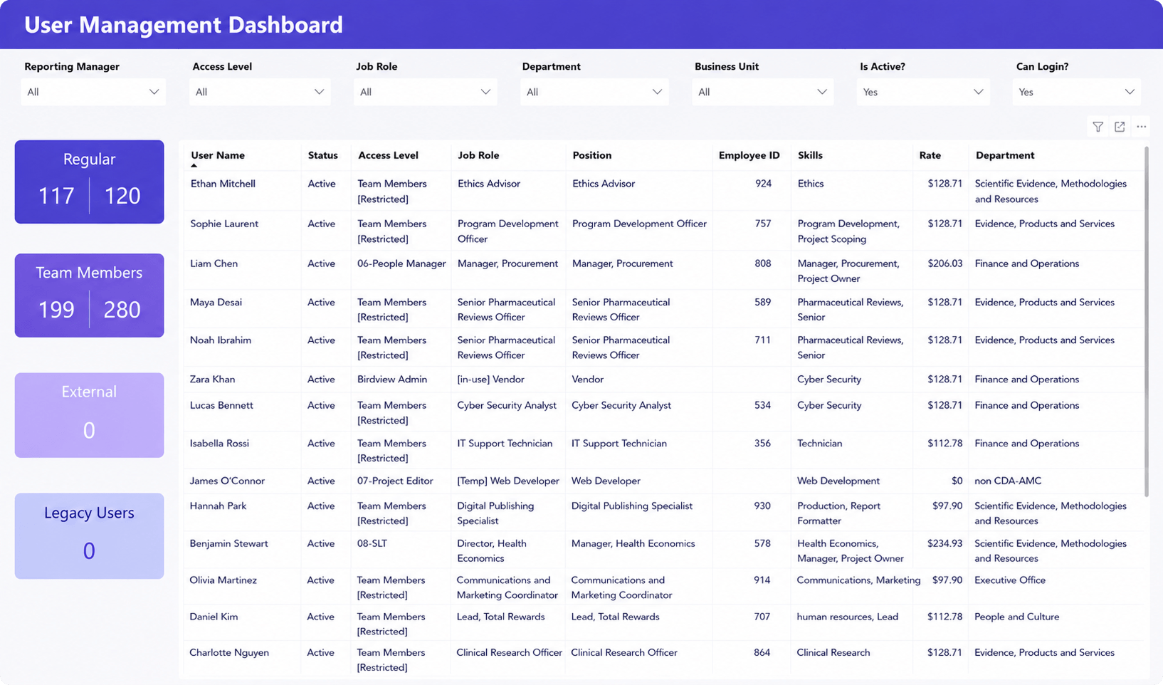
What it shows: This dashboard provides visibility into workforce structure, user access levels, job roles, departments, billing rates, and skills across the organization.
Why it matters: Large project organizations often struggle to maintain visibility into workforce structure and role distribution. This dashboard helps operations and PMO teams manage access governance, staffing visibility, and workforce organization in one centralized view.
Key metrics
- User status and access level
- Job roles and positions
- Department distribution
- Employee billing rates
- Skills and competencies
- Active vs inactive users
Target audience: Operations managers, PMO leaders, HR teams, resource managers, and system administrators.
Resource utilization dashboard
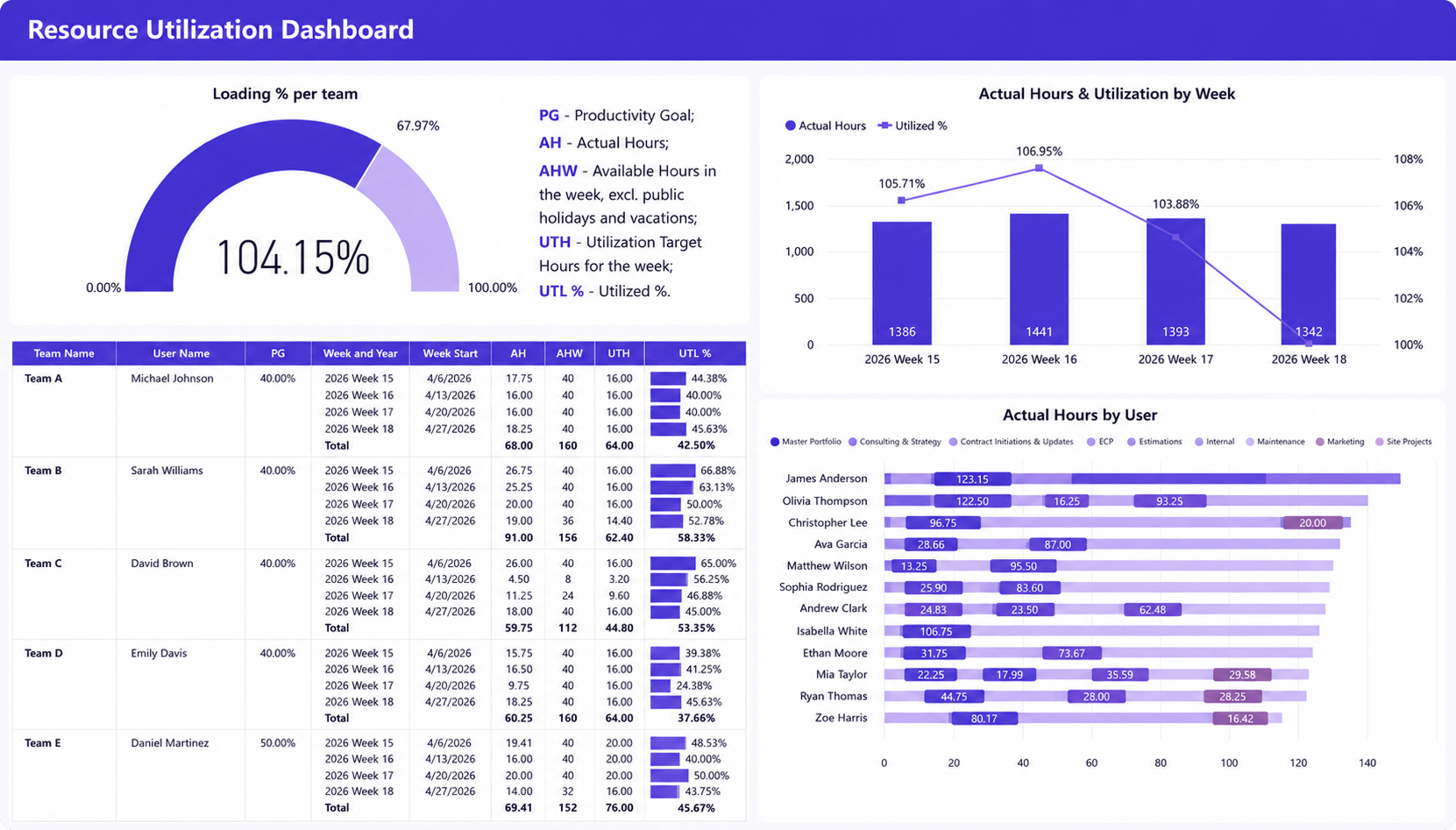
What it shows: This dashboard tracks utilization rates, actual hours, workload distribution, and team capacity across users and departments over time.
Why it matters: Resource utilization is one of the most important operational indicators in project-based organizations. This dashboard helps leaders identify overutilized or underutilized teams before delivery delays, burnout, or profitability issues appear.
Key metrics
- Utilization %
- Actual vs available hours
- Productivity goals
- Weekly utilization trends
- Hours by user and project
- Team loading percentages
Target audience: Resource managers, PMO directors, operations leaders, professional services teams, and delivery managers.
Project performance dashboards
Project performance dashboards focus on delivery execution, project health, schedule tracking, and financial performance at both portfolio and project levels. These dashboards help teams identify delivery risks before timelines, margins, or client commitments are affected.
Project performance dashboard
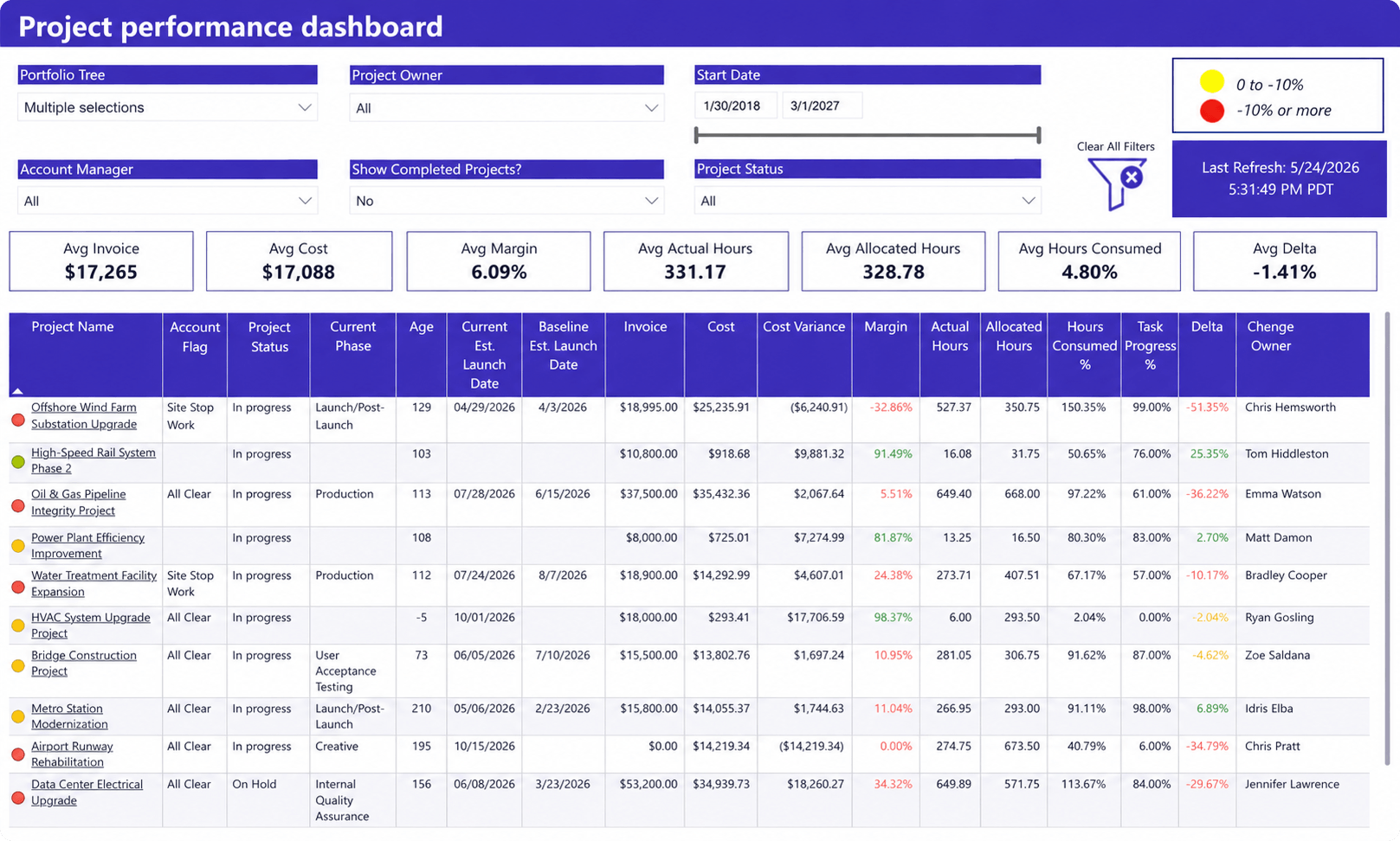
What it shows: This dashboard provides a portfolio-level view of project financials, schedule performance, margin trends, and delivery progress across active projects.
Why it matters: Project organizations often struggle to identify underperforming projects early enough to respond. This dashboard helps PMOs and operations teams monitor cost variance, margin performance, schedule slippage, and hours consumption across the portfolio.
Key metrics
- Average invoice value
- Average project cost
- Margin %
- Actual vs allocated hours
- Hours consumed %
- Cost variance
- Schedule delta
- Task progress %
Target audience: PMO directors, portfolio managers, operations leaders, delivery managers, and finance stakeholders.
Project analysis dashboard
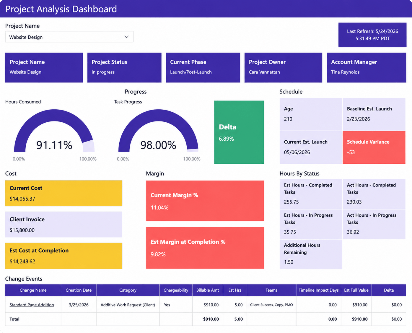
What it shows: This dashboard focuses on the detailed performance of a single project, including progress, schedule variance, costs, margins, invoicing, and change events.
Why it matters: Project managers often need more than high-level status reporting. This dashboard helps teams monitor delivery health, budget performance, timeline risk, and scope changes at the project level before issues affect profitability or delivery timelines.
Key metrics
- Task progress %
- Hours consumed %
- Current and estimated margin %
- Current and estimated project cost
- Schedule variance
- Actual vs estimated hours
- Client invoice value
- Change request impact
Target audience: Project managers, delivery leads, PMO teams, account managers, and finance stakeholders.
Finances and profitability dashboards
Financial dashboards connect project delivery data with revenue, costs, profitability, and forecasting metrics. They help organizations understand whether projects and services are financially healthy while improving visibility into margins, billing, and budget performance.
Actual and forecasted cost vs budget dashboard
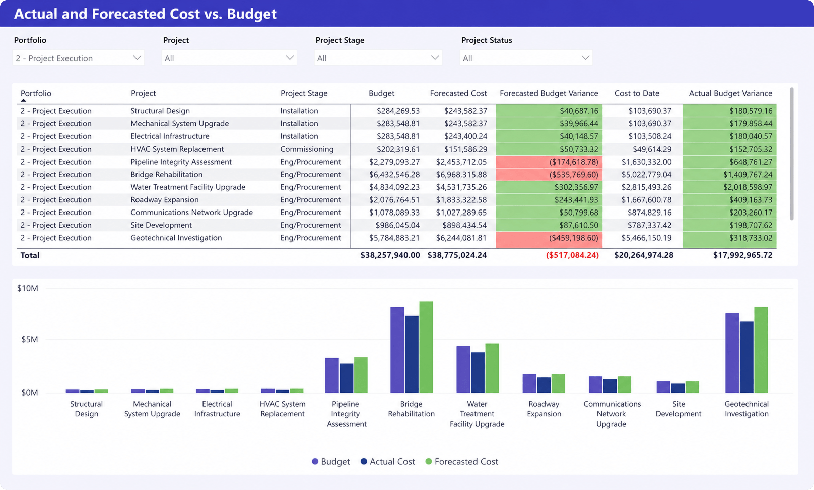
What it shows: This dashboard compares project budgets against actual and forecasted costs across projects and project stages. It highlights budget variance, cost-to-date values, and projected financial overruns or savings.
Why it matters: Project teams often detect budget issues too late. This dashboard helps finance and PMO teams identify projects where forecasted costs are trending above budget before profitability or delivery performance is affected.
Key metrics
- Budget vs actual cost
- Forecasted cost
- Forecasted budget variance
- Actual budget variance
- Cost to date
- Cost comparison by project
Target audience: Finance leaders, PMO directors, portfolio managers, project executives, and operations teams.
Revenue recognition dashboard
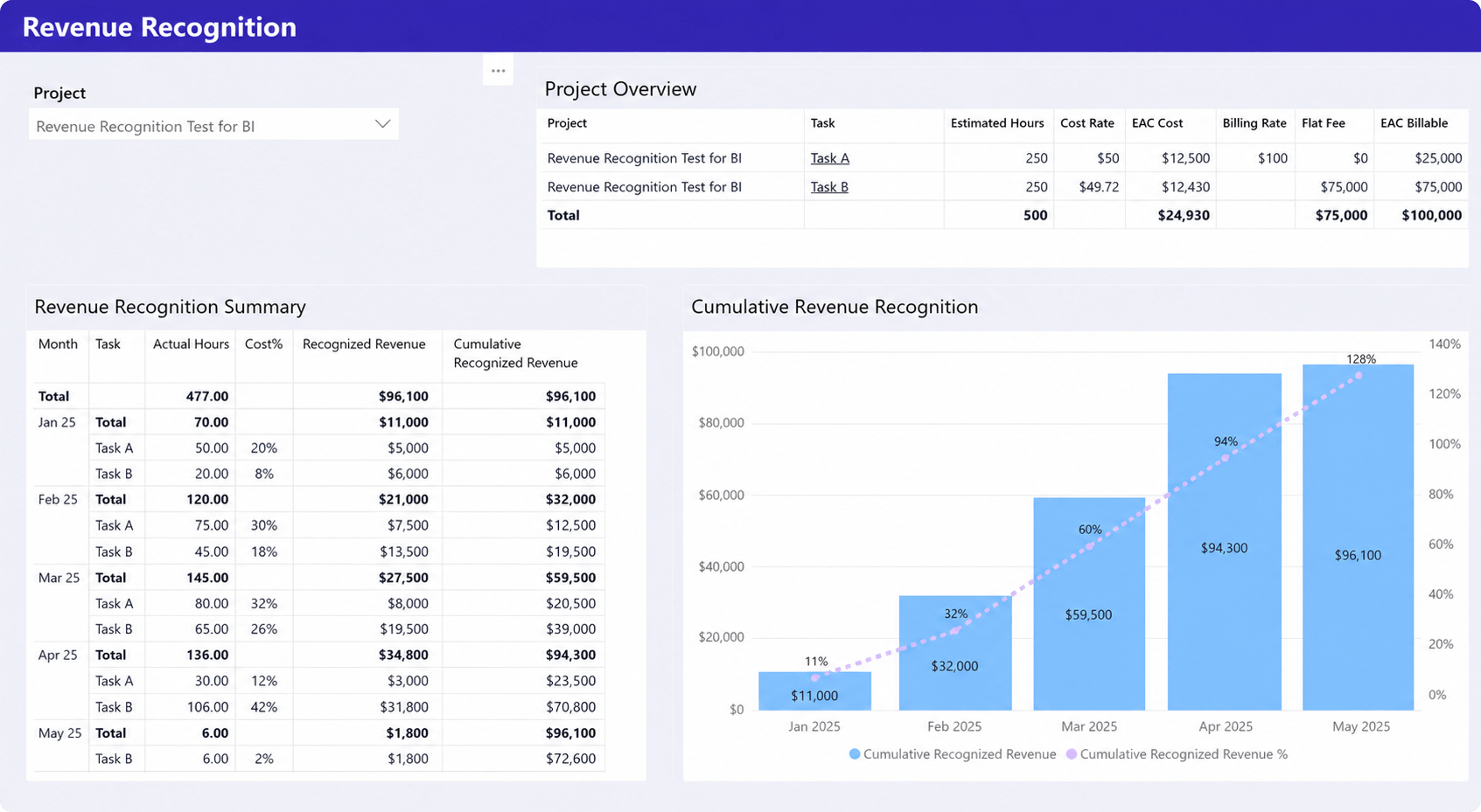
What it shows: This dashboard tracks recognized revenue over time based on project progress, actual hours, billing structure, and estimated project completion.
Why it matters: Revenue recognition is difficult to manage when delivery progress, labor effort, and billing data are disconnected. This dashboard helps finance and operations teams monitor earned revenue and compare recognized revenue against project completion progress.
Key metrics
- Recognized revenue
- Cumulative revenue recognition
- Actual hours
- Cost %
- Billing rates
- EAC billable values
- Estimated project cost
Target audience: Finance stakeholders, PMO leaders, controllers, project executives, and operations managers.
Revenue, cost, and profit dashboard
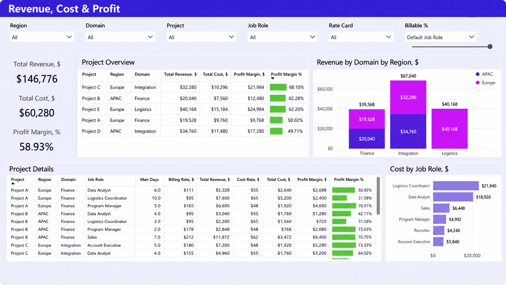
What it shows: This dashboard provides a financial overview of revenue, costs, and profit margins across projects, domains, regions, and job roles.
Why it matters: Professional services organizations often struggle to understand which projects, teams, or services generate the strongest margins. This dashboard helps leadership analyze profitability drivers and identify where labor costs or billing structures affect financial performance.
Key metrics
- Total revenue
- Total cost
- Profit margin %
- Revenue by region and domain
- Cost by job role
- Billing rates
- Project profitability
Target audience: Finance leaders, operations executives, PMO directors, professional services leaders, and business analysts.
Time tracking dashboards
Time tracking dashboards help organizations monitor logged hours, billable utilization, overtime, and timesheet compliance across teams and projects. These dashboards are especially important for professional services organizations where time data directly affects reporting accuracy and invoicing.
Missing timesheet dashboard
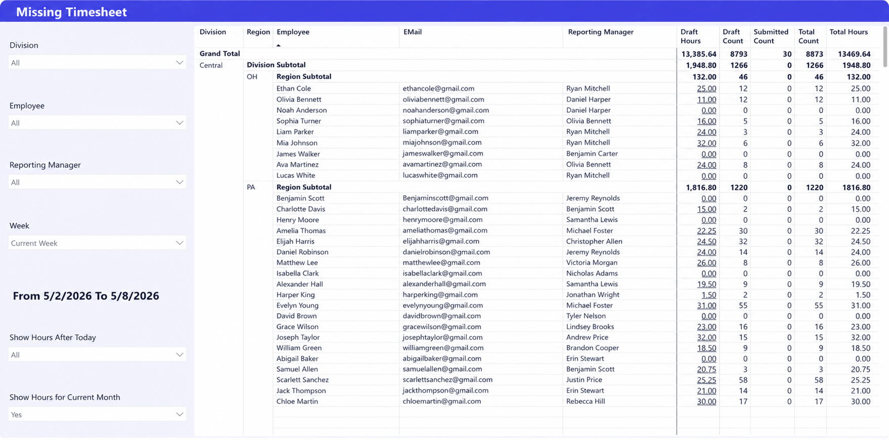
What it shows: This dashboard tracks missing or incomplete timesheets across employees, divisions, regions, and reporting managers during a selected reporting period.
Why it matters: Missing time entries affect utilization reporting, invoicing accuracy, and project financial visibility. This dashboard helps managers quickly identify missing submissions before reporting and billing deadlines are impacted.
Key metrics
- Missing draft hours
- Submitted vs total counts
- Total logged hours
- Missing timesheets by employee
- Reporting manager visibility
- Regional and division breakdowns
Target audience: Resource managers, PMO teams, finance stakeholders, team leads, and operations managers.
Billable vs non-billable dashboard
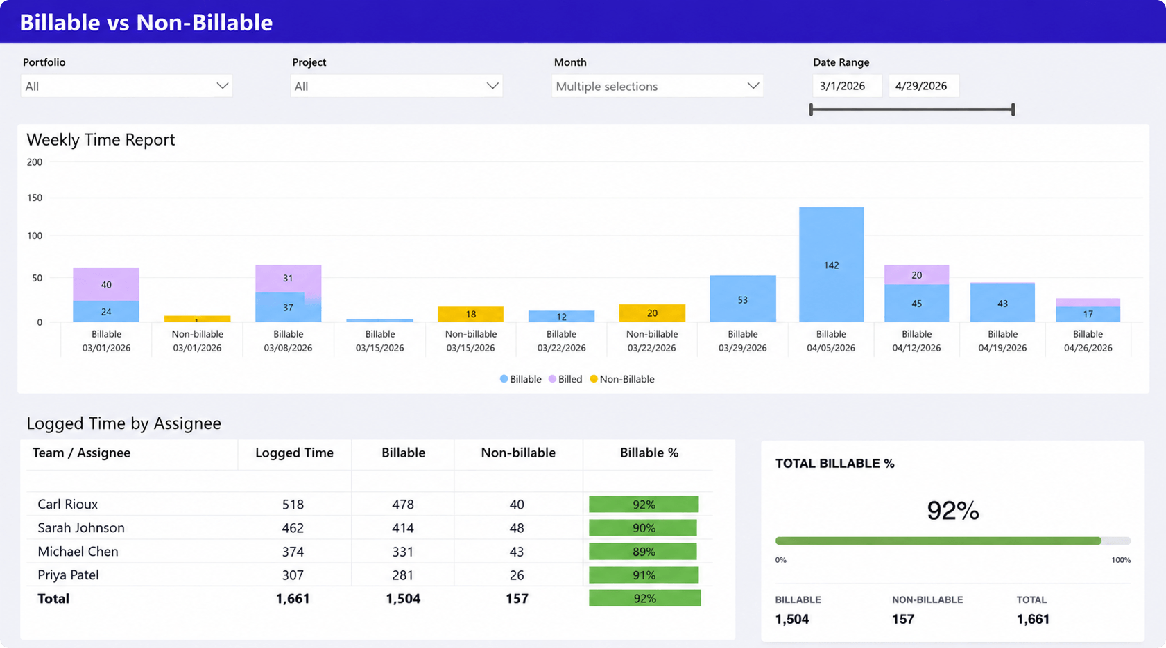
What it shows: This dashboard compares billable and non-billable time across projects, teams, and reporting periods while tracking overall billable utilization rates.
Why it matters: Professional services organizations rely heavily on billable utilization to maintain profitability. This dashboard helps leaders monitor how team capacity is spent and identify where non-billable work is reducing revenue potential.
Key metrics
- Billable vs non-billable hours
- Billable utilization %
- Logged time by assignee
- Weekly time distribution
- Total billable hours
- Total non-billable hours
Target audience: Operations leaders, resource managers, finance teams, PMO directors, and professional services managers.
Executive summary dashboards
Executive dashboards provide leadership teams with high-level visibility into portfolio health, project status, pipeline performance, and operational trends. These dashboards focus on fast decision-making without requiring leaders to review detailed project-level reports.
Business development dashboard
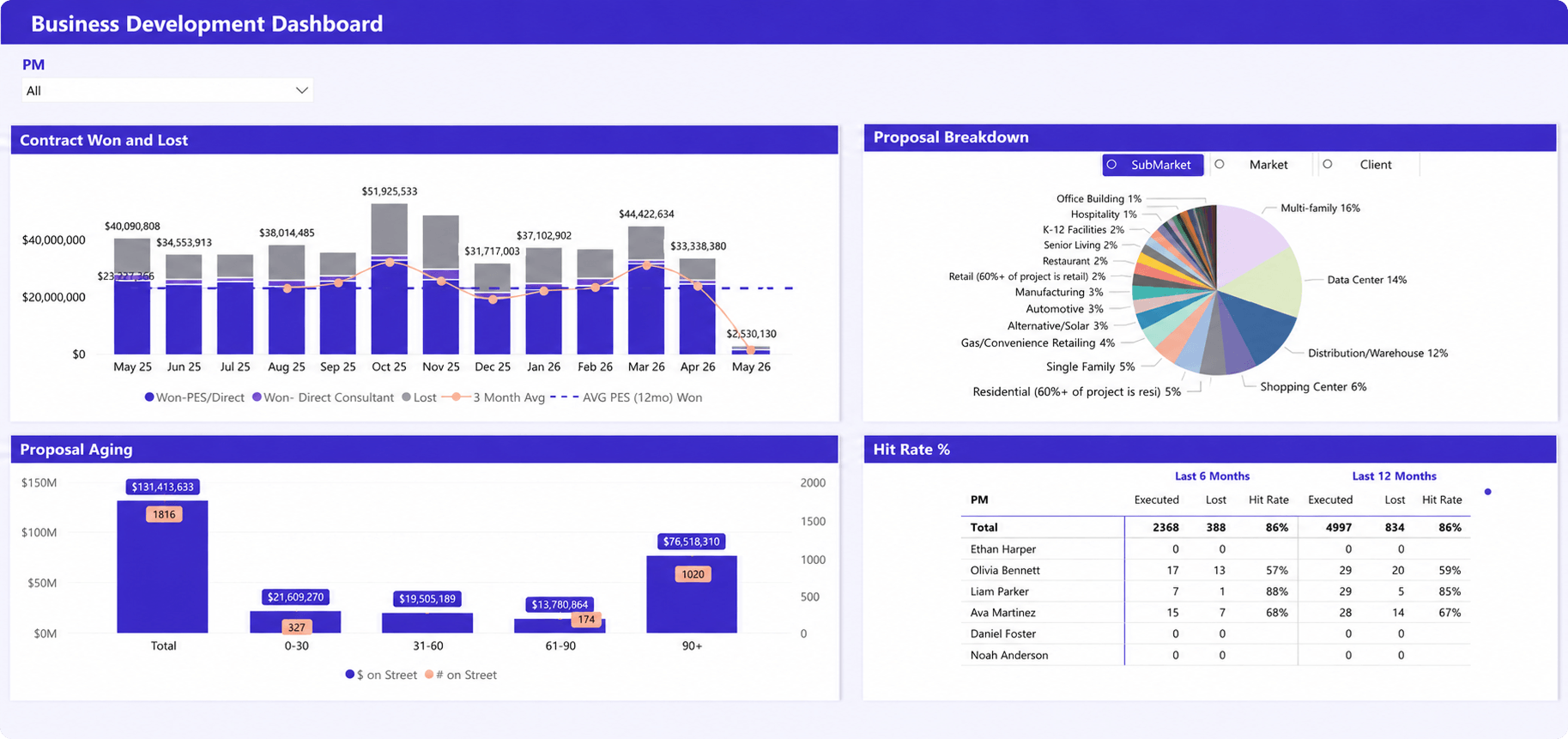
What it shows: This dashboard tracks sales pipeline performance, proposal distribution, proposal aging, and win rates across markets, clients, and project managers.
Why it matters: Executive teams often struggle to connect pipeline health with delivery planning and revenue forecasting. This dashboard helps leadership monitor proposal performance, sales trends, and future business demand across the organization.
Key metrics
- Won vs lost proposals
- Proposal aging
- Hit rate %
- Proposal distribution by market
- Pipeline value trends
- Proposal volume by PM
Target audience: Executives, PMO leaders, operations directors, business development teams, and professional services leaders.
Project status summary dashboard
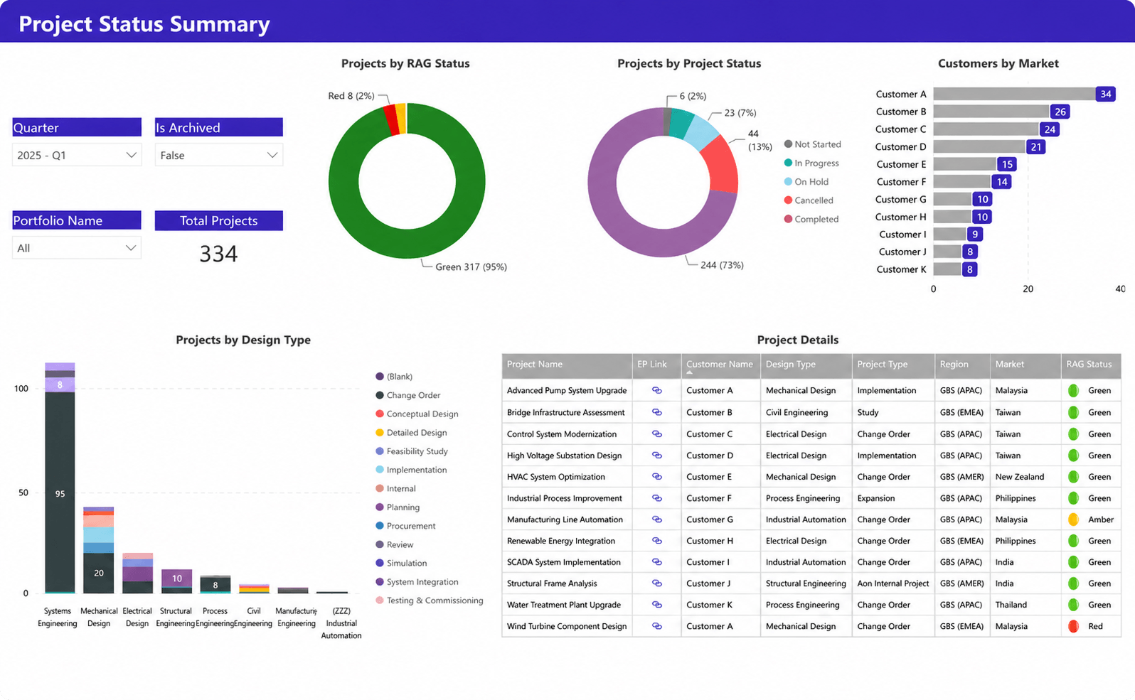
What it shows: This dashboard provides an executive-level overview of project health, RAG status, project stages, regional distribution, and customer activity across the portfolio.
Why it matters: Leadership teams need fast visibility into delivery health without reviewing individual project reports. This dashboard helps executives identify portfolio risks, delayed projects, and concentration areas across regions, customers, and project types.
Key metrics
- RAG project status
- Project status distribution
- Total active projects
- Customer distribution by market
- Projects by design type
- Regional project visibility
Target audience: Executives, PMO directors, portfolio managers, operations leaders, and regional delivery stakeholders.
Capacity planning and forecasting dashboards
Capacity planning dashboards help organizations compare future demand against available resources, staffing levels, and delivery capacity. These reports support forecasting, hiring, prioritization, and long-term resource planning decisions.
Business outlook – labor projections dashboard
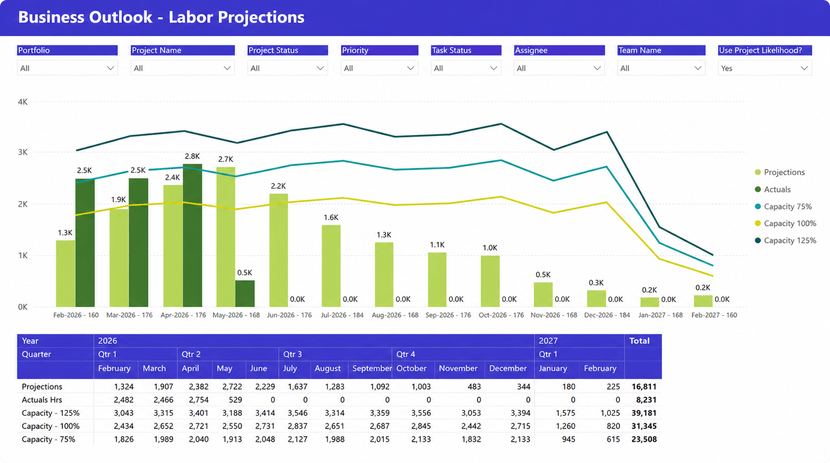
What it shows: This dashboard compares projected labor demand against actual hours and multiple capacity scenarios over time across projects and teams.
Why it matters: Forecasting labor demand is difficult when delivery plans and staffing data are disconnected. This dashboard helps operations teams identify future capacity gaps before resource shortages affect delivery timelines.
Key metrics
- Labor projections
- Actual hours
- Capacity scenarios
- Forecasted workload
- Projected demand by month
- Quarterly labor trends
Target audience: Resource managers, PMO directors, operations leaders, workforce planners, and professional services teams.
Capacity planning report
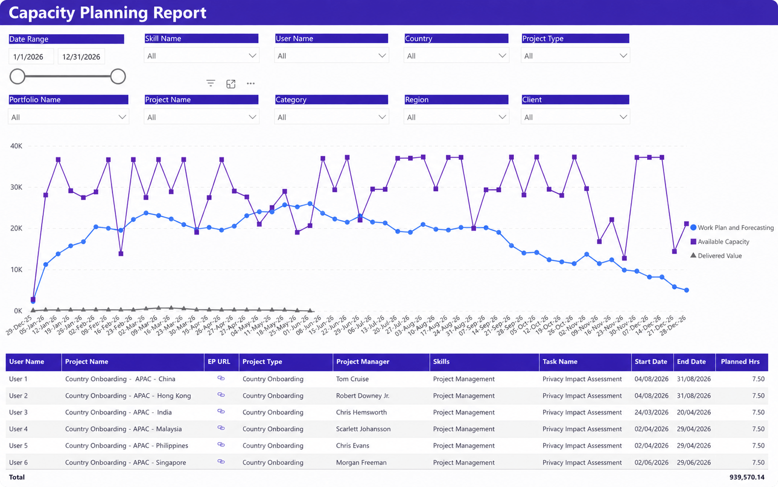
What it shows: This dashboard tracks available capacity, planned work, delivered value, and resource allocation across projects, skills, and regions over time.
Why it matters: Capacity planning becomes unreliable when organizations cannot connect resource availability with future project demand. This dashboard helps teams balance staffing levels, delivery commitments, and skill availability across the portfolio.
Key metrics
- Available capacity
- Work plan and forecasting
- Delivered value
- Planned hours
- Skill allocation
- Resource demand by project
Target audience: Resource managers, PMO teams, delivery leaders, workforce planners, and operations executives.
Demand projections dashboard
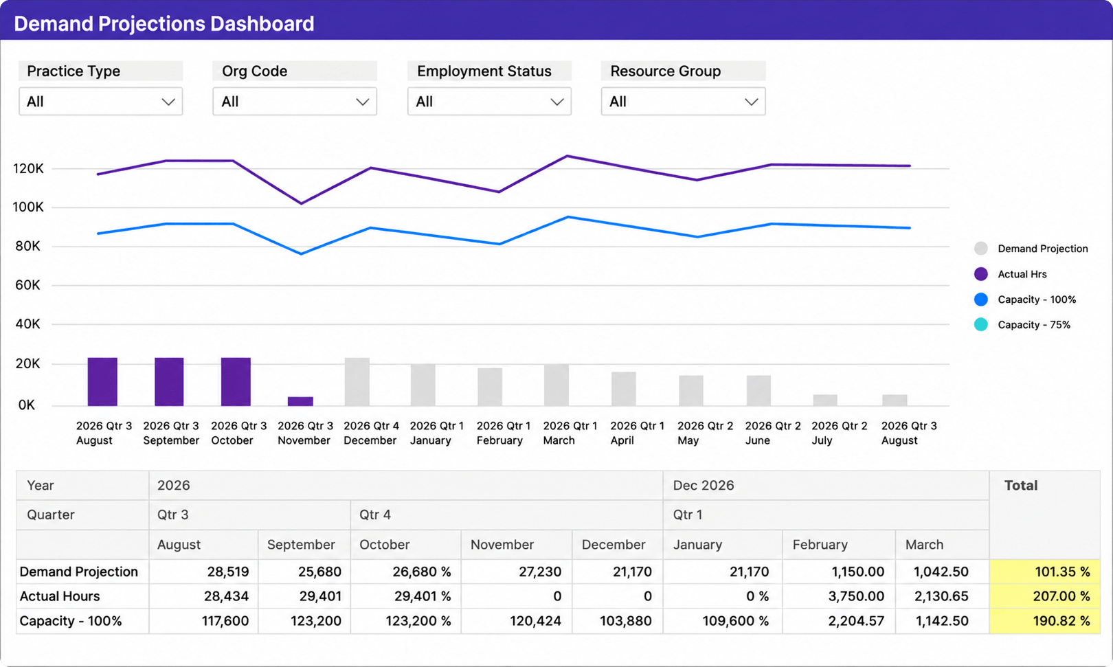
What it shows: This dashboard compares projected demand, actual hours, and capacity levels across reporting periods, resource groups, and organizational units.
Why it matters: Demand forecasting helps organizations understand whether future project demand exceeds available team capacity. This dashboard supports hiring, staffing, and prioritization decisions before delivery bottlenecks appear.
Key metrics
- Demand projections
- Actual hours
- Capacity utilization
- Forecasted workload
- Resource group demand
- Capacity vs demand trends
Target audience: Operations leaders, resource managers, PMO directors, finance stakeholders, and workforce planning teams.
How these dashboards solve common reporting problems
Most organizations start looking for Power BI reporting examples after reporting complexity outgrows spreadsheets. The real problem is usually fragmented data and slow decision-making.
Eliminating manual reporting
Manual reporting creates delays and inconsistent metrics.
In many service firms, teams still export Excel reports every week for utilization, project status, and budget tracking. By the time leadership reviews the data, it is already outdated.
Power BI dashboards reduce manual reporting by connecting directly to operational systems and centralizing project, resource, and financial reporting.
Creating a single source of truth
Disconnected systems create conflicting metrics.
PMOs, finance teams, and operations leaders often work from different spreadsheets and reporting logic. This makes utilization, profitability, and portfolio reporting difficult to trust.
A strong portfolio dashboard Power BI environment centralizes project, resource, time, and financial data into one reporting structure.
Improving decision-making
Dashboards help organizations identify delivery and resource risks earlier.
Without centralized reporting, teams often notice staffing shortages, margin problems, or project delays too late.
A good dashboard highlights trends before they become operational problems. This helps leadership make faster prioritization, forecasting, and staffing decisions.
How to build a Power BI dashboard for project management
Building useful dashboards starts with operational clarity, not visualization design.
The first question should not be “Which chart should we use?” The first question should be “What decision are we trying to support?”
Define your data sources
A dashboard becomes unreliable when teams combine disconnected or inconsistent data sources.
Most project organizations need visibility into four core operational areas:
- projects
- resources
- time tracking
- financials
This data usually comes from PSA software, project management tools, accounting systems, CRMs, and time-tracking platforms. The challenge is not collecting the data. The challenge is standardizing it.
A centralized PSA platform simplifies reporting because project delivery, budgets, resources, and billing already share the same structure. Organizations using tools like Birdview PSA often connect Power BI directly to project schedules, utilization data, portfolio metrics, and invoice reporting, reducing manual reconciliation work.
Choose the right metrics
Many dashboards fail because teams measure too much.
A dashboard should focus on operational KPIs that directly support planning, delivery, or financial decisions.
| Dashboard type | Common KPIs |
| Project dashboard | Budget vs actuals, milestone status, overdue tasks, schedule variance |
| Resource dashboard | Utilization %, capacity gaps, allocation conflicts, forecast demand |
| Portfolio dashboard | Portfolio health, active project count, strategic alignment, delivery risk |
| Financial dashboard | Revenue forecast, gross margin, billable hours, write-offs |
The best resource management dashboard examples focus on future capacity, not only historical reporting. Historical data explains what happened. Forecasting helps leaders prevent staffing and delivery problems earlier.
Structure for your audience
Different stakeholders need different reporting layers.
- Executives need summarized portfolio visibility
- Project managers need operational delivery detail
- Finance teams focus on margins, costs, and forecasting
One of the most common reporting mistakes is forcing all teams into the same dashboard experience.
Good Power BI environments separate executive dashboards from operational reporting. This improves usability and reduces reporting clutter.
Keep it simple and actionable
A dashboard should answer questions quickly.
Useful dashboards usually follow a simple hierarchy:
- Executive summary
- Operational detail
- Drill-down analysis
The first screen should immediately show where attention is needed and which metrics moved outside target ranges.
The dashboard should behave like a decision-support system, not a data warehouse.
What to look for in tools that power dashboards
The quality of a dashboard depends on the systems behind it. Even strong Power BI dashboards become unreliable when project, resource, and financial data is inconsistent.
Clean data structure
Reporting works best when projects, time tracking, resources, and financials follow a standardized structure. Without consistent operational data, teams stop trusting utilization, profitability, and portfolio reports.
Integration capabilities
Most service organizations still use multiple systems for CRM, project management, accounting, and resource planning.
Reporting becomes much easier when those systems can exchange data automatically instead of relying on spreadsheet exports and manual consolidation.
Real-time updates
Static reports create delayed decisions.
Modern reporting environments should update automatically as project, financial, and resource data changes. This is especially important for forecasting, utilization tracking, and portfolio visibility.
Flexibility for different reporting needs
Executives, PMOs, and finance teams all need different reporting views.
A good reporting environment should support both high-level portfolio dashboards and detailed operational reporting without forcing every team into the same structure.
FAQ: Power BI dashboard examples
1. What should a Power BI dashboard include?
A Power BI dashboard should include operational KPIs such as project status, utilization, budget performance, profitability, resource capacity, and delivery risks.
The best dashboards focus on decisions and exceptions instead of displaying too much raw data.
2. How do you build a project dashboard in Power BI?
Project dashboards usually combine project schedules, resource plans, time tracking, and financial data into centralized reporting views.
Strong dashboards focus on a small set of KPIs tied directly to delivery and operational decisions.
3. What data do you need for reporting?
Most project dashboards require project, resource, financial, utilization, and time-tracking data.
Organizations with disconnected systems usually spend more time preparing reports than analyzing them.
4. Can Power BI replace Excel reports?
In many cases, yes.
Power BI reduces manual spreadsheet reporting by centralizing operational and financial data into automated dashboards. Excel still works well for ad hoc analysis, but recurring reporting is usually easier to manage in Power BI.
5. How do dashboards improve decision-making?
Dashboards improve decision-making by helping teams identify delivery risks, capacity issues, and profitability problems earlier.
The biggest value usually comes from faster visibility and more consistent operational reporting.