- Service delivery dashboards help managed services teams combine workload, capacity, performance, and client data into a single operational view that supports faster decision-making.
- Resource utilization, capacity planning, forecasting, client delivery, and service profitability dashboards provide visibility into the factors that most directly affect service quality and business performance.
- Capacity and demand forecasting dashboards help leaders identify staffing shortages, workload spikes, and resource constraints before they affect client commitments.
- Service delivery performance improves when workload distribution, SLA compliance, utilization, and client outcomes are monitored continuously rather than through periodic reporting.
- Many reporting challenges stem from fragmented systems, disconnected resource planning processes, and spreadsheet-based reporting rather than a lack of available data.
- The most effective dashboards connect operational metrics with business outcomes, helping organizations improve staffing decisions, forecasting accuracy, profitability, and client satisfaction.
A service delivery dashboard is a reporting view that combines workload, resource capacity, delivery performance, client commitments, and operational metrics in one place. It helps service delivery leaders understand whether teams can meet demand, where risks are emerging, and how operational performance affects client outcomes.
For most managed services teams, the challenge is not a lack of data. The challenge is that information lives in multiple systems and arrives too late to support decisions. A good service delivery dashboard turns disconnected operational data into visibility that managers can actually use.
Why service delivery visibility matters
Managed services teams need visibility into workload, delivery performance, resource capacity, and client commitments to ensure services are delivered consistently and efficiently.
Many service organizations reach a point where reporting no longer keeps pace with operations. Team leads maintain spreadsheets, project managers track work in one system, and executives receive static reports that are already outdated when they arrive.
This creates several common problems:
- Fragmented reporting across multiple systems
- Overloaded teams that are difficult to identify early
- Missed client commitments caused by limited visibility
- Reactive staffing decisions driven by urgent requests
- Manual reporting processes that consume management time
One pattern appears repeatedly in growing service organizations. Managers know there is a capacity problem, but they cannot prove where it exists or how severe it is. Without visibility, resource conflicts often become visible only after delivery performance starts slipping.
What makes a good service delivery dashboard?
A good service delivery dashboard helps managers identify risks, monitor performance, and make faster operational decisions. Rather than simply reporting historical data, it should provide visibility into current operations and future capacity needs.
Key characteristics include:
- Real-time operational visibility into active work, workloads, and resource availability.
- Delivery performance monitoring through service-level metrics, completion rates, and delivery trends.
- Resource capacity tracking to identify overloaded teams and future staffing gaps.
- Client service insights that connect operational performance to client outcomes.
- Executive reporting that summarizes utilization, demand, capacity, and overall service health.
The most effective dashboards combine these elements to provide a complete view of service delivery performance.
8 service delivery dashboards every managed services team should use
Different dashboards answer different operational questions. Together, they create a complete picture of service delivery performance.
Portfolio summary dashboard
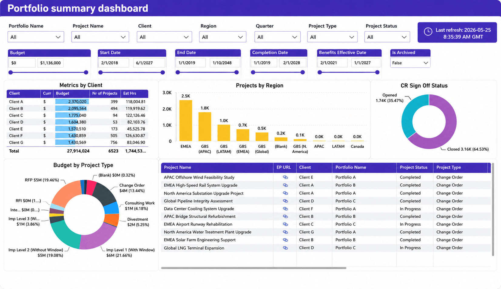
What it shows
- Budget and portfolio performance
- Active projects across clients and regions
- Project status distribution
- Delivery portfolio health
- Client-level metrics
- Open versus closed work
- Workload distribution across service areas
Why it matters
A service delivery overview dashboard acts as an operational command center for service leaders. Instead of reviewing separate reports for projects, clients, resources, and financial performance, managers can see the overall health of service operations in a single view.
This type of dashboard is particularly valuable for organizations managing multiple clients, regions, or service teams. Leaders can quickly identify which portfolios require attention, where delivery performance is declining, and whether workload is distributed appropriately across the organization.
One common challenge in growing service organizations is the lack of portfolio-level visibility. Teams often understand the status of individual projects but struggle to see how all client work affects overall capacity and delivery performance. A portfolio summary dashboard helps bridge that gap by connecting operational activity to broader business performance.
Resource utilization dashboard
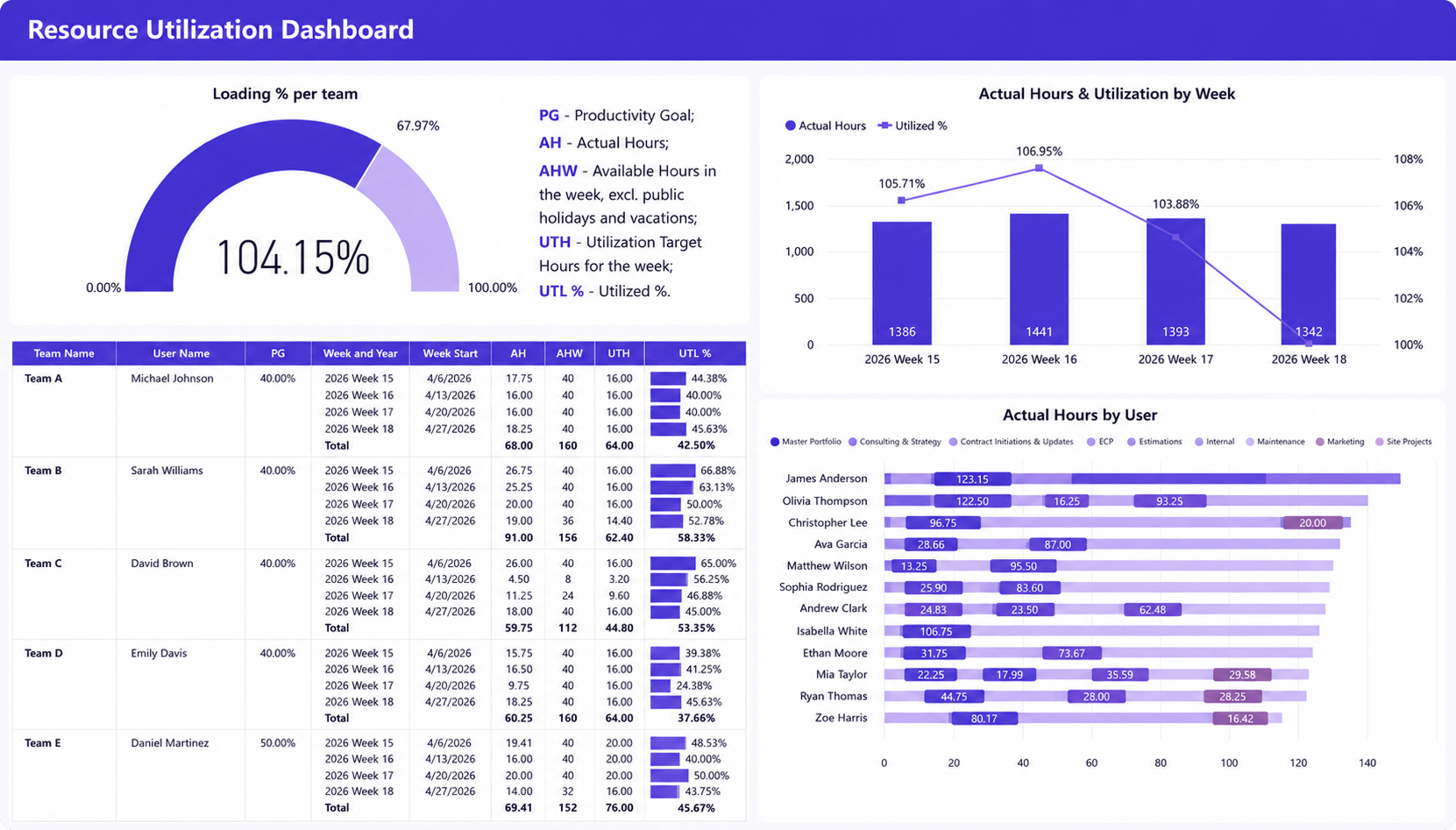
What it shows
- Team and individual utilization rates
- Actual hours worked versus utilization targets
- Weekly workload and utilization trends
- Resource loading percentages
- Distribution of work across employees and teams
Why it matters
Resource utilization is one of the most important indicators of service delivery performance. This dashboard helps managers understand whether resources are being used effectively, where workload imbalances exist, and how current staffing levels align with delivery demand.
By combining utilization targets, actual hours, and workload distribution in a single view, leaders can quickly identify overloaded team members, underutilized capacity, and emerging resource constraints. This visibility supports better staffing decisions and helps prevent both burnout and idle capacity before they impact client commitments.
High utilization is not always a positive sign. Many service organizations celebrate utilization improvements until teams become overloaded and service quality begins to decline. When utilization remains above target for extended periods, response times often increase, project delays become more common, and employee turnover risk grows. This dashboard helps managers identify those trends early enough to take corrective action.
Capacity planning dashboard
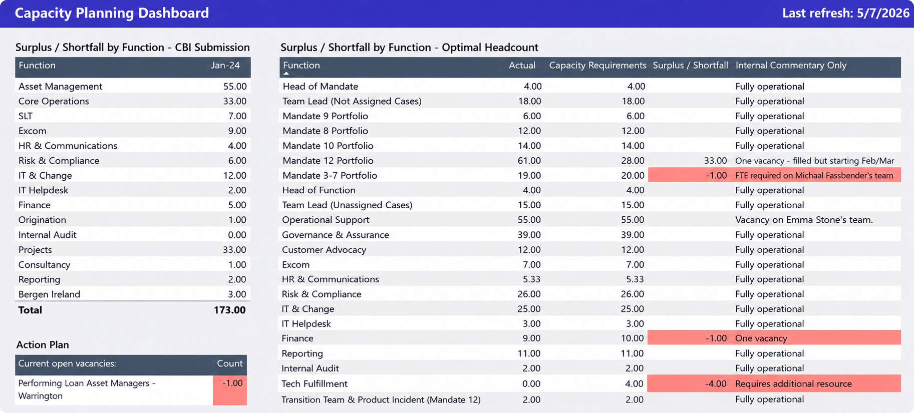
What it shows
- Resource surpluses and shortages by team or function
- Current staffing levels versus capacity requirements
- Headcount gaps across departments
- Open vacancies and hiring needs
- Areas where future demand exceeds available resources
Why it matters
Capacity planning is most effective when staffing decisions are made before delivery issues appear. This dashboard helps service delivery leaders compare current resource capacity against expected demand and identify where shortages are likely to occur.
By highlighting headcount gaps, staffing surpluses, and resource constraints across teams, managers can proactively plan hiring, redistribute work, or adjust delivery commitments before capacity problems affect service quality. This visibility is particularly valuable for organizations managing multiple clients, service lines, or delivery teams where resource shortages in one area can quickly impact overall operational performance.
For example, a managed services organization may discover that cloud engineers are fully allocated for the next two months while infrastructure specialists still have available capacity. Without this visibility, sales teams may continue accepting work that the delivery organization cannot realistically support. Capacity dashboards allow leaders to make staffing and hiring decisions before those constraints affect clients.
Service team utilization dashboard
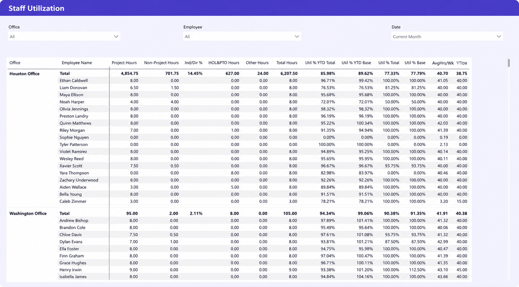
What it shows
- Team and employee utilization rates
- Project and non-project hours
- Individual productivity metrics
- Total hours worked and average weekly hours
- Utilization performance across offices and teams
Why it matters
Service delivery performance ultimately depends on how effectively teams use their available capacity. This dashboard provides visibility into individual and team-level utilization, helping managers understand workload distribution, productivity trends, and resource effectiveness across the organization.
By combining utilization metrics with project and non-project hours, leaders can identify top-performing teams, uncover uneven workload distribution, and detect potential burnout risks before they impact service quality. The dashboard also helps managers understand how different offices or teams contribute to overall delivery performance, making it easier to balance workloads and improve operational efficiency.
Many service organizations discover that a small group of experienced employees handles a disproportionate share of delivery work. While this may appear efficient in the short term, it often creates bottlenecks and increases operational risk. Team performance dashboards help leaders identify those patterns and distribute work more effectively across the organization.
Client delivery dashboard
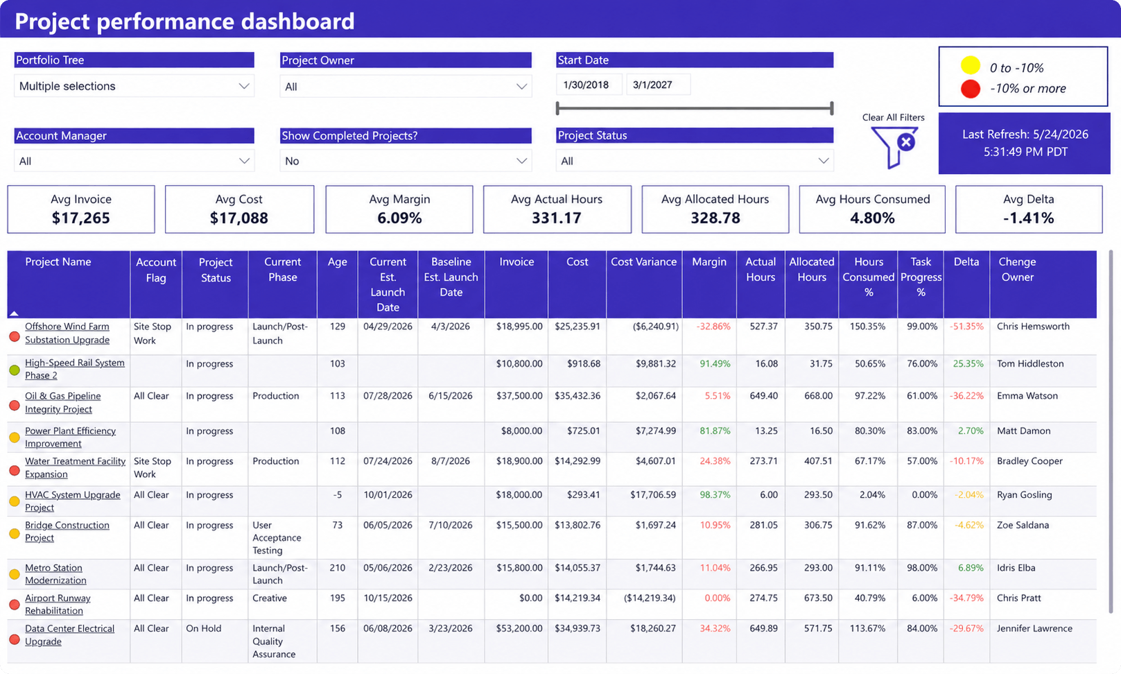
What it shows
- Client project status and delivery health
- Project progress and completion metrics
- Budget, invoice, and margin performance
- Cost variance against project plans
- Actual versus allocated hours
- Delivery risks across active client engagements
Why it matters
Successful client relationships depend on consistent delivery performance. This dashboard gives service delivery leaders a consolidated view of project execution, financial performance, and delivery health across client engagements.
By combining project status, budget performance, margins, resource consumption, and progress indicators in a single report, managers can quickly identify projects that are falling behind schedule, exceeding budgets, or consuming more effort than expected. This visibility helps teams address delivery risks early, improve client communication, and ensure service commitments are met before issues impact client satisfaction.
Client concerns rarely appear without warning. Delayed milestones, declining margins, growing effort consumption, and schedule slippage are often visible long before a formal escalation occurs. A client delivery dashboard helps account managers and service leaders identify those warning signs and take action before they affect the relationship.
Demand forecasting dashboard
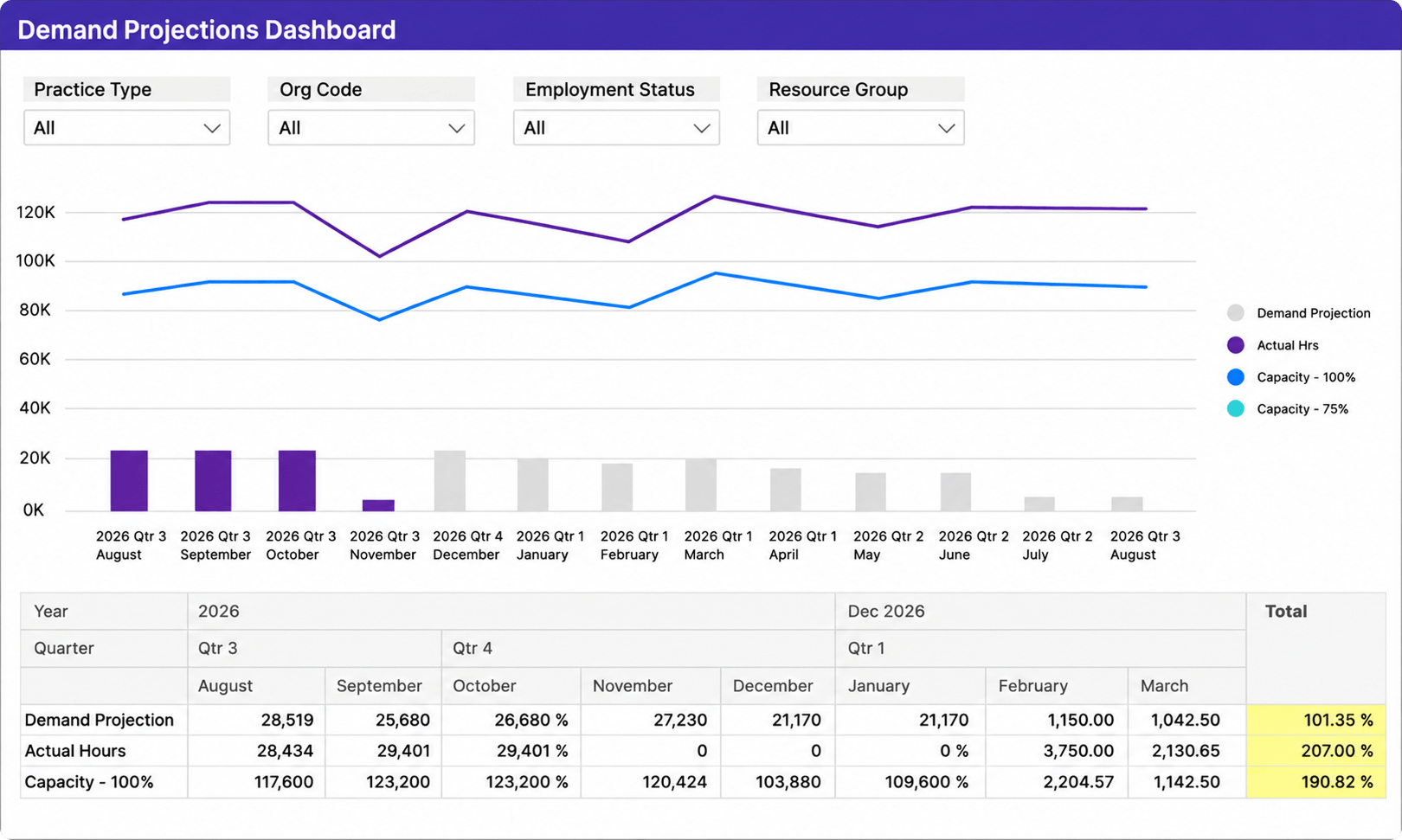
What it shows
- Forecasted resource demand over future periods
- Projected workload versus available capacity
- Actual hours compared to forecasted demand
- Capacity trends across teams and resource groups
- Potential resource shortages before they affect delivery
Why it matters
Forecasting is one of the most effective ways to prevent delivery issues before they occur. This dashboard helps service delivery leaders compare future demand against available capacity, making it easier to identify staffing risks, resource shortages, and upcoming workload spikes.
By combining demand projections, actual utilization, and capacity planning metrics, managers can make more informed hiring, staffing, and allocation decisions. Instead of reacting to capacity problems after delivery performance declines, teams can proactively prepare for future demand and maintain consistent service levels as workloads change.
Forecasting is also one of the most common challenges for growing service organizations. Many teams still rely on spreadsheets to estimate future demand. The problem is that staffing availability, project schedules, and client priorities can change weekly. Forecasting dashboards provide a more reliable way to evaluate future workload and identify risks before they become operational problems.
Service profitability dashboard
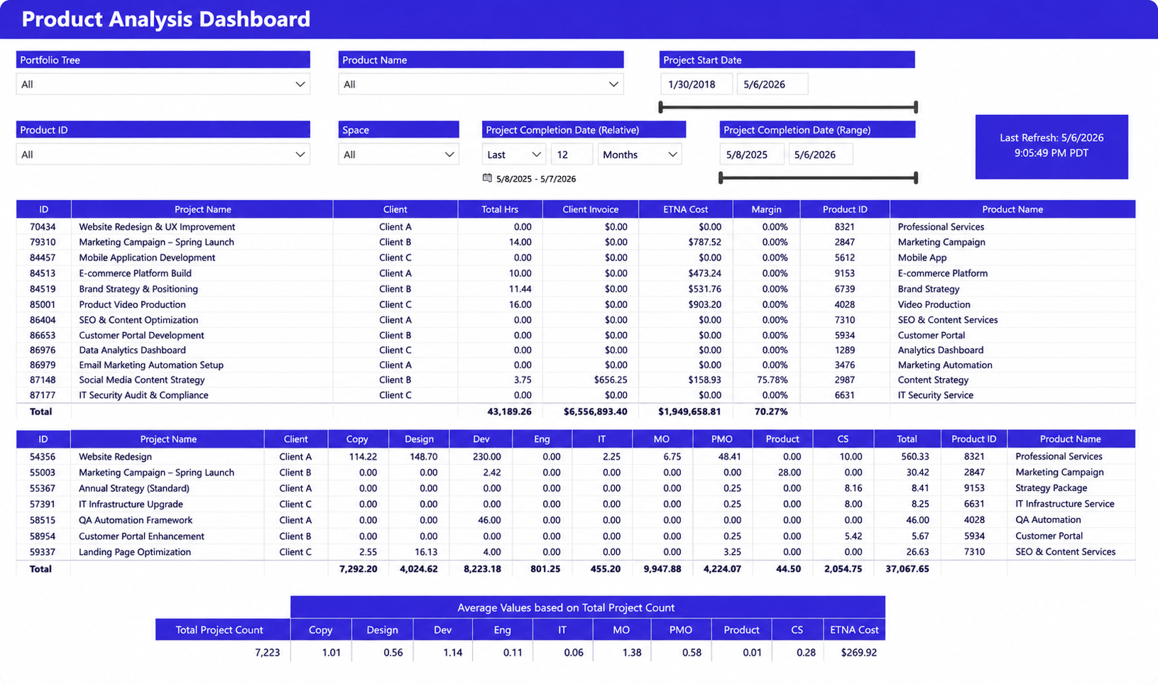
What it shows
- Revenue and invoice performance by service offering
- Project and service margins
- Labor costs and effort distribution
- Client profitability trends
- Resource contribution across service lines
Why it matters
Strong delivery performance does not always translate into strong financial performance. Organizations can meet client commitments while still losing profitability through inefficient staffing, underestimated effort, or excessive non-billable work.
This dashboard helps service leaders connect operational activity to financial outcomes. By comparing revenue, labor costs, utilization, and margins, managers can understand which services generate the greatest value and where profitability is being eroded.
This visibility is particularly important for organizations managing multiple service offerings, retainers, or recurring engagements. Understanding which work generates profit is often just as important as understanding which work gets completed.
Executive operations dashboard
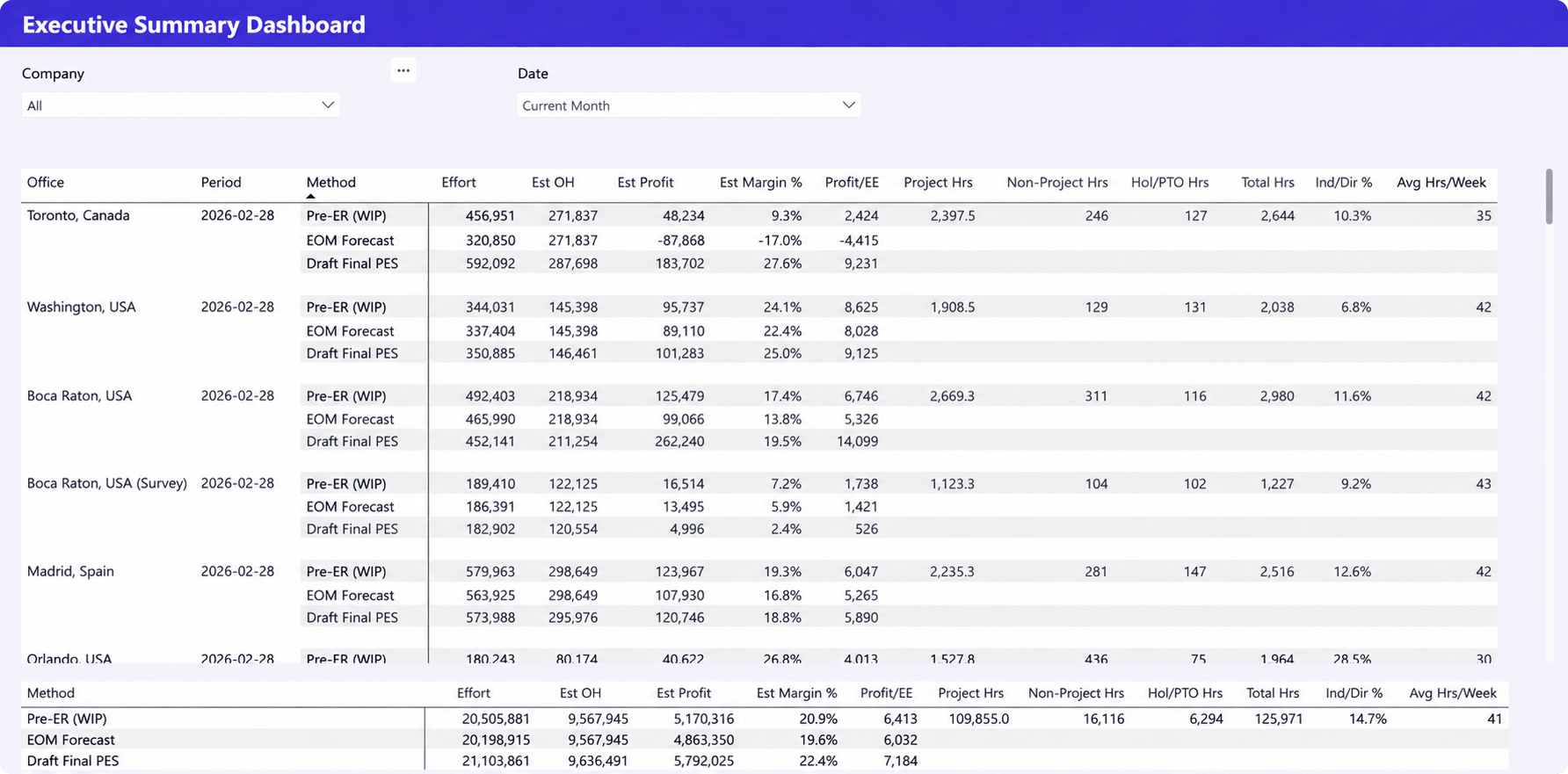
What it shows
- Revenue, profit, and margin forecasts
- Project and non-project effort across offices and teams
- Resource utilization and available capacity
- Hours worked, PTO, and workforce productivity metrics
- Financial and operational performance in a single view
Why it matters
Executives need visibility into both operational performance and business outcomes. This dashboard combines delivery, resource, and financial metrics to provide a high-level view of organizational health without requiring leaders to review multiple reports.
By bringing together profitability forecasts, resource utilization, project effort, and workforce capacity, the dashboard helps leadership teams understand whether current operations can support future demand. It also provides early visibility into profitability risks, capacity constraints, and performance trends, enabling more informed decisions about hiring, resource allocation, and business growth.
One of the most common executive challenges is balancing growth with delivery capacity. Winning additional business creates little value if teams cannot deliver it profitably. Executive dashboards help leadership understand how delivery performance, utilization, capacity, and financial results influence one another, making strategic planning decisions significantly more data-driven.
The most important service delivery KPIs
The most effective service delivery dashboards focus on a small number of metrics that help managers identify delivery risks, capacity constraints, and workload issues before they affect clients.
Service-level performance
Measures how consistently teams meet client commitments through metrics such as response times, resolution times, and SLA compliance. Persistent declines often indicate workload or staffing issues.
Resource utilization
Measures how effectively available capacity is being used. High utilization can improve efficiency, but consistently overloaded teams often experience declining service quality and reduced flexibility.
Capacity availability
Shows how much additional work the organization can realistically absorb. This KPI helps leaders make better staffing, prioritization, and hiring decisions.
Forecast accuracy
Compares expected workload with actual demand. Poor forecast accuracy often leads to resource shortages, missed deadlines, or excess capacity.
Resource saturation
Measures future workload allocation. Saturation metrics help managers identify upcoming bottlenecks and staffing gaps before they affect delivery performance.
Work completion rates
Tracks how efficiently teams convert planned work into completed work. Declining completion rates can signal growing backlogs, shifting priorities, or resource constraints.
Client satisfaction indicators
Measures the outcome of service delivery efforts through metrics such as retention, escalations, renewals, and customer feedback. When reviewed alongside operational KPIs, these indicators help identify delivery issues before they impact client relationships.
Why managed services reporting often breaks down
Many service organizations struggle with visibility despite having plenty of data. The issue is rarely the dashboard itself. More often, reporting is slowed down by disconnected systems, manual processes, and limited visibility into future resource needs.
Common reporting challenges include:
- Data lives in multiple systems. Project data, resource plans, financial information, and client records are often stored in separate tools, making it difficult to create a complete picture of service delivery performance.
- Resource planning and delivery reporting are disconnected. Teams may track capacity in one system and delivery performance in another, making it difficult to understand how staffing decisions affect client commitments.
- Capacity planning is reactive. Many organizations only identify resource shortages after utilization increases, workloads become unbalanced, or service levels begin to decline.
- Reports are manually compiled. Exporting data from multiple systems into spreadsheets creates reporting delays and increases the risk of outdated or inconsistent information.
The most effective service delivery dashboards solve these challenges by bringing operational, resource, and performance data together in a single reporting environment. This gives leaders a clearer view of current performance and helps them make better decisions about staffing, capacity, and client commitments.
How dashboards improve service delivery performance
The value of a dashboard comes from helping managers make better decisions, not simply displaying data. When service delivery leaders have visibility into workload, capacity, and performance, they can respond to issues before they affect clients.
Key benefits include:
- Faster issue identification. Workload imbalances, delivery risks, and bottlenecks become visible earlier.
- Better staffing decisions. Capacity and utilization data help managers allocate resources more effectively and avoid overloading teams.
- Improved forecasting. Visibility into future demand supports more accurate hiring, staffing, and planning decisions.
- More consistent service delivery. Teams are better equipped to meet commitments when workload and performance are continuously monitored.
- Greater leadership visibility. Executives gain access to operational insights without relying on manual reporting and status updates.
Effective dashboards help organizations move from reactive management to proactive decision-making, improving both service quality and operational efficiency.
Reliable service delivery dashboards require reliable operational data
The best service delivery dashboards combine resource, workload, project, and financial data to provide a complete view of operational performance.
Many reporting challenges stem from disconnected systems and spreadsheet-based processes. As organizations grow, maintaining accurate reporting across multiple tools becomes increasingly difficult.
Platforms such as Birdview PSA can serve as a centralized data source for Power BI by connecting project delivery, resource planning, time tracking, and operational reporting. The result is more reliable visibility and better decision-making.
A dashboard is only as valuable as the data behind it. Improving reporting often starts with improving the quality and consistency of operational data.
FAQ: service delivery dashboards
What is a service delivery dashboard?
A service delivery dashboard is a reporting tool that combines operational metrics, workload data, resource information, and delivery performance indicators into a single view. It helps managers monitor service health and make informed operational decisions.
Which KPIs should managed services teams track?
The most important service delivery KPIs typically include utilization, capacity availability, service-level performance, completion rates, forecast accuracy, workload distribution, and client satisfaction indicators.
How do dashboards support SLA management?
Dashboards provide visibility into response times, resolution times, compliance percentages, escalation rates, and performance trends. This helps teams identify risks before service-level commitments are missed.
How do dashboards improve resource planning?
Resource planning dashboards connect workload demand with available capacity. This helps managers identify staffing gaps, prevent overload situations, and allocate resources more effectively.
What data should be included in service delivery reporting?
Service delivery reporting should include workload data, resource utilization, capacity forecasts, service-level performance, work completion trends, client delivery metrics, and operational performance indicators. The goal is to connect operational activity with business outcomes.