Ksenia Kartamysheva
 - A project reporting dashboard is valuable only if it helps leaders make decisions, not simply monitor activity.
- Many dashboards miss critical business insights because they focus on project status rather than project health, profitability, capacity, and forecasting.
- The most common reporting gaps include limited portfolio visibility, disconnected financial and operational data, missing forecasting metrics, and continued reliance on spreadsheets.
- Effective dashboards answer business questions such as “Can we deliver upcoming work?” or “Which projects need executive attention?” instead of displaying every available metric.
- KPIs like forecast utilization, project margin, realization rate, unbilled work, revenue forecast, and portfolio risk provide a more complete view of business performance than traditional project metrics alone.
- Better dashboards start with connected operational data. Integrating project management, resource planning, time tracking, and financial information creates a reliable foundation for reporting and supports proactive, data-driven decision-making.
A project reporting dashboard should help leaders understand project health, resource capacity, profitability, and delivery risks quickly enough to make confident decisions. If your team still relies on spreadsheets, manual analysis, or follow-up meetings to explain what the dashboard is showing, it isn’t providing complete visibility.
This is a common challenge for growing professional services organizations. As projects become more complex, dashboards often display more data without answering the questions leaders actually ask. Fragmented systems, spreadsheet-based processes, and disconnected operational and financial data create reporting blind spots that no visualization can fix on its own. These challenges consistently appear among organizations evaluating PSA solutions.
This article identifies the most common reporting gaps, explains why they affect decision-making, and provides a practical framework for evaluating whether your dashboard gives your business the visibility it needs.
Why dashboards can look impressive but still fail decision-makers
A dashboard is only useful if it helps someone make a better decision.
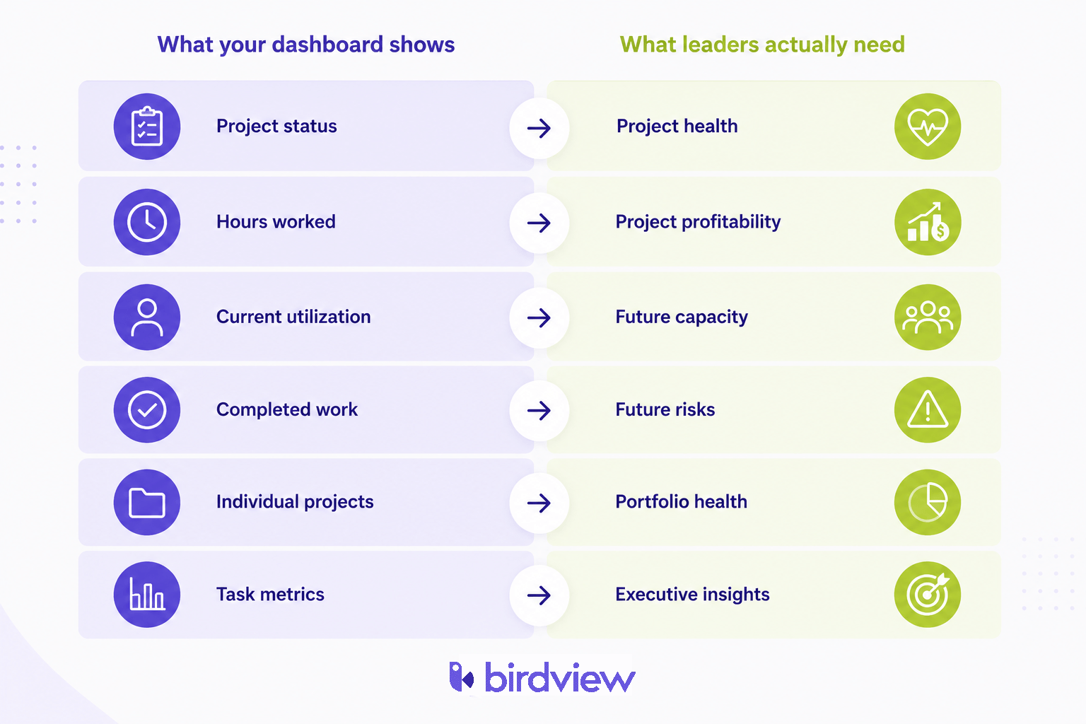
Many organizations build dashboards around the data they already collect rather than the questions leaders actually need answered. They track project status, completed tasks, billable hours, and overdue activities because those metrics are readily available. Executives, however, are asking different questions.
- Can we deliver the work we’ve already sold?
- Which projects are becoming unprofitable?
- Where are the biggest delivery risks?
- Do we need to hire before accepting more work?
- Are we on track to hit next quarter’s revenue target?
If your dashboard can’t answer those questions without additional spreadsheets or manual analysis, it’s reporting activity rather than supporting decisions. That’s a common challenge for growing professional services firms, where fragmented reporting and spreadsheet dependency make it difficult to build a complete picture of delivery, resources, and financial performance.
The purpose of a dashboard isn’t to display data, it’s to support decisions
The easiest way to improve a dashboard isn’t by adding another chart. It’s by changing the question you ask during its design.
Instead of asking “What data do we have?”, ask “What decisions should this dashboard support?”
That shift changes reporting from documenting activity to guiding action. Every metric should help someone identify a risk, validate a trend, or make a decision.
| Business question | Dashboard should answer with |
| Can we deliver upcoming work? | Future capacity, allocation conflicts, forecast utilization |
| Which projects need attention? | Budget variance, schedule risk, project health indicators |
| Are projects profitable? | Margin, realization rate, revenue forecast |
| Where should executives focus? | Portfolio health, strategic risks, delivery trends |
| Are we prepared for next quarter? | Capacity forecasts, pipeline demand, hiring gaps |
If a chart doesn’t help answer one of those questions, it probably doesn’t belong on the dashboard.
The 8 most common reporting gaps
Most dashboards don’t fail because they’re missing charts. They fail because they’re missing the information leaders need to make confident decisions. As organizations grow, reporting often becomes fragmented across project management tools, spreadsheets, financial systems, and resource plans. The dashboard reflects those gaps instead of solving them.
If several of the following situations sound familiar, your dashboard is probably missing important information:
- Executives still ask for spreadsheet exports.
- Project reviews require lengthy explanations.
- Finance and operations report different numbers.
- Resource conflicts appear unexpectedly.
- Delivery problems are identified too late.
- Teams maintain their own reports outside the dashboard.
You can see project status, but not project health
Project status tells you where work stands today. Project health tells you whether the project is likely to finish successfully.
Many dashboards rely on Red, Amber, and Green indicators or percentage complete. Those measures are useful, but they rarely show whether a project is drifting over budget, consuming key resources faster than expected, or carrying delivery risks that threaten future milestones. A stronger project health dashboard combines schedule performance, budget variance, forecast completion dates, and key risks so leaders can intervene before clients are affected.
You know who’s busy, but not who’s overloaded
Current utilization shows who’s busy today. The bigger question is whether today’s commitments create tomorrow’s delivery problems.
As projects grow, resource conflicts develop gradually across multiple engagements. Looking only at current allocations makes it difficult to see future shortages, hiring needs, or competing priorities. A useful resource utilization dashboard combines current workload with forecast demand, planned leave, and pipeline commitments so managers can resolve capacity issues before schedules begin slipping. This forward-looking visibility remains one of the biggest reporting gaps for organizations still relying on spreadsheet-based planning.
You track hours, but not profitability
If your dashboard celebrates billable hours but can’t tell you which projects are losing money, you’re measuring activity instead of business performance.
This is one of the most common reporting blind spots in professional services. Delivery teams see utilization improving while finance discovers shrinking margins weeks later. Neither team is wrong. They’re simply looking at different measures of success.
Imagine a consulting firm where two client projects each log 500 billable hours. On the surface, they appear equally successful. But one project stays within budget and invoices every hour worked, while the other absorbs repeated scope changes, generates write-offs, and requires senior consultants to spend additional non-billable time resolving issues. The dashboards show identical effort, yet one project is highly profitable and the other barely breaks even.
A useful project reporting dashboard makes that difference visible by connecting operational delivery with project margin, realization rate, forecast revenue, labour costs, and unbilled work. Those KPIs help leaders identify declining profitability while there is still time to improve the outcome instead of discovering it during month-end financial reporting.
You report completed work, but not future risks
If your dashboard mainly explains what happened last week, you’re already reacting instead of planning.
The most valuable dashboards identify problems before customers notice them. Capacity shortages, declining margins, delayed approvals, and delivery bottlenecks usually appear long before projects turn red. Forecasting makes those risks visible early enough to adjust schedules, rebalance workloads, or reset client expectations while there is still time to change the outcome.
Your dashboard measures projects, but not the portfolio
Project managers focus on individual delivery. Executives are responsible for the entire portfolio.
Without portfolio reporting, it’s difficult to identify competing resource demands, strategic priorities, or organization-wide delivery risks. Several healthy projects can collectively overload the same team or delay higher-value initiatives without any individual project appearing to be in trouble. Portfolio visibility helps leaders decide where investment, capacity, and executive attention will have the greatest impact.
Finance and operations see different numbers
If finance and operations regularly arrive at leadership meetings with different numbers for the same project, your reporting problem isn’t in the dashboard.
It’s usually a sign that each department is working from different operational data.
Project managers report progress. Finance reports costs and revenue. Resource managers maintain separate planning tools. Each report is accurate within its own system, but none reflects the complete business. Leadership then spends valuable meeting time reconciling reports instead of deciding what action to take.
A reliable dashboard brings project delivery, resource planning, time tracking, and financial data together so everyone works from the same operational picture.
Executives see too much detail
Dashboards built for project managers rarely work for executives.
Senior leaders don’t need task-level information. They need trends, portfolio health, forecast revenue, resource constraints, and the exceptions that require immediate attention. A strong executive reporting dashboard reduces complexity by highlighting business outcomes instead of operational detail.
Teams still export everything to Excel
One of the easiest ways to assess a dashboard is to watch what people do immediately after opening it.
If they export the data into Excel before making a decision, the dashboard hasn’t answered an important business question.
People rarely export reports because they prefer spreadsheets. They export them because they need calculations that aren’t available, want to combine information from different systems, or don’t trust the numbers enough to act on them.
Excel becomes the symptom rather than the problem. It fills the reporting gaps created by disconnected systems, manual processes, and incomplete operational data. That’s why spreadsheet dependency remains one of the clearest signs that an organization has outgrown its current reporting approach.
The KPIs many dashboards forget
Many dashboards measure what is easy to collect rather than what is useful for decision-making. While every organization will track different metrics, the following KPIs consistently provide valuable insight for project-based businesses.
| KPI | Why it matters | Helps answer |
| Forecast utilization | Identifies future resource shortages before schedules are affected. | Will we have enough capacity? |
| Project margin | Connects delivery performance with profitability. | Are projects making money? |
| Revenue forecast | Predicts future financial performance based on current delivery. | Are we on track to meet revenue goals? |
| Capacity availability | Shows remaining resource capacity across teams. | Can we take on new work? |
| Realization rate | Compares billable work performed with billable revenue earned. | Are we recovering the value of our work? |
| Unbilled work | Highlights completed work that has not yet been invoiced. | Are we delaying revenue? |
| Portfolio risk | Aggregates delivery risks across projects. | Which initiatives need executive attention? |
These metrics move reporting beyond operational activity and provide leaders with the context needed to make proactive business decisions rather than simply reviewing completed work. Related reading: the KPIs services firms track.
Dashboard examples that close these reporting gaps

The best dashboards aren’t organized around departments or data sources. They’re organized around the decisions people need to make.
When evaluating your own reporting, don’t ask whether you have an executive dashboard or a resource dashboard. Ask whether your dashboards answer the business questions your leadership team asks every week.
| Business question | Dashboard that answers it | Typical KPIs |
| Can we deliver the work we’ve already sold? | Resource planning dashboard | Forecast utilization, capacity availability, allocation conflicts, pipeline demand |
| Which projects are becoming unprofitable? | Project profitability dashboard | Project margin, realization rate, labour cost, budget vs. actual, unbilled work |
| Which projects need executive attention today? | Portfolio dashboard | Project health, schedule variance, portfolio risk, resource dependencies |
| Are we on track to meet our business goals? | Executive dashboard | Revenue forecast, portfolio health, utilization trends, strategic KPIs |
| What problems are likely to happen next? | Forecasting dashboard | Future capacity, revenue forecast, hiring gaps, delivery risks |
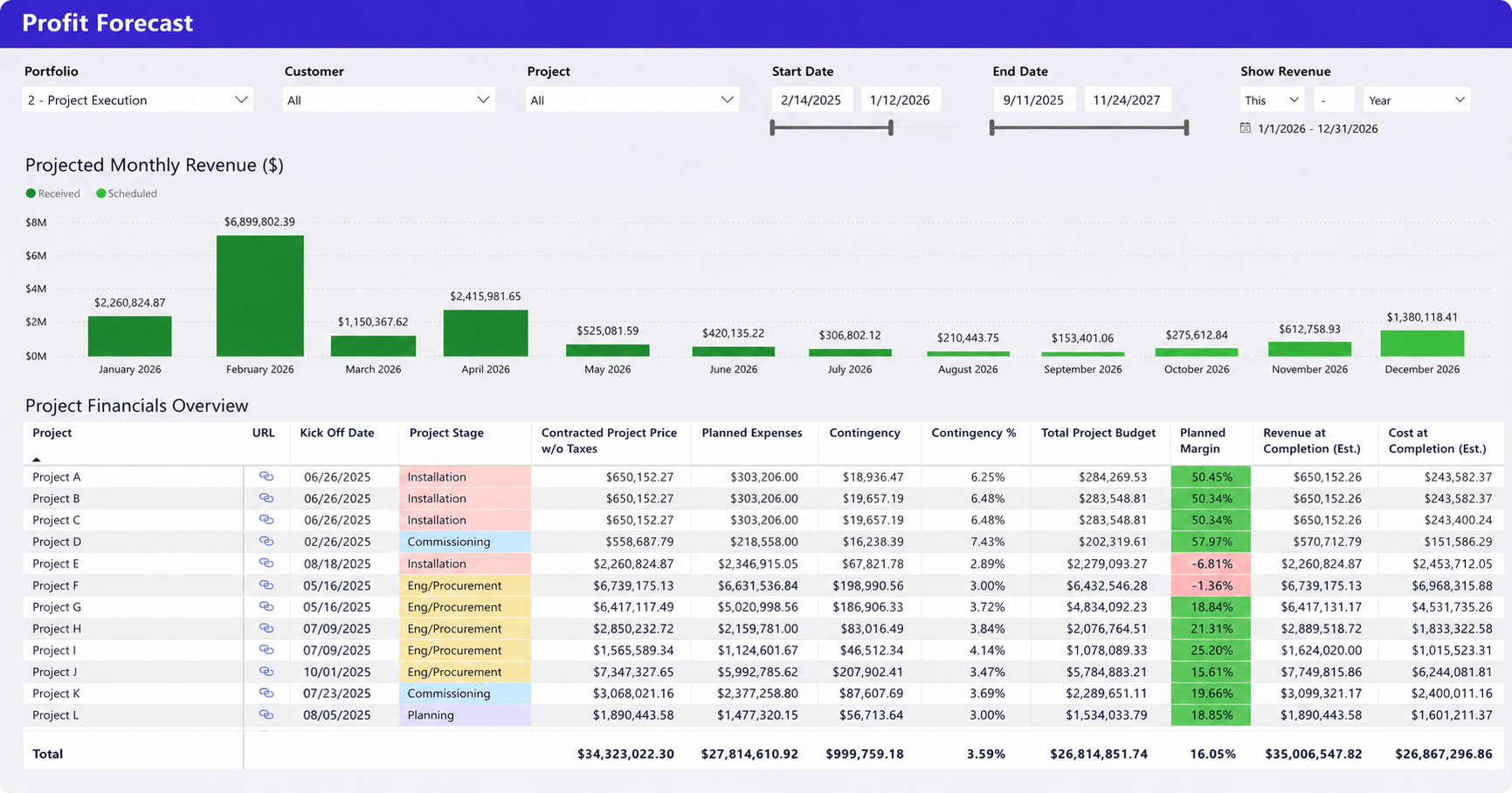
Looking at dashboards this way makes reporting gaps easier to identify. If your leadership team regularly asks a question that none of your dashboards can answer, you’ve found the next reporting capability your organization should improve.
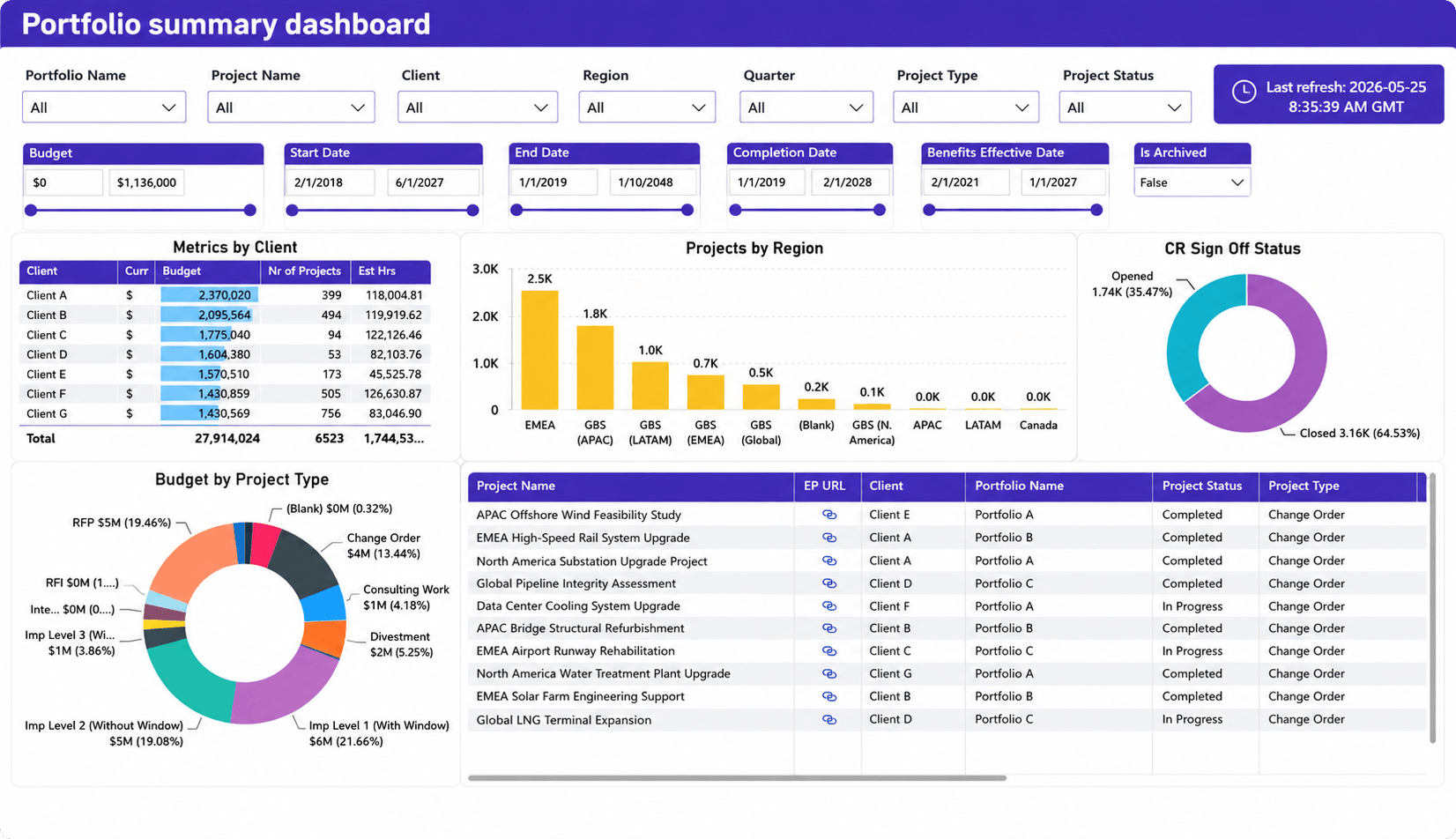
Why reporting gaps usually start with disconnected data
When reporting gaps appear, the dashboard usually isn’t the problem. The underlying data is.
If project management, resource planning, time tracking, and financial information live in separate systems, no dashboard can provide a complete view of the business. As organizations outgrow spreadsheets and point solutions, fragmented reporting makes it increasingly difficult to forecast capacity, measure profitability, or monitor portfolio health from a single source of truth.
Better dashboards start with better operational data
Better dashboards don’t come from adding more charts. They come from connecting the operational data behind those charts.
Professional Services Automation (PSA) platforms bring projects, resources, time, and financials into the same workflow, creating a stronger foundation for reporting. For example, Birdview PSA combines these data sources to support dashboards for project profitability, forecast utilization, portfolio health, and executive reporting without relying on manual reconciliation.
Self-assessment: Is your dashboard missing critical information?
A useful dashboard should answer the questions your leadership team asks most often. If the answer to several of the questions below is No, your reporting likely has important blind spots.
Can your dashboard…
- ✓ Forecast resource shortages before they affect delivery?
- ✓ Show project profitability while work is still in progress?
- ✓ Highlight at-risk projects without requiring manual analysis?
- ✓ Track unbilled work and potential revenue delays?
- ✓ Give finance and operations access to the same numbers?
- ✓ Provide portfolio-level visibility alongside individual project performance?
- ✓ Help executives identify priorities within five minutes?
The goal isn’t to have more charts. It’s to reduce the number of questions people still need to ask after looking at the dashboard.
FAQ
Why do project reporting dashboards still leave leaders with unanswered questions?
Because many dashboards report activity instead of combining project, resource, financial, and portfolio data into a complete view of the business. When important operational data is missing, leaders still need manual analysis before making decisions.
Which KPIs are most commonly missing from project dashboards?
Forecast utilization, project margin, realization rate, unbilled work, revenue forecast, and portfolio risk are frequently overlooked because they require data from multiple operational systems rather than a single project management tool.
Why do executives continue asking for spreadsheets?
Usually because the dashboard doesn’t answer a specific business question or different departments are reporting different numbers. Spreadsheet exports often become a way to validate data or combine information from disconnected systems.
Can better dashboard design solve reporting gaps?
Better design improves readability, but it cannot replace missing operational data. If project, financial, resource, and time-tracking information aren’t connected, the dashboard will always have blind spots.
What’s the difference between a reporting dashboard and an executive dashboard?
A reporting dashboard helps teams monitor operational performance. An executive dashboard summarizes trends, risks, profitability, portfolio health, and forecasts so leaders can make strategic decisions quickly.