Leonid Kostin
 - Power BI dashboards are only as reliable as the data behind them. A dashboard can visualize information, but it cannot correct incomplete, inconsistent, or disconnected operational data.
- Most reporting problems begin before Power BI. Fragmented systems, spreadsheet-based processes, inconsistent KPI definitions, and manual data preparation are the real causes of unreliable reporting.
- Clean data is more than accurate data. Effective reporting depends on data that is accurate, complete, consistent, timely, standardized, and connected across project, resource, CRM, financial, and time-tracking systems.
- Poor data quality has real business consequences. It slows decision-making, reduces confidence in reports, delays project interventions, weakens forecasts, and creates profitability blind spots.
- Successful BI projects focus on operational data first. Organizations that establish a single source of truth, standardize KPIs, automate data collection, and connect business systems build dashboards that leaders can trust.
- Project-based organizations face greater reporting complexity. Because delivery, resource planning, time tracking, CRM, and finance often operate in separate systems, reporting becomes increasingly difficult as the business grows.
- Power BI should be the final reporting layer, not the foundation. The strongest dashboards are built on connected operational data from systems that support project delivery, resource management, financials, and time tracking.
Power BI dashboards help organizations visualize project, resource, financial, and operational data. They make trends easier to spot and support faster decision-making. However, a dashboard cannot improve the quality of the information it receives. If the underlying data is incomplete, inconsistent, or scattered across multiple systems, the dashboard simply presents those problems in a more attractive format.
Many organizations assume that implementing Power BI will solve their reporting challenges. In reality, reporting problems usually begin long before a dashboard is created. They start with disconnected business systems, inconsistent processes, manual spreadsheets, and data that different teams interpret in different ways.
This is especially true for project-based organizations. Project managers update one system, finance works in another, sales tracks opportunities in a CRM, and resource managers maintain separate spreadsheets. By the time the data reaches Power BI, it has already passed through multiple manual steps, creating opportunities for inconsistencies and errors.
The result is familiar to many Operations Leaders and BI teams. Reports conflict with one another, executives question the numbers, and analysts spend more time validating data than delivering insights.
Why great dashboards still produce poor decisions
Power BI is an excellent reporting platform, but it cannot fix poor operational data. The quality of every dashboard depends on the quality of the data feeding it. When project, resource, financial, and time-tracking information is inconsistent, dashboards simply visualize those inconsistencies instead of resolving them.
This misconception appears frequently in growing professional services organizations. Teams invest weeks building dashboards only to discover that different reports show different utilization rates, project margins, or revenue forecasts. The dashboard is rarely the problem. The underlying data is.
One of the first warning signs is a growing lack of confidence in reporting. Leadership begins asking which report is correct instead of discussing what actions to take. Analysts spend hours reconciling numbers before every executive meeting. Instead of supporting decisions, reporting becomes another operational task to manage.
Common symptoms include:
- Conflicting reports that show different numbers for the same KPI
- Missing project metrics because information lives in disconnected systems
- Inconsistent KPI calculations across departments
- Manual validation before every reporting cycle
- Executive distrust of dashboards, leading teams back to spreadsheets
These issues are not caused by Power BI. They are caused by inconsistent operational data flowing into Power BI.
What “clean data” actually means
Many people think Power BI data quality is about removing duplicate records or fixing formatting issues. In reality, clean data means information that is reliable enough for every department to make decisions from the same numbers.
Clean reporting data is:
Accurate
It reflects what is actually happening. For example, missing time entries lead to inaccurate project profitability, regardless of how well the dashboard is designed.
Complete
Critical information is present across projects, resources, finances, and sales. Missing timesheets, budgets, or delivery dates create reporting gaps.
Consistent
KPIs are calculated the same way across the business. If Finance and Operations define utilization differently, Power BI will produce conflicting reports.
Timely
Data is updated frequently enough to support decisions before problems become expensive. Weekly spreadsheet updates rarely provide the visibility growing organizations need.
Standardized
Teams use common project statuses, KPI definitions, and reporting processes, making information easier to compare across departments.
Connected
Project management, CRM, time tracking, finance, and resource planning share data instead of relying on manual exports. Connected systems reduce reconciliation work and provide a more reliable foundation for project reporting dashboards.
The five reasons Power BI dashboards fail
Most failed BI initiatives share the same underlying problems. The dashboard often gets the blame, but the real issues begin much earlier in the reporting process.
Data comes from too many disconnected systems
Power BI reporting depends on reliable, connected data sources. Many project-based organizations have the opposite environment.
Project data lives in one system, sales in the CRM, financials in accounting software, resource plans elsewhere, with additional information stored in spreadsheets. Analysts spend hours combining and validating data before they can build a report, and every manual step increases the risk of errors.
This is one of the biggest reporting challenges for growing professional services organizations. As more tools are added, reporting becomes an exercise in assembling data instead of analyzing it.
Teams define KPIs differently
Reports become unreliable when departments calculate the same KPI differently.
For example, Finance may calculate project profitability using actual labor costs, while Operations includes planned work and project managers exclude overhead. The same issue appears with utilization, project health, and revenue forecasts.
Before building dashboards, organizations should agree on standard KPI definitions. Otherwise, Power BI simply presents multiple versions of the truth.
Manual data preparation becomes the reporting process
Many BI teams spend more time preparing data than analyzing it.
Instead of generating insights, analysts export project data, combine spreadsheets, reconcile timesheets, and correct missing values before every reporting cycle. Reporting deadlines slip, manual errors become common, and valuable analysis time disappears.
The bigger opportunity is not redesigning dashboards, but reducing manual work through reporting automation and connected operational systems.
Data quality issues remain hidden until executives question the numbers
Poor data quality often goes unnoticed until reports begin to conflict.
Analysts start validating every dashboard before sharing it. Managers maintain their own spreadsheets because they trust them more than centralized reports. Executives ask for additional reports to verify existing ones.
Once confidence in reporting is lost, rebuilding it takes far longer than fixing the underlying data.
Dashboards focus on visualization instead of decision-making
A well-designed dashboard is only valuable if it helps leaders make decisions.
Executive dashboards should answer questions such as:
- Which projects need attention?
- Where are resource shortages developing?
- Which accounts are becoming less profitable?
- Which portfolios are at risk?
If users cannot answer those questions with confidence, the problem usually isn’t the visualization. It’s the data behind it.
The hidden cost of poor reporting data
Poor data quality for reporting affects more than the reporting team. It slows decisions, reduces confidence, and makes it harder to manage a growing project-based business.
Slower decision-making
When leaders question the numbers, meetings shift from making decisions to validating reports. Analysts rerun data, managers compare spreadsheets, and corrective actions are delayed. In project-based organizations, even a short delay can affect delivery dates, resource allocation, and project margins.
Reduced confidence in reporting
Executives only rely on reports they trust. When dashboards produce conflicting results, teams often return to spreadsheets or request manual reports, reducing the value of business intelligence investments.
Delayed project interventions
Incomplete or outdated data hides early warning signs such as declining utilization, delayed time entries, or budget overruns. By the time issues appear in reports, they are often much harder to correct.
Forecasting inaccuracies
Reliable forecasts depend on connected operational data. If project plans, resource schedules, and CRM opportunities are disconnected, capacity planning and revenue forecasts quickly become unreliable.
Revenue and profitability blind spots
Disconnected time, billing, and financial data make it difficult to measure project profitability accurately. Many organizations discover margin problems only after projects are complete, leaving little opportunity to improve financial performance.
What successful BI projects do differently
Organizations with reliable business intelligence reporting focus on improving operational data before building dashboards. Clean, connected data makes reports easier to maintain and gives leaders confidence in the numbers.
Establish a single source of truth
A single source of truth means every report pulls from trusted operational data. Project information, time entries, customer records, and financial results should each have a clear system of record instead of existing in multiple spreadsheets.
Standardize operational definitions
Agree on how key metrics such as utilization, project health, backlog, and profitability are calculated. Consistent KPI definitions ensure every department measures performance the same way.
Connect project, resource, time, and financial data
Project reporting is most valuable when operational systems work together. Connecting project management, resource planning, time tracking, CRM, and financial data gives leaders a complete view of delivery, capacity, and profitability instead of isolated metrics.
Automate and govern reporting data
Reduce manual exports and spreadsheet updates wherever possible, then establish ownership for KPI definitions, data quality, and refresh schedules. Automation improves reporting accuracy, while data governance keeps reports consistent as systems and processes evolve.
The dashboards that benefit most from connected data
Connected operational data improves every dashboard, but some reporting areas benefit more than others because they combine information from multiple business functions.
Executive dashboards
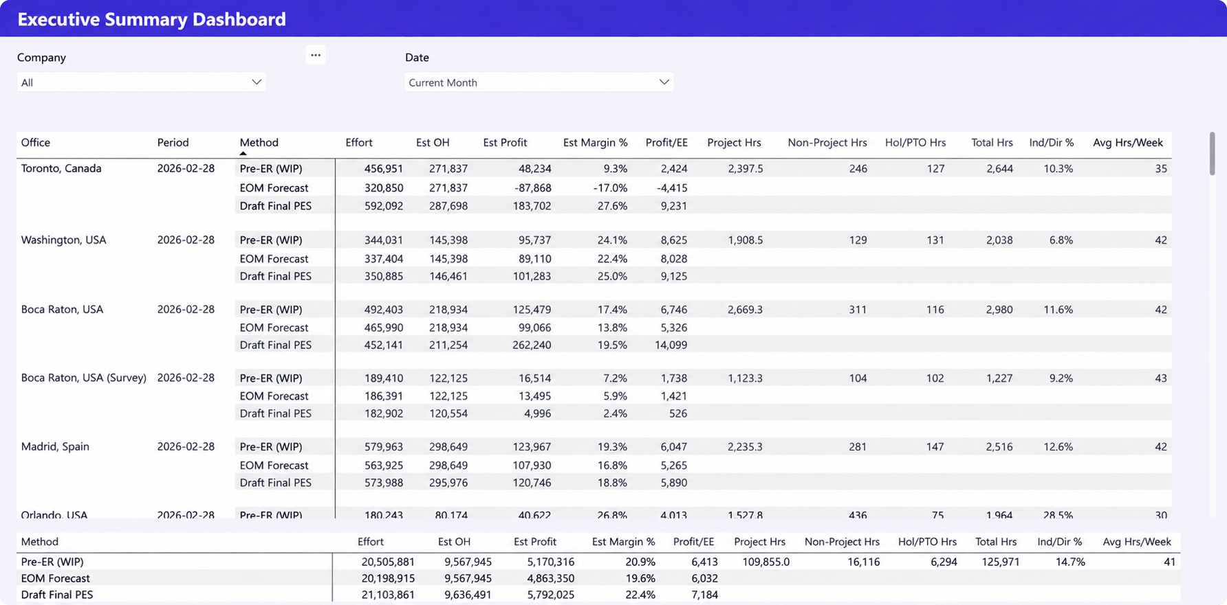
Connected project, financial, resource, and sales data gives executives a complete view of business performance. Instead of reviewing isolated KPIs, they can understand how utilization, delivery, profitability, and future capacity affect one another.
Project profitability dashboards
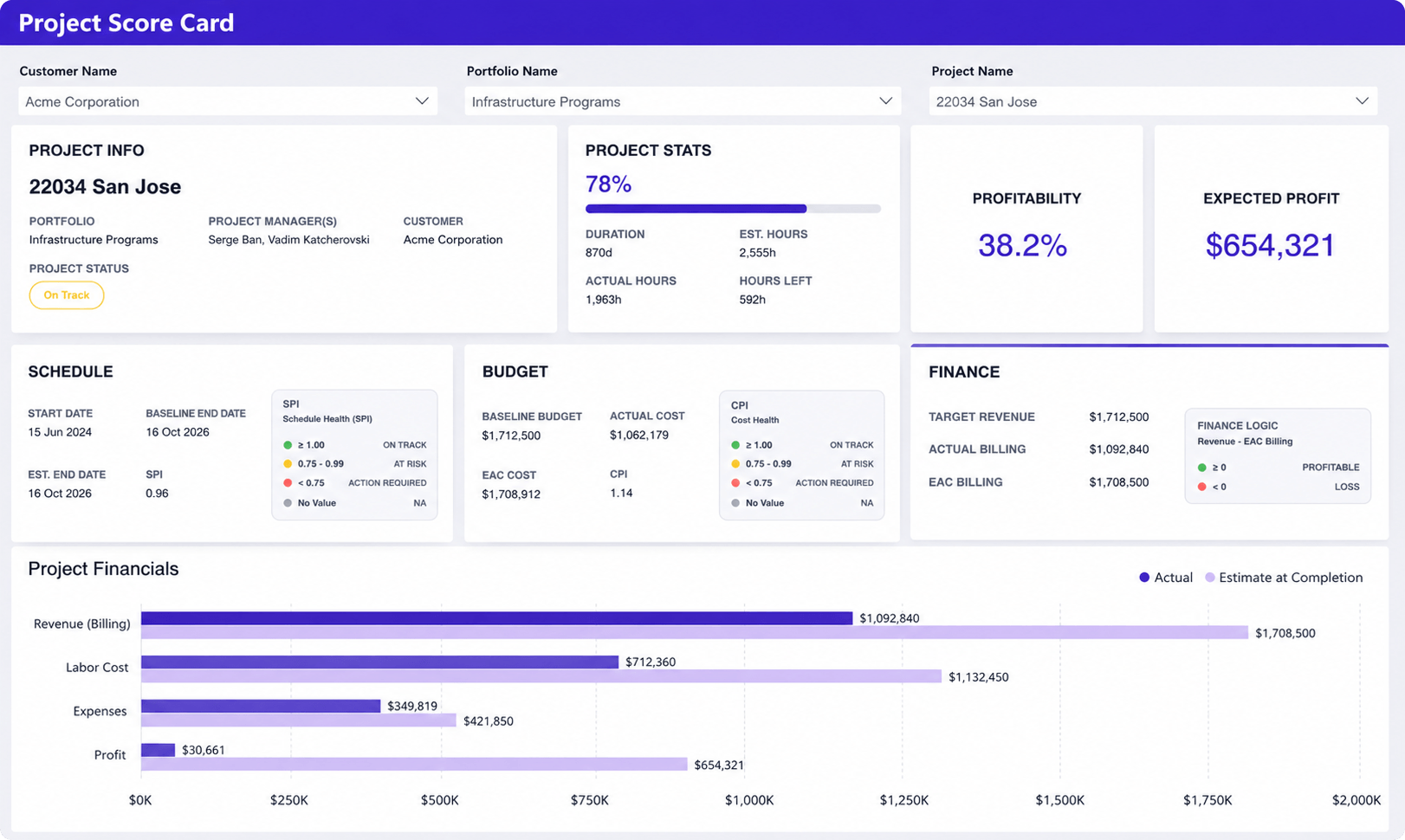
Profitability reporting becomes more accurate when labor costs, approved time, expenses, billing, and revenue data are connected. Managers can identify declining margins while projects are still in progress, giving them time to take corrective action.
Resource utilization dashboards
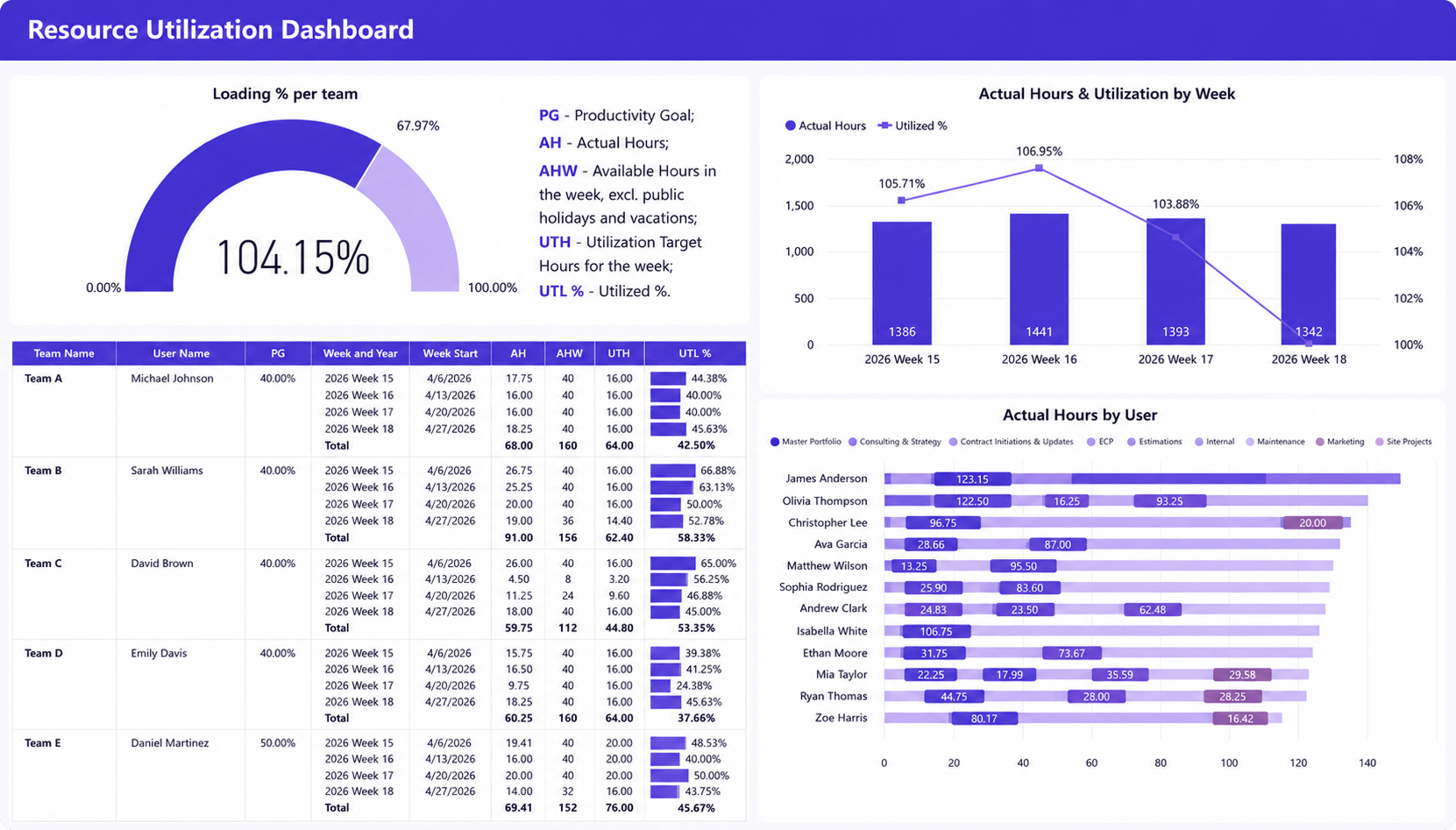
Connected resource data provides visibility into current allocations, future demand, and capacity. This helps managers identify overloaded or underutilized teams and make staffing decisions based on reliable information rather than spreadsheets.
Portfolio dashboards
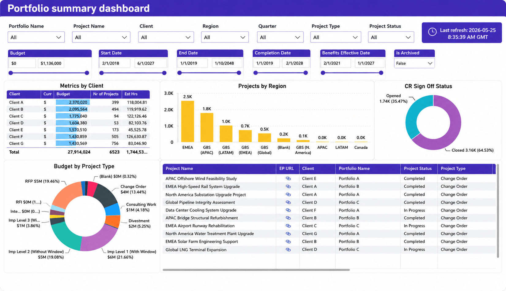
Portfolio dashboards rely on consistent project data. When every project follows the same reporting standards, PMOs can compare delivery performance, prioritize investments, and identify risks across the portfolio.
Profit forecasting dashboards
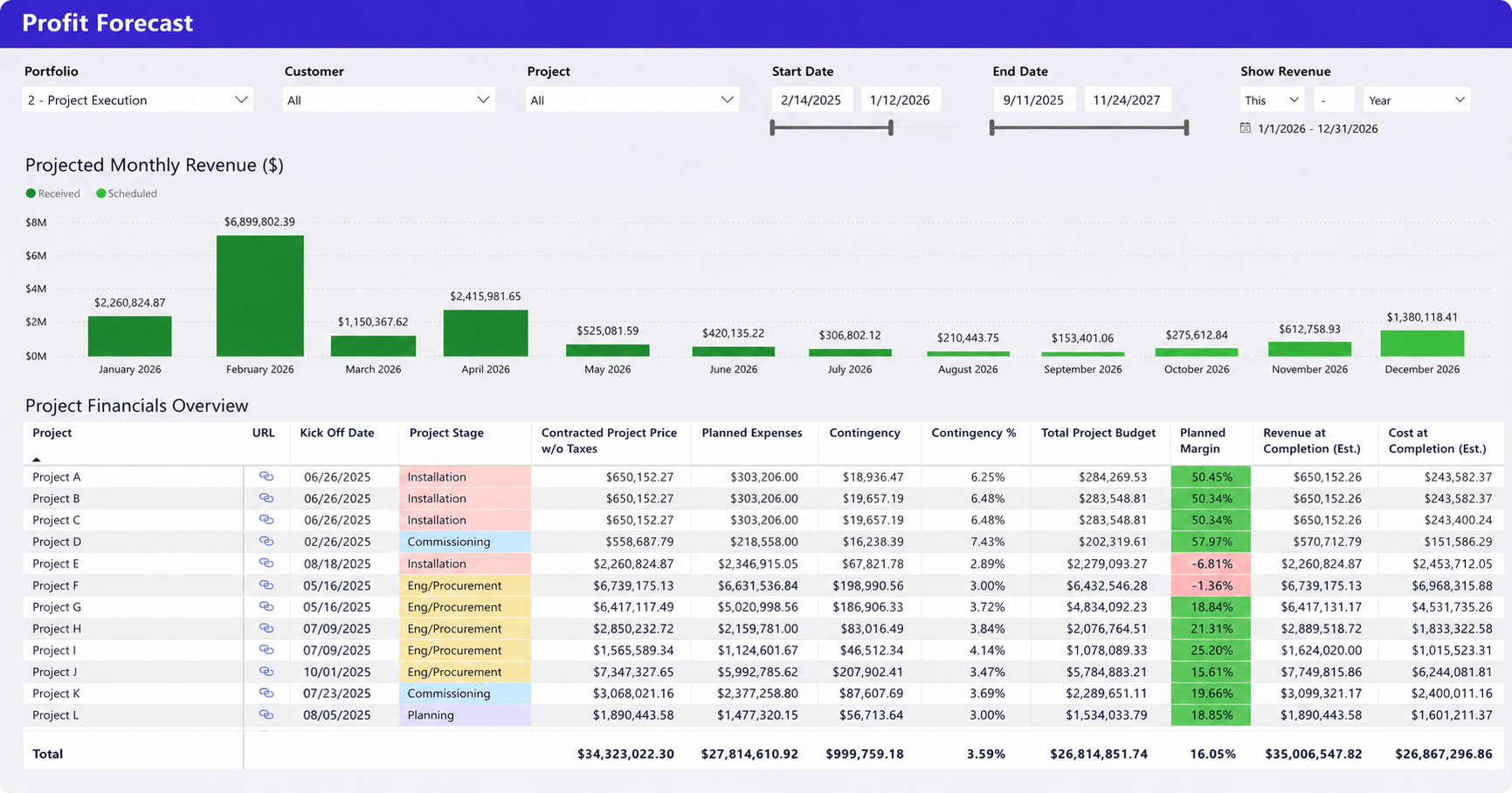
Profit forecasting becomes much more reliable when project budgets, planned resource allocations, labor costs, time tracking, and financial data are connected. Instead of estimating future revenue alone, leaders can forecast expected margins, identify projects at risk of becoming unprofitable, and take corrective action before financial performance declines.
Why project-based organizations struggle more than most
Project-based businesses face reporting challenges that many product companies never experience because every stage of the client lifecycle is managed in a different system. Sales works in the CRM, project managers manage delivery, resource managers plan capacity, consultants track time, and Finance handles invoicing and revenue. Individually, these systems work well. Together, they make accurate reporting difficult unless the data is connected.
This pattern appears repeatedly in growing consulting firms, engineering companies, agencies, and professional services organizations. Teams often begin with spreadsheets because they are flexible and familiar. As the business grows, additional applications solve individual problems but create new reporting challenges because they are not fully connected.
Eventually, analysts spend more time assembling information than interpreting it. Reporting delays become normal. Executives lose confidence in dashboards because different systems produce different answers.
These are operational maturity problems, not BI problems.
Better dashboards start long before Power BI
Power BI remains one of the strongest platforms for business reporting and analytics. The mistake is expecting it to solve problems created elsewhere.
Organizations that achieve the best reporting outcomes treat Power BI as the final presentation layer rather than the foundation of their reporting strategy.
They first establish consistent project processes, standardized KPIs, reliable time tracking, connected financial data, and integrated operational systems. Once those pieces are in place, dashboards become significantly easier to build, maintain, and trust.
For many professional services organizations, this is where a Professional Services Automation platform becomes valuable. Rather than replacing Power BI, it provides consistent operational data across project management, resource planning, time tracking, budgets, and financial workflows. Power BI can then connect to that data and focus on what it does best, turning reliable information into actionable insights.
For example, platforms like Birdview PSA centralize project delivery, resource planning, time tracking, and financial management into a single operational system. Power BI can then visualize that connected data, giving leaders a more reliable foundation for reporting than manually assembled spreadsheets.
Better reporting is rarely achieved by building more dashboards. It is achieved by improving the quality of the data those dashboards depend on.
If your Power BI dashboards still depend on spreadsheets, disconnected systems, and manual data preparation, improving the data behind your reports will have a far greater impact than redesigning your dashboards. Explore how Birdview PSA can provide a unified operational data foundation that integrates with Power BI to support more accurate, trusted reporting.
FAQ
Why do Power BI dashboards fail?
Power BI dashboards usually fail because the underlying operational data is incomplete, inconsistent, or disconnected across multiple systems. The software accurately visualizes the available data, but it cannot correct poor data quality or inconsistent business processes.
What does clean data mean in Power BI?
Clean data is accurate, complete, consistent, timely, standardized, and connected across business systems. It allows reports to produce reliable KPIs without requiring manual validation before every reporting cycle.
Can Power BI fix poor-quality data?
No. Power BI includes tools for data transformation and preparation, but it cannot resolve inconsistent business processes, missing operational data, or conflicting KPI definitions. Those issues must be addressed before reporting.
Why do dashboards show inconsistent numbers?
Inconsistent dashboards usually result from disconnected systems, different KPI definitions, delayed data updates, or manual spreadsheet consolidation. When different reports use different source data or calculation methods, conflicting results are inevitable.
How can organizations improve reporting accuracy?
Start by creating a single source of truth, standardizing KPI definitions, connecting project, resource, time, CRM, and financial systems, and automating data collection wherever possible. Once the underlying operational data is reliable, Power BI dashboards become significantly more accurate and trustworthy.