Vadim Katcherovski
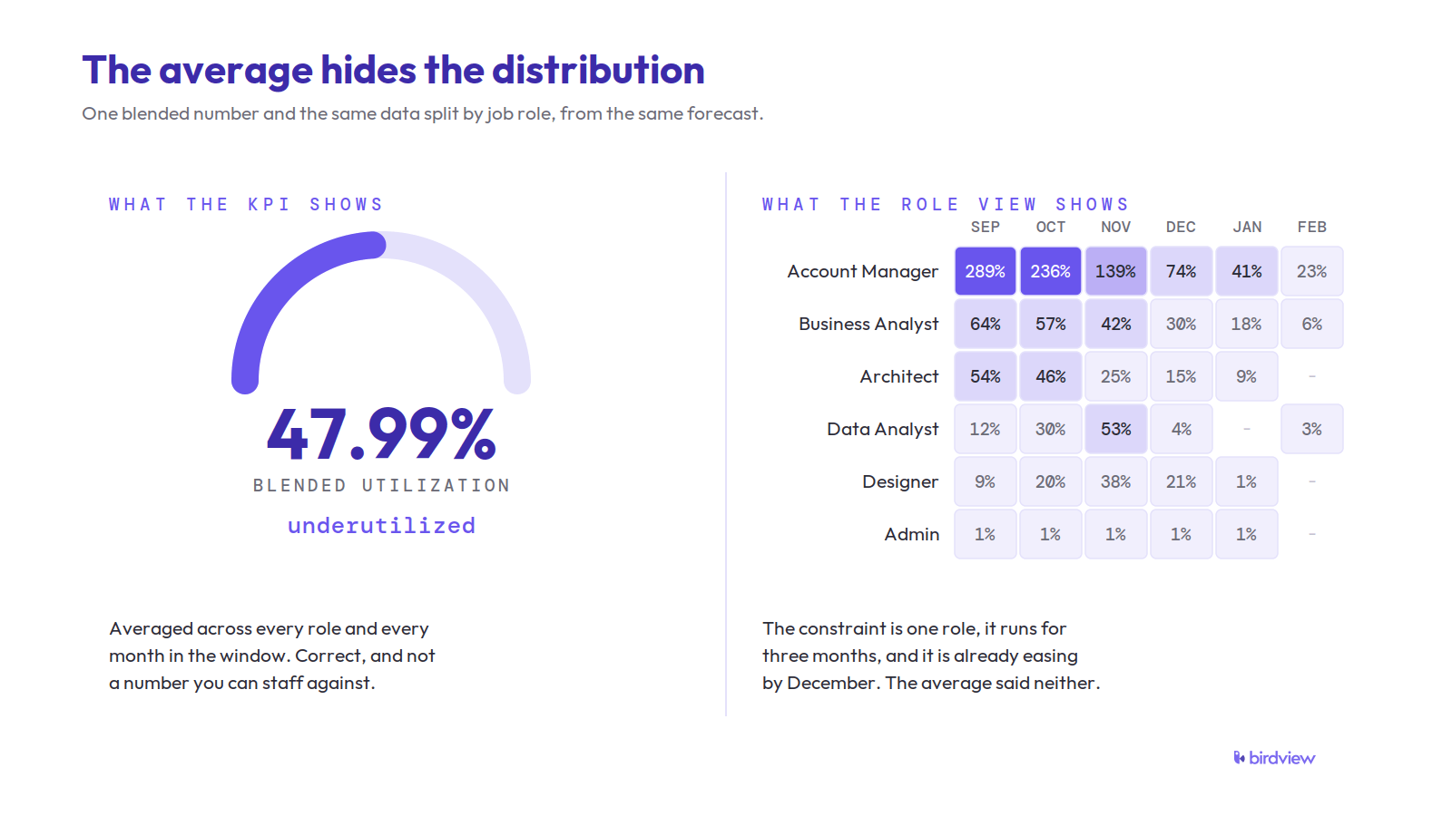
 - A blended utilization number can hide the real problem. A firm can read 48% utilized overall while one role sits at 289% capacity, and the average points you at the wrong decision.
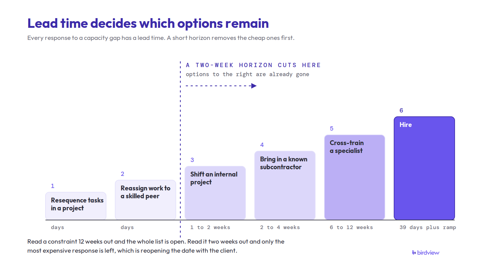
- Retrospective utilization reports arrive too late to act on. Every response to a capacity problem has a lead time: median time to fill a role is 39 days (SHRM, 2026), so a forecast horizon shorter than your hiring lead time quietly removes hiring as an option.
- Full utilization is a bad target. Queueing theory shows waiting time rises hyperbolically as utilization approaches capacity, and SPI Research treats 75% billable utilization as optimal, not a ceiling.
- Forecast at role level, not firm level. Over-allocated hours and bench hours reported side by side reveal matching problems that a blended figure nets out into false health.
- Signed work is only part of demand. Weight unclosed pipeline by win probability and add it to the forecast, or the demand curve will systematically understate what is coming.
- Predictive forecasting does not require machine learning. Most of the value comes from projecting confirmed allocations, calendars, time off, and weighted pipeline forward, which is arithmetic over data your PSA system already holds.
- Correct estimates with your own history. If delivered projects consume 1.3x their scoped hours, apply that ratio before estimates enter the forecast. This is the highest-return hour of analysis available to a delivery leader.
- Report a range, not a single number. Prediction intervals widen with horizon, and nominal 95% intervals often deliver only 71–87% actual coverage, so treat the pessimistic edge as the planning case for expensive decisions.
- Benchmark your forecast against a naive one. If it cannot beat “next quarter looks like last quarter” at role level, fix the inputs before building anything fancier.
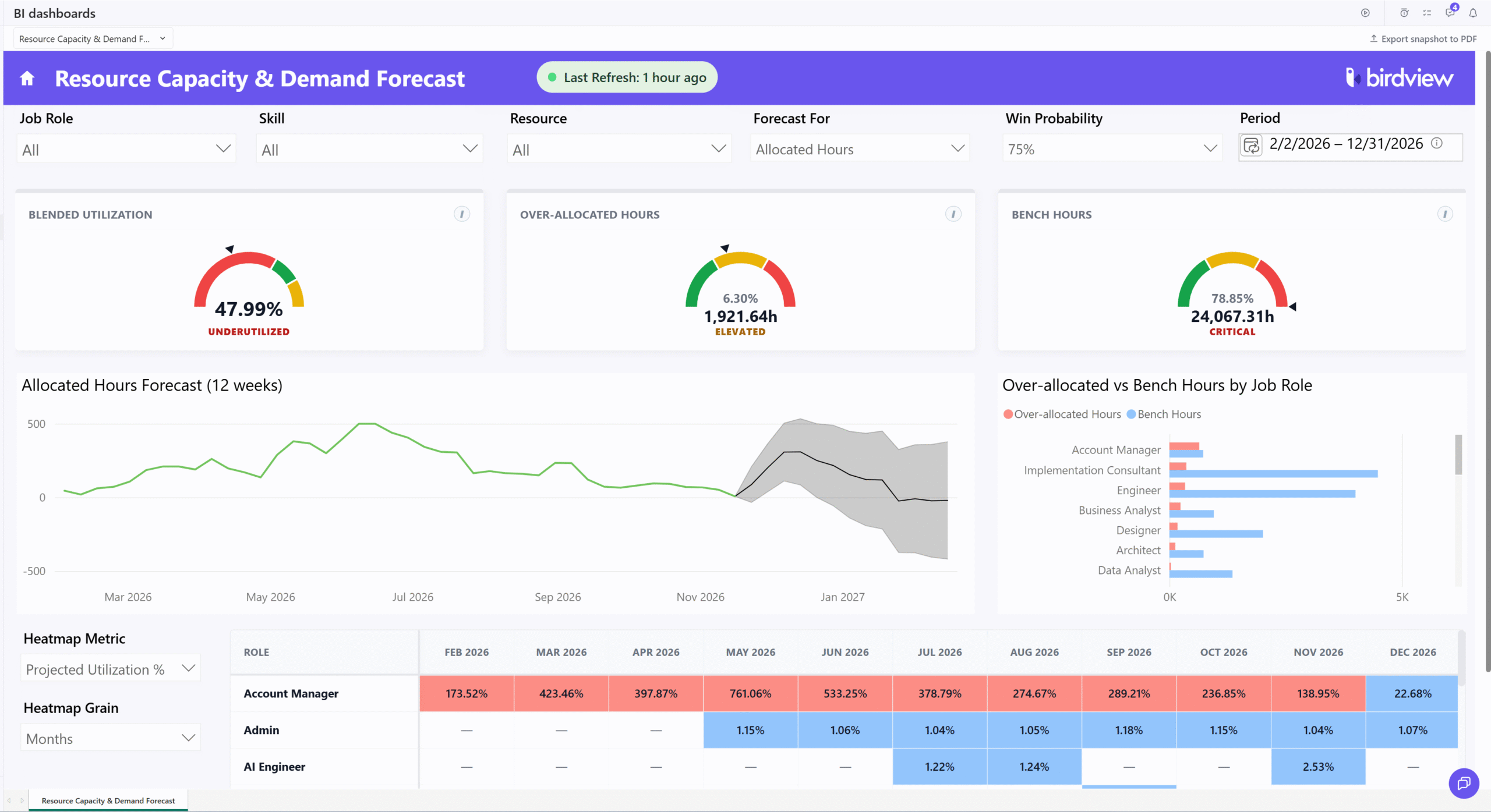
It’s easy to get this wrong. Your resource forecast is open on the screen, the blended utilization gauge read 47.99%, and underneath the number it said “underutilized.” Your first reaction was the obvious one, which was that we had bench to fill and sales needed to work harder. Then somebody opens the role heatmap and points at the first row, where Account Manager is projected at 289% for September and 236% for October, while designers, analysts and admin sit at one or two percent through the same months. The average is arithmetically correct. It’s also pointing you at exactly the wrong decision.
That gap between a true number and a useful one is what this guide is about. Predictive resource forecasting is the practice of projecting future demand for people against future available capacity, at a granularity you can actually staff against, far enough ahead that you still have choices. It is not a replacement for the utilization reporting your finance team already produces every month. It is the thing that makes that reporting actionable, because history tells you how you did and a forecast tells you what you can still change.
Most of the firms we talk to have the raw material for this already sitting in their systems and have simply never pointed it forward.
Forecasting is not the same as capacity planning, and the difference matters operationally
Capacity planning asks how much capability the organization should have. It runs on a longer clock, it touches hiring plans and skill investments and sometimes office locations, and it is usually owned somewhere near the executive team. Resource forecasting asks a narrower question: given what we have committed to and what we are likely to commit to, will the specific people we need be available in the specific weeks we need them. The two feed each other, and if you want the distinction drawn out properly we have written about how capacity planning and resource planning differ in more detail.
The reason the distinction matters is that they fail differently. A bad capacity plan produces a firm with the wrong shape, too many generalists and not enough of whatever your delivery actually bottlenecks on. A bad resource forecast produces a firm with roughly the right shape that still misses dates, because the shape was right in aggregate and wrong in September.
Professional services is a big sector to be running this on instinct. The US Bureau of Labor Statistics counts 10.8 million people employed in professional, scientific and technical services as of June 2026. The delivery capacity of every one of those firms is a perishable inventory of hours that cannot be stockpiled, and unlike physical inventory it walks out of the building when it gets annoyed.
Retrospective utilization reporting arrives after the decisions have expired
Here is the practical problem with a monthly utilization report, and it has nothing to do with the report being wrong.
Every meaningful response to a capacity problem has a lead time, and most of those lead times are measured in weeks or months. SHRM’s 2026 recruiting benchmarking data puts the median time to fill a non-executive role at 39 calendar days, down from 44 days the year before, and that is the median across all roles rather than the senior specialist you actually need. Statistics Canada reports that 28.0% of job vacancies in the first quarter of 2026 had been open for 90 days or more. If your forecast horizon is shorter than your hiring lead time, hiring is not on the menu, and you have quietly removed one of your five options without deciding to.
Cross-training has a lead time too, usually longer than people admit, because the first project someone does in a new role runs slower and needs supervision from the person who was already the bottleneck. Subcontracting needs a vetted bench and a rate agreement, which takes weeks the first time. Resequencing two projects needs a conversation with two clients. Renegotiating a date needs enough notice that it reads as planning rather than as failure.
Capacity also leaks for reasons no project plan contains. The BLS JOLTS series put the quits rate in professional and business services at 2.2% in June 2026, which is 488,000 people in one month across the sector. Averaged over a 60 person delivery org that is a bit more than one person a month walking out with their allocations still on the plan. A forecast that only counts signed work and current headcount is structurally optimistic about both halves of the equation.
Full utilization is a worse target than most firms assume
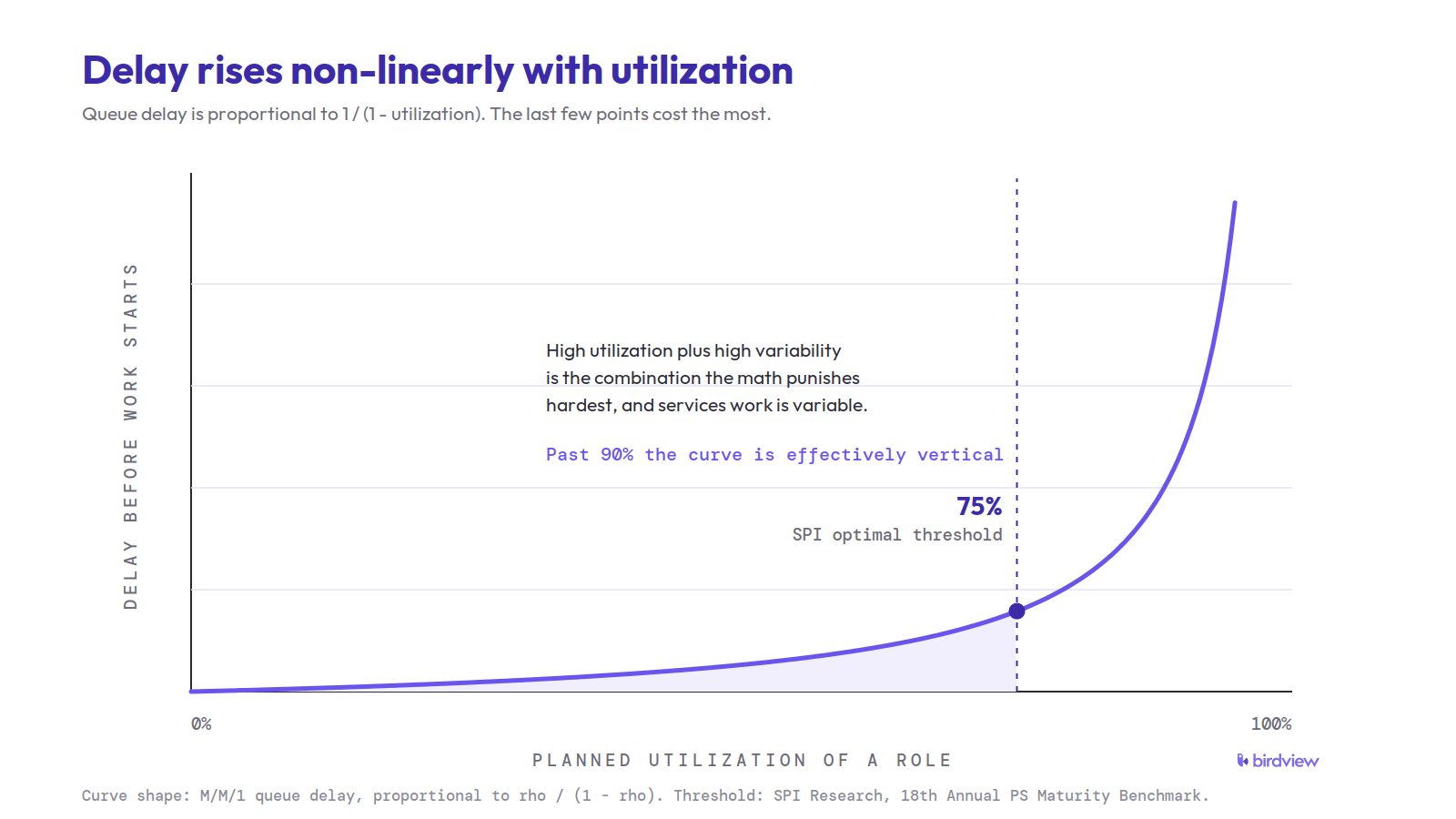
This is the part I wish more delivery leaders had been taught, because this is queueing theory rather than a soft management opinion, and it has been settled for sixty years.
When a system’s utilization approaches its capacity, the time work spends waiting does not rise proportionally. It rises hyperbolically. MIT’s operations management course notes state it plainly, that “the relationship between waiting time and capacity utilization is strongly non-linear”, and the accompanying queue approximation has utilization in the denominator as one minus rho, which is what produces the hockey stick. The same formula carries a variability term built from the coefficients of variation of arrival and service times, and professional services work is about as variable as it gets. Scope changes, client review cycles that stall for a week, a discovery phase that uncovers twice the work. High utilization plus high variability is the exact combination the math punishes hardest.
So a delivery organization planned to 95% utilization is not an efficient organization. It is an organization with no shock absorber, in a business where shocks are the normal weather.
The industry data lines up with this. Service Performance Insight’s 18th annual benchmark found billable utilization at 68.9%, which they describe as below a 75% optimal threshold across 403 firms. In SPI’s own release announcing its 19th annual report, covering 509 organizations in February 2026, utilization had declined further to 66.4%, the lowest in the 19 years they have run the benchmark. Note what that implies. The sector-wide problem is not firms running too hot on average. It is firms carrying slack in aggregate while individual roles inside them run hot enough to break, which is the same shape as our own dashboard, where a comfortable-looking blended figure sat directly on top of one role at nearly triple capacity.
There is also good evidence that sustained overload costs you the thing you were trying to buy. A study of hospital operations in Management Science found that short bursts of extra load make people faster, but that persistent overwork degrades outcomes, with a 1% increase in overwork associated with a six hour increase in length of stay and a 10% increase associated with measurably worse patient outcomes. Hospitals are not consultancies, and I would not stretch the analogy further than the mechanism. The mechanism is the transferable part: transient load looks like productivity on a dashboard, and sustained load quietly buys it back in rework.
Fragmentation does similar damage. When researchers observed 24 information workers, including developers, analysts and managers, they found people worked an average of 11 minutes and 4 seconds on a task before switching, that 57% of work segments were interrupted, and that resuming an interrupted piece of work took an average of 25 minutes and 26 seconds. Spreading one over-allocated specialist across five projects to solve a forecast problem on paper is how you generate that pattern deliberately. If you are setting numeric utilization goals, it is worth thinking through how to set utilization targets without burning out the team before you pick the number.
A blended number cannot tell you which role is the constraint
Two firms can both report 100% utilization for next quarter and be in entirely different situations. One has demand spread evenly across roles and seniority. The other has three senior architects booked at triple capacity while a third of the junior bench has nothing, and the blended figure is 100% because those two errors cancel.
Role-level granularity is what separates those cases, and in practice it needs three things visible at once.
The first is projected utilization by role, by month, so concentration is legible. In our own view that is a heatmap, and the value of the heatmap is that a row reading 289% in September and 236% in October registers as a shape rather than as a data point. It tells you the constraint runs for two months and is already easing by November, which is a different problem from a single spike.
The second is over-allocated hours and bench hours reported side by side, split by role rather than summed. A firm holding both at the same time does not have a hiring problem, it has a matching problem, and matching is faster and cheaper to fix. That is also the specific case where the aggregate number is most misleading, because the two conditions net out into something that looks like health. Reducing idle time without breaking delivery readiness is its own discipline, and bench management in consulting firms is worth treating as a distinct workstream rather than an afterthought.
The third is skills underneath job roles. Job role is a useful planning abstraction and a lossy one. Two people with the same title are frequently not substitutable on a given project, and a forecast that treats them as interchangeable will show you capacity that does not exist in practice.
Signed work is only part of the demand, and the rest lives in the CRM
A forecast built only on contracted projects systematically understates demand, for a reason that is obvious once you say it out loud and easy to miss when you are building the report: some share of what your sales team is working right now is going to land, and it will need staffing on a schedule that is already partly determined.
The fix is to bring unclosed opportunities into the same demand line as signed work and scale their hours by win probability, so a deal at high confidence contributes most of its projected hours and a long shot contributes a little. The forward demand curve then reflects likely work rather than confirmed work only. This is also the single input most delivery teams go without, and the reason is organizational rather than technical. The pipeline data lives in the CRM, the staffing decision happens in the delivery system, and nobody owns the join. When those two are in one place the forecast starts answering the question executives actually ask, which is whether the firm can deliver the plan it is selling. The same join is what makes revenue forecasting for professional services coherent, since the revenue and the capacity are two views of the same set of commitments.
Alongside probability-weighted pipeline, a forecast worth acting on needs confirmed allocations separated from tentative ones, project schedules with real dependencies, each person’s actual working calendar rather than a company default, and approved time off. Vacations are the input people skip most often and regret most reliably, because a two week absence in a role that is already at 200% is not a rounding error.
None of this requires machine learning.
I want to be blunt about that, because “predictive” has become a word that implies a model and a budget. What I have described is arithmetic over data most PSA systems already hold. There are genuine uses for statistical and machine learning methods in this space, particularly in estimating how much work a project will actually consume versus what was scoped. But the first 80% of the value in resource forecasting comes from projecting known commitments forward at role granularity, and if a vendor tells you that requires a model, ask what the model is doing that a calendar cannot.
Horizon determines which decisions are available
The right forecast horizon is not a matter of taste. It is set by the lead time of the slowest decision you want to keep on the table. If you want hiring to be an option and your median time to fill is around 40 days, plus ramp, your horizon needs to reach at least a quarter out. If you only care about resequencing work between existing people, six weeks is enough.
There is a real tension here, because forecast quality degrades as the horizon lengthens. In a large open access study of statistical and machine learning methods, Makridakis and colleagues report accuracy deteriorating as the horizon lengthens, because each further step out depends on the accuracy of the step before it. The same paper found that a naive seasonal benchmark was more accurate than half the machine learning methods tested, which is a useful piece of humility to carry into any forecasting project.
The practical resolution is a rolling forecast with different uses at different depths rather than one number for one date. The near window, roughly 30 days, is a scheduling instrument and should be treated as close to binding. The middle window, 60 to 90 days, is where most of the useful decisions live, because it is long enough for hiring and cross-training and short enough that the pipeline weighting means something. Anything past a quarter reads as a shape rather than a plan, and its job is to tell you which conversations to start. We have set out how to structure that cadence in a 30/60/90 day capacity forecast.
On cadence, the UK National Audit Office notes in its 2025 government workforce planning audit framework that the Cabinet Office suggests strategic workforce plans be reviewed at least twice a year. That is a reasonable floor for strategy and nowhere near enough for delivery. If your resource forecast refreshes less often than your pipeline changes, you are steering on stale data.
A forecast that reports a single number is hiding its own uncertainty
Every resource forecast is wrong. The useful question is by how much, and in which direction, and whether the person reading it knows.
Hyndman and Athanasopoulos put it about as directly as a textbook can, that “point forecasts can be of almost no value without the accompanying prediction intervals”, and that intervals widen as the horizon extends because uncertainty accumulates. That is why our own forecast chart runs six months of actual allocated hours into a projected band rather than a line, and why the band gets visibly fatter toward the far edge. It looks less authoritative. It is more honest, and it changes how people use it, because a manager reading a range asks what would have to be true for the bad end to happen.
Worth knowing that intervals themselves tend to be overconfident. Hyndman has written that nominal 95% prediction intervals often deliver actual coverage between 71% and 87%, because standard methods account for random error but not for uncertainty in the parameters, the model choice, or whether the underlying process keeps behaving the same way. Applied to resource forecasting, that argues for treating the pessimistic edge of your band as the planning case for anything expensive to reverse.
The inputs carry a systematic bias, and you can correct for it with your own history
Forecast quality is usually limited by estimates rather than by arithmetic, and estimates in project work are not randomly wrong. They are wrong in a consistent direction.
Kahneman and Tversky named this in a 1977 technical report, noting that people are “notoriously prone to underestimate the time required” for a project even after repeatedly missing their own schedules. Their diagnosis is the useful part. The planning fallacy comes from taking an internal view, reasoning from the specifics of the case in front of you, while neglecting distributional information about how similar cases actually turned out.
The scale of the bias in large projects is documented well enough to be uncomfortable. Studying 258 transportation infrastructure projects worth around 90 billion US dollars, Flyvbjerg and colleagues found costs underestimated in almost nine out of ten, with an 86% likelihood that actual costs exceed estimated costs, and no evidence of improvement across seventy years of data. Bridges are not software implementations and the authors’ conclusion about strategic misrepresentation is specific to public procurement, so I would not import the percentages. The pattern is what transfers, and the correction they propose transfers cleanly.
That correction is to forecast from the reference class rather than from the plan. In practice, for a services firm, it means computing the ratio of actual to estimated hours for your own delivered projects, segmented by project type and by whoever did the estimating, and applying that ratio to new estimates before they enter the forecast. If your implementations have historically consumed 1.3 times their scoped hours, a forecast that ingests scoped hours at face value is understating demand by 30% and no amount of dashboard polish fixes it. Most firms have this data and have never computed the ratio. It is the highest-return hour of analysis available to a delivery leader, and it needs a query rather than a project.
One view beats four accurate reports
Every component described here already exists somewhere in most PSA and BI stacks, whether that is utilization reporting, capacity views or pipeline reports. The gap is that they are produced by different teams, on different refresh schedules, against different definitions of a working week, and they are read in different meetings.
That fragmentation has a specific cost, and it is not inefficiency. It is that the insight lives in the intersection. Nobody sees that blended utilization is low and one role is critical and there are 24,000 bench hours and 1,900 over-allocated hours in the same window, because those four facts arrive on four different days in four different formats, and the person who could act on the combination never holds all of it at once. Reconciling definitions across reports also burns the credibility you need later, since the fastest way to kill a forecast is a meeting that spends twenty minutes arguing about whether two numbers should match.
The test I would apply is not whether your stack can produce each view. It is whether one person can see all of them, sourced from the same data, refreshed at the same moment, and change their mind in a single sitting.
What to do with a forecast once you have one
A forecast is only worth building if it changes a decision, so it helps to have the responses ranked by how much lead time each one needs. Fastest first: resequence tasks inside a project, move work between people who already have the skill, shift a non-critical internal project, then bring in a known subcontractor, then cross-train, then hire, then reopen a date with a client. Reading a constraint 12 weeks out means the whole list is available. Reading it two weeks out leaves the last item, and it is the most expensive one.
Two habits make this stick. Give every forecast breach a named owner and a review date, because a heatmap cell that goes red and stays red for four weeks is not information, it is decoration. And record what you did, so that next quarter you can tell whether the forecast changed the outcome or merely predicted it.
How to tell whether your forecast is any good
Measure it against something dumb.
The benchmark to beat is the naive forecast, which in this context is simply assuming next quarter looks like last quarter, by role. Hyndman and Athanasopoulos make the general case that simple methods like this “work remarkably well” and that any new method should be compared against them to prove it adds value. If your carefully assembled forecast cannot beat last-quarter-repeated on role-level demand, the problem is in your inputs, most likely the estimate ratio described above, and building a fancier model will not help.
Track two things monthly. Compare forecast role-level demand at 30, 60 and 90 days out against what actually happened, and keep the error signed rather than absolute so you can see whether you are consistently under or over. Then check calibration on your ranges, which means counting how often the actual value landed inside the band you published. If your 80% band is catching outcomes 60% of the time, the band is too narrow and you should widen it before somebody makes an expensive decision on the strength of a false precision.
The limits of this
A forecast will not tell you whether to take the deal. It narrows the question to what staffing it requires and what that displaces, and the judgment stays with a person.
It will not fix bad source data either. If allocations are stale, if half the team logs time weekly from memory, or if project schedules are aspirational, the forecast inherits all of that and presents it with more confidence than it deserves. Forecasting is usually the second project. Getting allocations and time capture trustworthy is the first, and firms that skip it end up distrusting the dashboard for reasons that are entirely correct.
And it will not survive being ignored. The forecast that changes decisions is the one somebody is accountable for reading on a schedule, with the authority to act on what it says.
FAQ
How far ahead should a professional services firm forecast resource demand?
Set the horizon by the lead time of the slowest response you want available. Keeping hiring on the table means reaching a full quarter out at minimum, given a median time to fill near 40 days plus ramp. Refresh weekly if your pipeline moves weekly.
Does this need AI or machine learning?
No. Projecting confirmed allocations, schedules, calendars, time off and probability-weighted pipeline forward is arithmetic. Statistical methods earn their place in a narrower spot, estimating how much work a scope will actually consume, and even there a naive baseline competes seriously.
What utilization target should we plan to?
Lower than feels comfortable, and set per role rather than firm-wide. Queueing behaviour means the last few points of planned utilization cost far more in delay than they return in billable hours, and SPI Research’s benchmark treats 75% as an optimal level rather than a ceiling to push past.
Why include pipeline that has not closed?
Because it will consume capacity on a timeline that is already partly fixed by the time it closes. Weighting by win probability is what keeps that from overstating demand.
We have utilization reports already. What is missing?
Direction and granularity. A monthly report tells you what a closed period looked like in aggregate. A forecast tells you which role is short in which future week, early enough that cheap responses are still available.
Where do most resource forecasts go wrong?
In the estimates feeding them, not the math. If your projects historically consume more hours than scoped and you never apply that ratio, the forecast is confidently understating demand every single time.