Leonid Kostin
 - Power BI dashboards help IT services firms transform project, resource, financial, and time-tracking data into actionable insights that support staffing, delivery, and profitability decisions.
- Resource utilization, capacity planning, project profitability, forecasting, and executive reporting are among the most valuable dashboard categories for service-based organizations.
- Utilization and capacity dashboards help managers identify resource shortages, workload imbalances, bench capacity, and future staffing requirements before delivery is affected.
- Financial dashboards are most effective when project delivery data, revenue, costs, margins, and profitability metrics are viewed together rather than in separate reporting systems.
- Forecasting dashboards help organizations move from reactive resource management to proactive planning by combining project demand, utilization trends, and capacity data.
- The value of Power BI depends heavily on data quality. Organizations typically achieve the best reporting outcomes when project, resource, time-tracking, financial, and forecasting data come from a consistent operational system.
Power BI dashboards for IT services companies help transform project, resource, financial, and time-tracking data into actionable insights. The best dashboards give leaders visibility into utilization, delivery performance, profitability, capacity, and future demand so they can make better staffing and business decisions.
Many IT services firms collect large amounts of operational data but struggle to turn it into useful information. Resource managers maintain spreadsheets, project managers create manual reports, finance teams build separate profitability reports, and executives receive outdated summaries. As the business grows, reporting becomes harder, not easier.
The most successful IT services organizations use a small set of focused dashboards that answer critical questions:
- Who is available?
- Which projects are profitable?
- Where are delivery risks emerging?
- Can we take on new work?
- Will we hit our revenue targets?
Beyond project status, IT services leaders also need visibility into billable utilization, bench capacity, resource demand, project margins, and future revenue. These metrics directly influence staffing decisions, delivery performance, and profitability.
This guide covers the ten most valuable Power BI dashboards for IT services companies and explains which KPIs matter most for each one. For the full picture, see our guide to the metrics behind delivery performance.
Why dashboards are critical for IT services companies
IT services companies run on people, time, and project delivery. Visibility into those areas directly affects revenue, profitability, and client satisfaction.
Unlike product companies, most IT services firms earn revenue when consultants, engineers, developers, analysts, or project teams deliver billable work. Small changes in utilization, staffing efficiency, or project margins can have a significant impact on financial performance.
For example, a consulting team operating at 70% utilization has a very different revenue profile than the same team operating at 80%. Similarly, a project can appear healthy from a delivery perspective while generating poor margins due to excessive non-billable work, write-offs, or inefficient staffing.
Many organizations face similar reporting challenges:
- Disconnected systems for projects, resources, and finance
- Manual reporting processes
- Limited forecasting visibility
- Resource bottlenecks
- Unclear project profitability
- Inconsistent executive reporting
A common pattern appears as firms grow. Teams start with spreadsheets and basic project management tools. Eventually, leaders spend more time gathering information than acting on it. Reporting becomes reactive instead of strategic.
Well-designed dashboards solve this problem by creating a shared view of operational performance.
What makes a good IT services dashboard?
A good dashboard helps leaders make decisions quickly. It does more than display information. The most effective IT services dashboards highlight the metrics that influence staffing, delivery performance, profitability, and future planning.
Real-time operational visibility
Projects, resources, and priorities can change throughout the week. Leaders need access to current information so they can identify delays, workload imbalances, and delivery risks before they become larger problems. A dashboard should provide visibility without requiring managers to gather updates from multiple teams.
Resource and utilization tracking
For many IT services companies, utilization is one of the most important performance indicators. Effective dashboards make it easy to understand how much time is spent on billable work, where excess capacity exists, how resources are allocated, and whether future demand can be supported by the available team. Without this visibility, staffing problems often surface after delivery or revenue has already been affected.
Financial performance monitoring
Operational performance and financial performance should be viewed together. Strong dashboards connect project delivery data with revenue, costs, margins, budget performance, and profitability trends. When financial reporting is separated from project reporting, organizations often miss early warning signs that projects are becoming less profitable.
Delivery forecasting
Forecasting helps organizations move from reacting to planning. By combining project demand, resource availability, and utilization trends, dashboards help managers anticipate staffing requirements, capacity constraints, and future delivery challenges before they impact clients.
Executive-level reporting
Executives rarely need detailed project data. They need a clear picture of business performance. The best executive dashboards bring together key operational and financial indicators in a single view, making it easier to evaluate performance, monitor trends, and support strategic decision-making.
Top 7 Power BI dashboards for IT services companies
Resource utilization dashboard
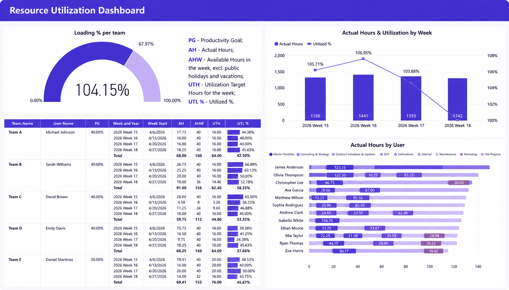
What it shows
- Team loading percentage against utilization targets
- Actual hours and utilized % by week
- Available versus utilized hours
- Individual resource workloads by project
- Weekly utilization performance by employee
Why it matters
Utilization directly impacts revenue and delivery efficiency. This dashboard helps managers identify overutilized and underutilized resources, monitor workload balance across teams, and ensure billable capacity is being used effectively without creating resource bottlenecks.
In many IT services firms, this dashboard becomes part of weekly resource planning meetings. Managers can quickly spot consultants approaching capacity limits, identify teams with excess availability, and make staffing adjustments before utilization issues affect project delivery or revenue performance.
Product/Service analysis dashboard
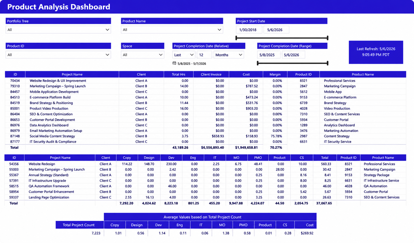
What it shows
- Project delivery performance across services and clients
- Project hours, invoiced amounts, costs, and margins
- Delivery trends by product or service line
- Resource effort by department and discipline
- Portfolio-wide project completion and financial results
Why it matters
Service delivery teams need visibility into both project execution and financial outcomes. This dashboard helps leaders identify high-performing services, monitor project margins, compare delivery effort across teams, and understand which client engagements contribute most to business performance.
Over time, trends in this dashboard often reveal which services generate the strongest margins and which consume excessive delivery effort. This information can influence staffing decisions, service offerings, and future investment priorities.
Capacity planning dashboard
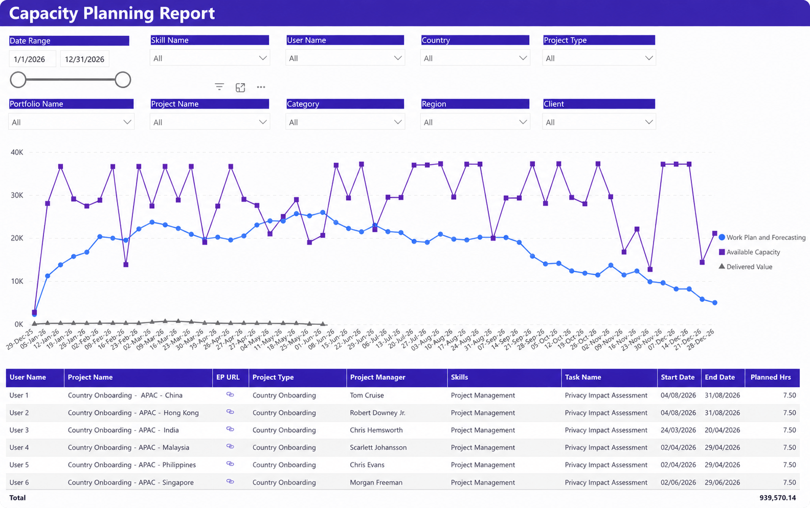
What it shows
- Forecasted demand versus available resource capacity
- Planned work, delivered value, and utilization trends over time
- Upcoming project assignments and scheduled hours
- Resource availability by skill, region, client, or project type
- Future capacity gaps across teams and portfolios
Why it matters
Capacity planning is most effective when future demand can be compared directly against available resources. This dashboard helps leaders identify staffing shortages, balance workloads across teams, evaluate upcoming project commitments, and make hiring or resourcing decisions before delivery is affected.
Rather than reacting to resource shortages after projects are sold, managers can use this dashboard to evaluate upcoming demand several weeks or months in advance. This improves forecast accuracy and reduces last-minute staffing challenges.
Revenue, cost & profit dashboard
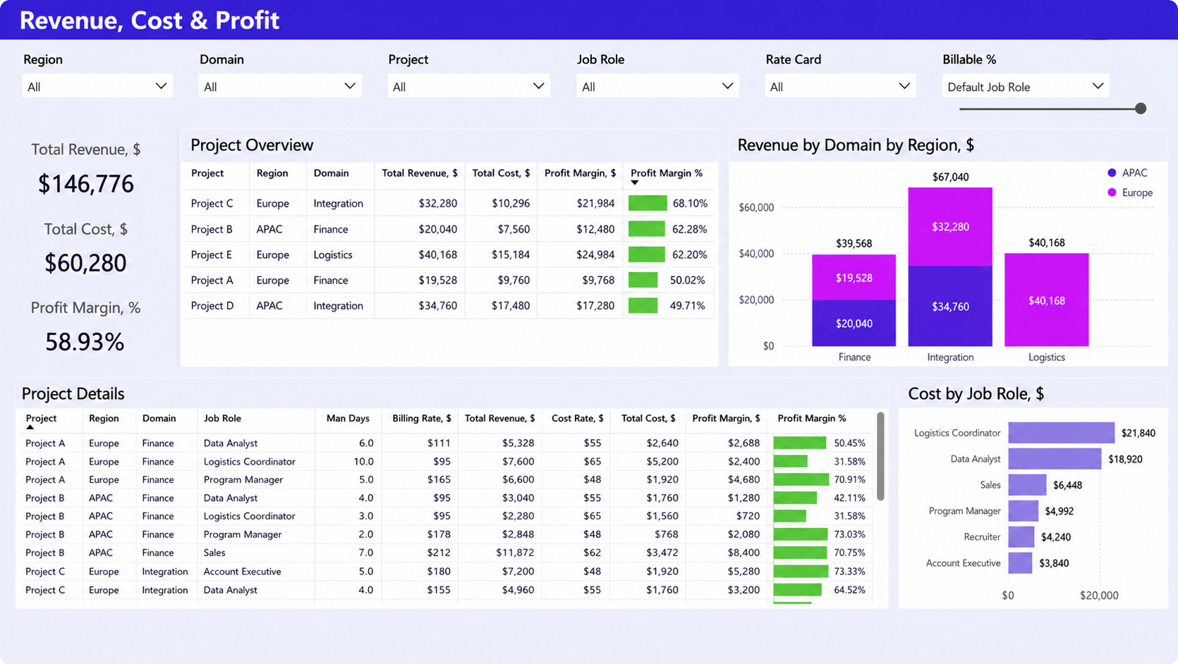
What it shows
- Revenue, costs, and profit margins across projects
- Financial performance by region, domain, and project
- Revenue contribution by service line
- Cost distribution by job role
- Detailed profitability metrics for individual projects
Why it matters
This dashboard provides a clear view of where revenue is generated, how delivery costs are distributed, and which projects produce the strongest margins. Leaders can quickly identify profitable service areas, monitor project financial performance, and understand the impact of staffing costs on overall profitability.
Many IT services organizations discover profitability issues only after projects are completed. This dashboard makes margin performance visible throughout project execution, allowing teams to address issues before they affect overall financial results.
Executive dashboard
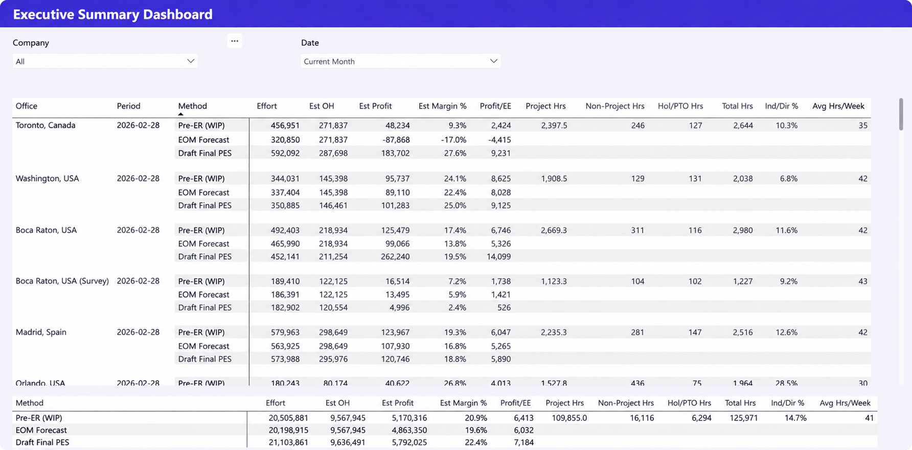
What it shows
- Revenue, effort, profitability, and margin forecasts by office
- Project and non-project hours across locations
- Forecast scenarios including pre-EOM, EOM, and final projections
- Indirect labor percentages and resource utilization trends
- High-level operational and financial performance metrics
Why it matters
Executives need a consolidated view of delivery performance, resource effort, and financial outcomes across the organization. This dashboard helps leadership compare offices, evaluate forecast accuracy, monitor profitability trends, and make strategic planning decisions based on both operational and financial data.
Instead of reviewing separate operational, resource, and financial reports, leadership teams can use a single dashboard to understand overall business performance and identify areas that require attention.
Time tracking dashboard
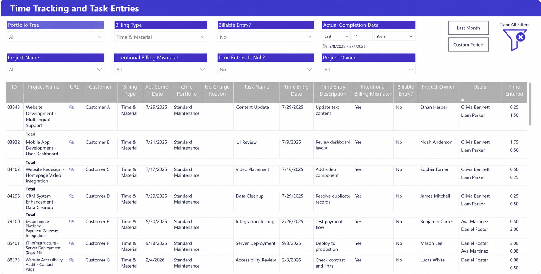
What it shows
- Detailed time entries across projects, tasks, and users
- Billable and non-billable work by billing type
- Time entry descriptions, hours logged, and completion dates
- Billing mismatches and missing time entry exceptions
- Time tracking activity by project owner and team member
Why it matters
Accurate time data is the foundation of utilization reporting, project costing, and client billing. This dashboard helps managers identify missing or inconsistent entries, monitor billable work, and improve the quality of operational and financial reporting.
Even small gaps in time tracking can distort utilization and profitability calculations. Regular review of this dashboard helps maintain reporting accuracy and reduce billing discrepancies.
Resource forecasting dashboard
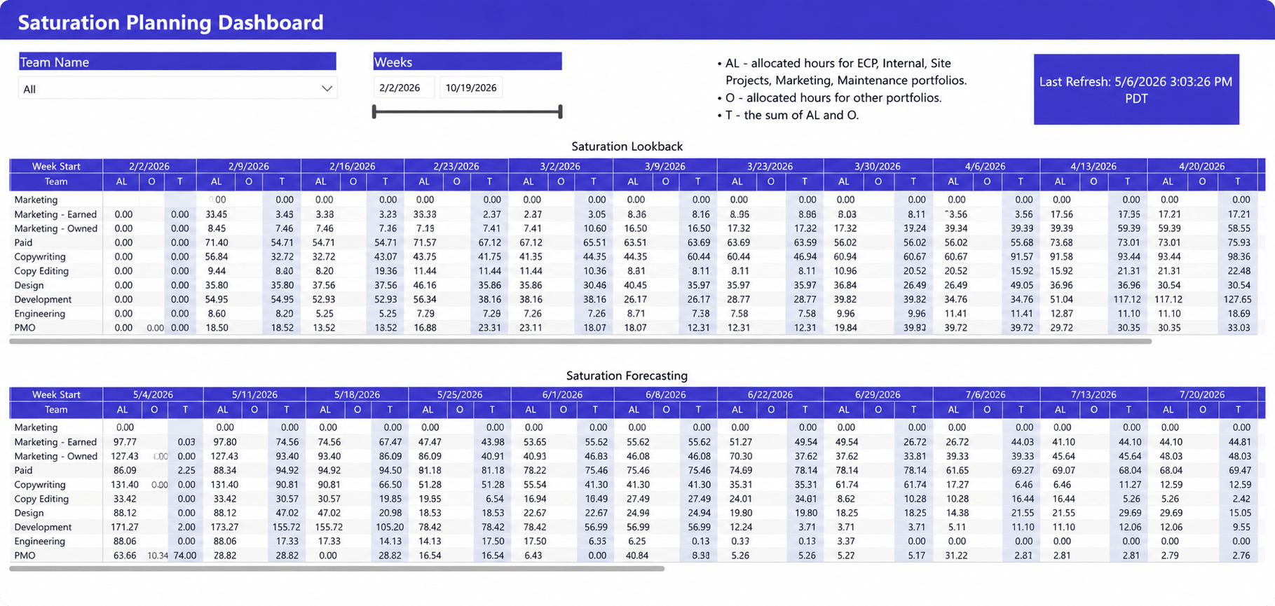
What it shows
- Allocated hours versus available capacity by team
- Future workload forecasts across upcoming weeks
- Resource saturation trends by department
- Potential overutilization and underutilization periods
- Planned demand across portfolios and projects
Why it matters
Resource shortages and excess capacity often become visible weeks before they affect delivery. This dashboard helps managers forecast future workload, identify teams approaching capacity limits, and make staffing or project assignment decisions before utilization problems emerge.
Forecast visibility is particularly valuable for growing IT services firms where hiring decisions, contractor planning, and project intake depend on understanding future resource demand rather than current utilization alone.
Portfolio dashboard
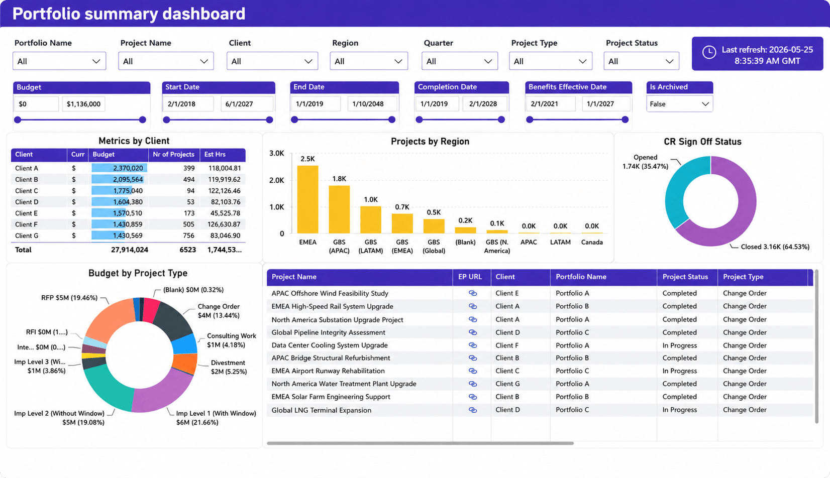
What it shows
- Portfolio budgets, project counts, and client performance
- Projects grouped by region, client, and project type
- Project status and completion trends across the portfolio
- Change request activity and approval status
- Portfolio-wide delivery and investment distribution
Why it matters
Project-level reporting does not reveal portfolio-level risk. This dashboard helps leaders evaluate portfolio performance across clients, regions, and project types, monitor budget distribution, track project status trends, and identify where delivery efforts and investments are concentrated. It provides the visibility needed to prioritize initiatives, manage portfolio risk, and support strategic planning decisions.
The most important KPIs for IT services companies
Not every metric deserves executive attention. The following professional services KPIs consistently provide the most operational value.
Utilization rate
Many IT services firms target 70-85% billable utilization, although the ideal range varies by service model. Consistently lower rates often indicate excess capacity, while sustained rates above 90% can create delivery and retention risks. This KPI directly influences revenue potential and resource efficiency.
Realization rate
Realization compares billable work performed against revenue actually captured. A declining realization rate often indicates excessive discounts, scope creep, write-offs, or inaccurate project estimates.
Project profitability
Project profitability measures whether engagements generate acceptable margins after labor and delivery costs are considered. This KPI connects project performance to business outcomes.
Revenue forecast accuracy
Forecast accuracy compares projected revenue against actual results. Consistently inaccurate forecasts usually indicate planning, sales, or capacity management issues.
Resource capacity
Capacity measures how much work teams can realistically deliver. This metric supports hiring, staffing, and project intake decisions.
Project margin
Project margin helps organizations compare profitability across clients, service lines, and project types. Margin trends often reveal operational inefficiencies before they appear in financial statements.
Bench utilization
Bench utilization tracks the percentage of resources not assigned to billable work. While some bench capacity is healthy, prolonged bench time reduces revenue potential and often signals forecasting or resource planning problems. Tracking bench trends helps leaders balance hiring decisions with future demand.
Why reporting remains difficult for many IT services firms
Most reporting challenges are not caused by Power BI. They are caused by fragmented operational data.
Data is spread across multiple systems
Project information, time tracking, financial data, CRM records, and resource schedules often live in separate applications. Every manual export increases the risk of inconsistent reporting.
A common scenario is project plans living in one system, resource schedules in spreadsheets, CRM data in Salesforce or HubSpot, and financial information in accounting software. Teams spend hours reconciling conflicting reports rather than acting on the information.
Resource planning is disconnected from reporting
Many IT services firms still manage resource allocations in spreadsheets while reporting from separate project or financial systems. As a result, leaders struggle to answer simple questions such as who is available next month, whether upcoming projects can be staffed, or how much bench capacity is expected.
Financial and delivery data do not align
Project managers track delivery performance while finance teams track revenue and costs. When those datasets are disconnected, leaders struggle to understand the relationship between delivery performance and profitability.
This disconnect often creates conflicting reports. Project managers may report that delivery is on track while finance teams see declining margins. Bringing operational and financial data together helps leaders understand whether projects are both successful and profitable.
Reports become outdated quickly
Manual reporting often creates a lag between operational reality and executive visibility. By the time reports reach leadership teams, project conditions have already changed.
How dashboards improve delivery and profitability
The value of a dashboard is not in the report itself. The value comes from the decisions it enables. For IT services companies, better visibility into resources, project performance, utilization, and financial results helps leaders address issues earlier and make more informed planning decisions. When reporting is connected to daily operations, teams spend less time gathering information and more time improving delivery outcomes.
Effective dashboards help IT services organizations:
- Identify delivery risks earlier by highlighting schedule delays, resource conflicts, budget overruns, and project health issues before they impact clients.
- Make better staffing decisions through visibility into utilization, workload distribution, capacity constraints, and future resource demand.
- Improve forecasting accuracy by combining project plans, resource allocations, utilization trends, and staffing data into a single reporting environment.
- Increase financial visibility by connecting project delivery performance with revenue, costs, margins, and profitability metrics.
- Reduce reporting effort by replacing manual spreadsheets and status updates with real-time dashboards that support executive decision-making.
For many growing IT services firms, reporting starts as a way to monitor performance. As the organization scales, reporting becomes a planning tool. The most effective dashboards help leaders anticipate problems, allocate resources more effectively, and make decisions that improve both delivery performance and profitability.
Dashboards are only as good as the data behind them
The best Power BI dashboards for IT services companies depend on reliable operational data. A dashboard cannot solve fragmented reporting processes on its own.
The most effective reporting environments combine:
- Project management data
- Resource planning data
- Time tracking data
- Financial data
- Forecasting data
This is where many IT services firms struggle. Information exists, but it lives in multiple disconnected systems.
For example, a PSA platform such as Birdview PSA can act as a central operational system for project delivery, resource planning, budgeting, and time tracking. Power BI can then use that data to create executive dashboards, utilization reports, profitability analysis, and forecasting views.
The reporting layer becomes far more valuable when the underlying operational data comes from a consistent source. Organizations that solve the data foundation problem usually see greater value from dashboards than organizations that focus only on report design.
FAQ: Power BI dashboards for IT services companies
What should an IT services dashboard include?
An IT services dashboard should combine project, resource, financial, and operational KPIs. Most organizations track utilization, project health, profitability, capacity, revenue forecasts, and delivery performance.
Which KPIs are most important for service delivery teams?
Utilization rate, project profitability, realization rate, resource capacity, project margin, and forecast accuracy are among the most important service delivery metrics.
How do IT services firms track utilization?
Most firms calculate utilization by comparing billable hours against available working hours. Utilization dashboards help identify underutilized resources, overloaded teams, and future capacity constraints.
What dashboards help improve profitability?
Project profitability dashboards, revenue forecasting dashboards, utilization dashboards, and executive dashboards provide the strongest visibility into profitability drivers.
How do dashboards support forecasting?
Forecasting dashboards combine project plans, resource capacity, utilization trends, and pipeline data to predict future demand, staffing requirements, and revenue performance.