- An operations dashboard gives service delivery teams a centralized view of project performance, resource utilization, capacity, and delivery risks, helping leaders make faster and more informed decisions.
- The most effective dashboards support operational decision-making by combining project, resource, time tracking, and financial data into a single source of truth.
- Key dashboards for service organizations include service delivery, resource utilization, capacity planning, project portfolio, profit forecasting, time tracking, and business development dashboards.
- Operations leaders should focus on a small set of meaningful KPIs, including utilization rate, capacity availability, resource forecast accuracy, project delivery performance, project margin, and revenue forecast accuracy.
- Many reporting challenges stem from fragmented systems, manual reporting processes, and delayed visibility into operational risks rather than a lack of data.
- Connected operational data improves forecasting, resource planning, workload balancing, and overall delivery performance.
- Organizations that rely on spreadsheets and disconnected tools often struggle to gain the visibility needed to manage growth, capacity, and service delivery effectively.
- The most valuable dashboards do more than report on past performance–they help leaders identify risks early, plan proactively, and align resources with future demand.
An operations dashboard helps service delivery teams monitor project performance, resource utilization, capacity, and delivery risks from a single view. It gives operations leaders the visibility needed to make staffing, forecasting, and delivery decisions before small issues become client-facing problems.
For many professional services organizations, operational data is scattered across project management tools, spreadsheets, time tracking systems, and financial reports. This makes it difficult to understand delivery performance, identify resource constraints, and forecast future demand.
A well-designed operations dashboard connects these data sources and turns them into actionable insights. Instead of spending time gathering information, leaders can focus on balancing workloads, improving utilization, managing delivery risks, and planning for future growth.
Why operations leaders need real-time visibility
Operations leaders are responsible for balancing project delivery, resource capacity, utilization, and future demand. To do that effectively, they need a clear view of what is happening across the organization, not just within individual projects. An operations dashboard brings project, resource, and delivery data together in one place, helping leaders identify risks, respond faster, and make more informed decisions.
Common challenges that limit operational visibility include:
- Fragmented reporting – Project, resource, financial, and sales data often live in different systems, making it difficult to get a complete picture of delivery performance.
- Resource conflicts – As project demand grows, teams compete for the same specialists. Without visibility into future allocations, capacity issues often go unnoticed until deadlines are affected.
- Delayed visibility into delivery issues – Missed milestones, workload imbalances, and utilization declines are often hidden across multiple reports, delaying corrective action.
- Manual status updates – Spreadsheets, meetings, and email-based reporting consume valuable management time and frequently result in outdated information.
- Forecasting uncertainty – When project plans, resource schedules, and future demand are disconnected, staffing decisions become less accurate and harder to manage.
Real-time dashboards help address these challenges by providing a shared view of delivery performance, resource availability, and operational risks before they become larger business problems.
What makes a good operations dashboard?
Not every dashboard improves operations. The most effective dashboards help leaders make decisions, identify risks, and plan ahead rather than simply display information. While reporting needs vary between organizations, the best operations dashboards tend to share several common characteristics.
Focus on operational decisions
A dashboard should help leaders answer important operational questions. Whether the goal is improving utilization, managing capacity, or monitoring delivery performance, every metric should support a decision. If a dashboard does not influence actions, it quickly becomes another report that nobody uses.
Combine project, resource, and financial data
Operational performance cannot be measured through a single metric. A project may be on schedule but over budget, while a highly utilized team may be approaching burnout. Bringing project delivery, resource management, time tracking, and financial data together provides the context needed to understand the full picture.
Highlight risks early
The best dashboards make emerging problems visible before they affect clients or business performance. Resource constraints, declining utilization, schedule slippage, and forecasting gaps are easier to address when they are identified early. Timely visibility gives leaders more options and reduces the need for reactive decision-making.
Support proactive planning
Strong operations teams look beyond current performance. They need visibility into future workload, capacity trends, staffing requirements, and projected demand. Dashboards that support forward-looking planning help organizations prepare for upcoming challenges instead of reacting to them after they occur.
The 7 most important operations dashboards for service delivery teams
Different dashboards answer different operational questions. Together, they create a complete picture of service delivery performance.
Service delivery overview dashboard
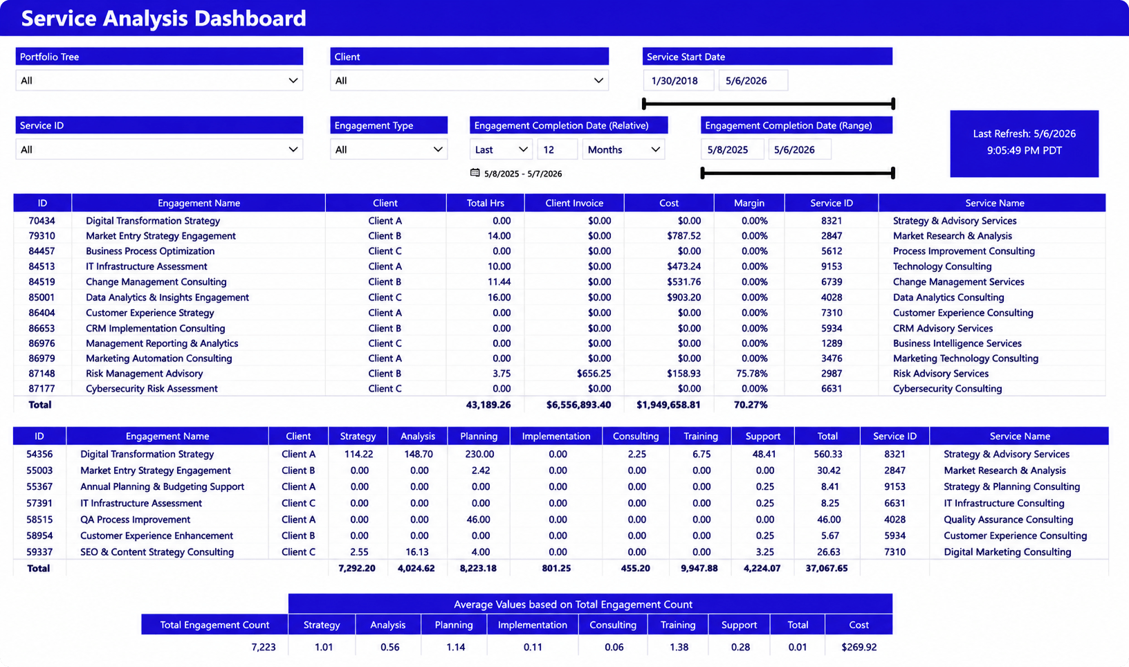
A high-level view of service performance across projects, clients, and service lines, including delivery effort, revenue, costs, and margins. Leaders can analyze performance by service offering, project, or portfolio to understand where work is being delivered and where results are strongest.
Why it matters
As service organizations grow, it becomes harder to understand performance across dozens of engagements. This dashboard helps leaders evaluate which services contribute the most value, identify underperforming areas, and make better decisions about resource allocation and service strategy.
Resource utilization dashboard
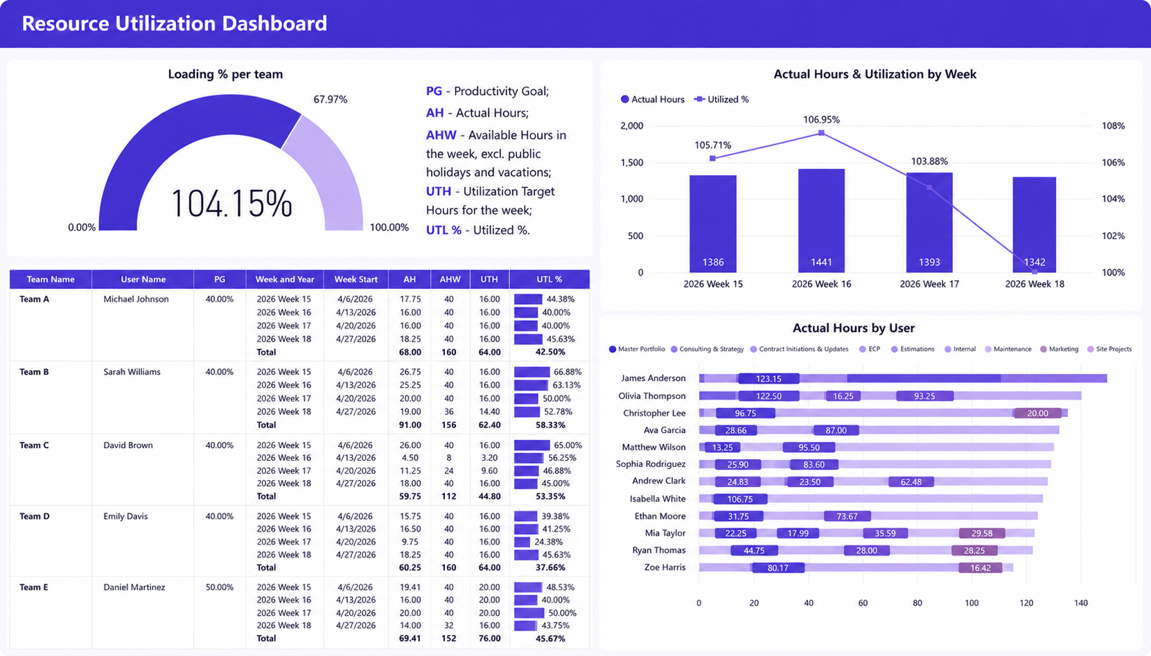
Team and individual utilization levels, available capacity, actual hours worked, and workload distribution over time. The dashboard also highlights how utilization compares against targets and where effort is being spent across projects and portfolios.
Why it matters
Utilization has a direct impact on both delivery capacity and profitability. This dashboard helps operations leaders balance workloads, identify resources approaching capacity limits, and uncover utilization trends that could affect future project delivery.
Capacity planning dashboard
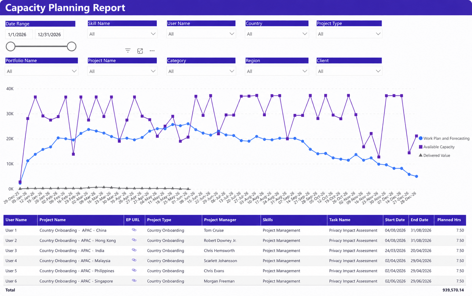
This dashboard compares future project demand against available resource capacity over time. Leaders can analyze capacity by skill, project type, region, client, or individual resource, while identifying upcoming workload peaks, capacity gaps, and staffing requirements.
Why it matters
Capacity planning becomes difficult when future demand and resource availability are reviewed separately. This dashboard helps operations leaders understand whether the organization has enough capacity to support upcoming work, identify potential resource shortages early, and make more informed hiring, staffing, and project prioritization decisions.
Project portfolio dashboard
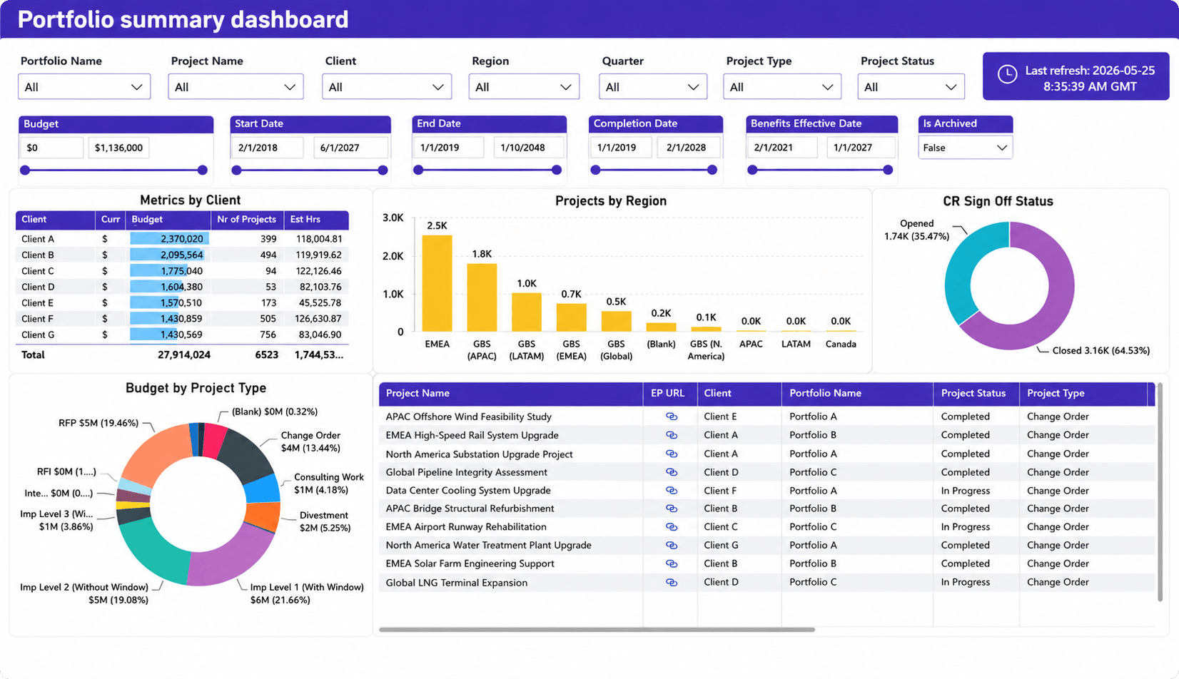
A consolidated view of project performance across portfolios, clients, regions, and project types. The dashboard brings together budgets, project status, delivery progress, completion metrics, and portfolio distribution, helping leaders understand how work is performing across the organization.
Why it matters
As the number of projects grows, it becomes increasingly difficult to spot portfolio-level trends from individual project reports. This dashboard helps operations leaders monitor overall portfolio health, identify areas that require attention, and ensure resources and investments remain aligned with strategic priorities.
Profit forecasting dashboard
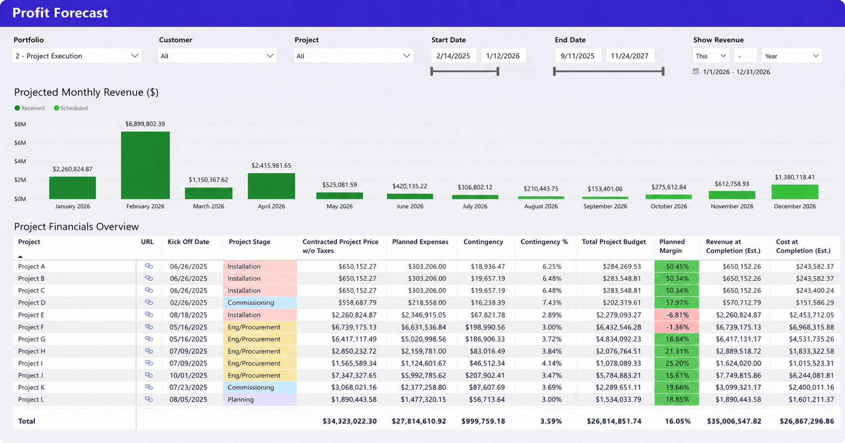
A forward-looking view of projected revenue, project budgets, planned costs, margins, and expected financial performance across the project portfolio. Leaders can analyze future revenue streams alongside project-level profitability and budget forecasts.
Why it matters
Forecasting is most valuable when it connects delivery plans to financial outcomes. This dashboard helps operations leaders understand how upcoming work is expected to impact revenue and margins, identify projects that may affect profitability, and make more informed decisions about staffing, investments, and future growth.
Time tracking dashboard
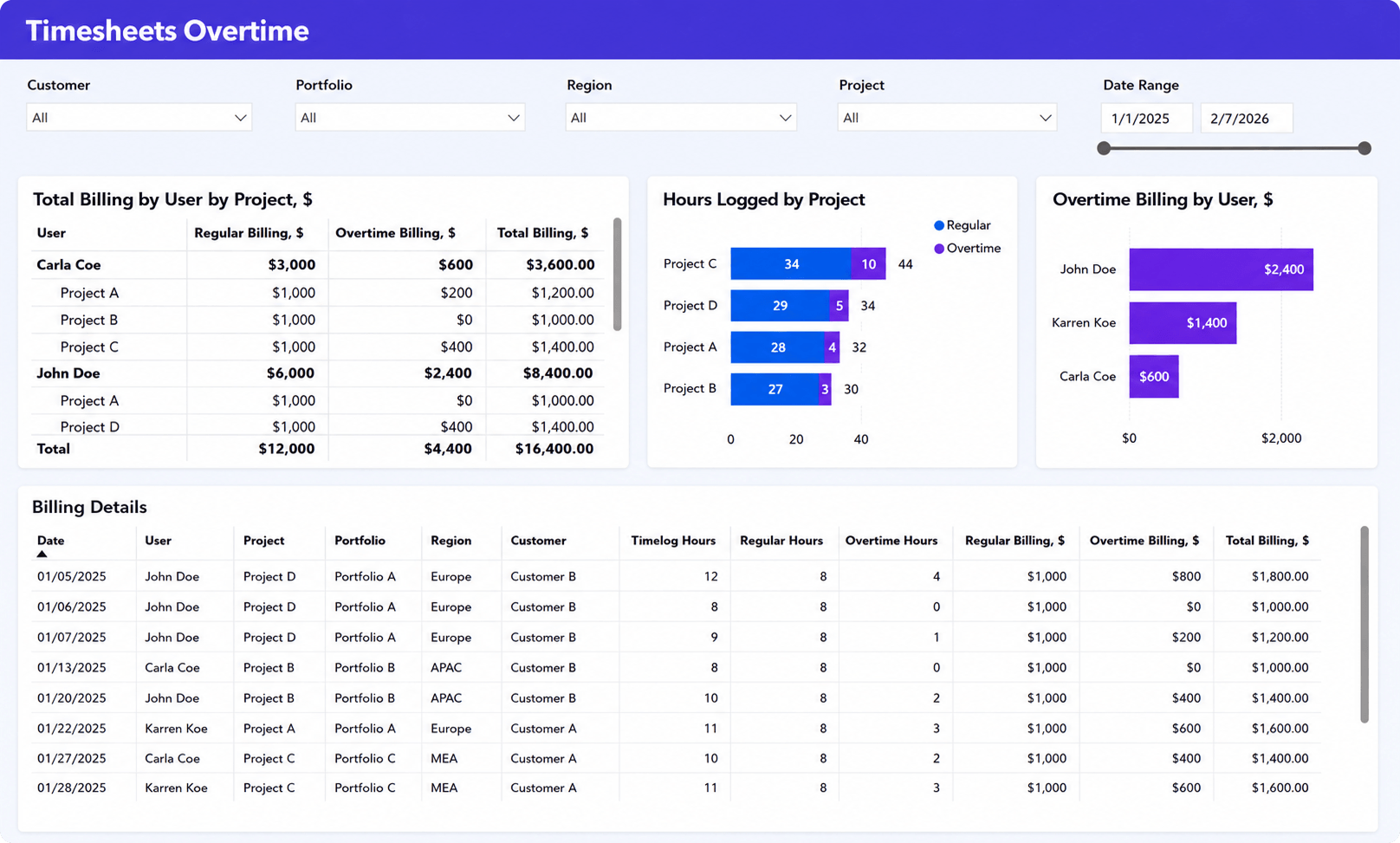
A detailed view of logged hours, overtime, and billable work across projects, portfolios, customers, and team members. The dashboard highlights overtime trends, compares regular and overtime hours, and shows the financial impact of additional effort on project billing.
Why it matters
Time data often reveals delivery and staffing issues before they appear in project reports. This dashboard helps operations leaders identify teams relying heavily on overtime, monitor workload pressure, and understand how extra effort affects both project costs and billable revenue. By tracking overtime alongside billing data, leaders can make better decisions about staffing levels, workload distribution, and project planning.
Business development dashboard
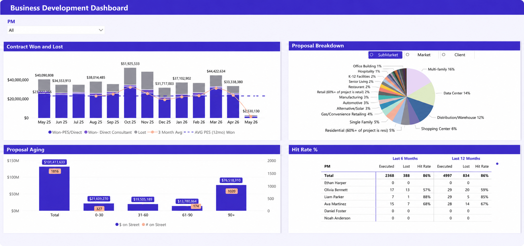
A view of sales pipeline performance, proposal activity, win rates, and business development trends across teams, clients, and market segments. The dashboard tracks opportunities won and lost, proposal aging, hit rates, and the distribution of opportunities across industries and markets.
Why it matters
Operations leaders need visibility into future demand, not just current delivery performance. This dashboard helps connect sales activity with operational planning by showing the volume, quality, and maturity of upcoming opportunities. Understanding what’s likely to enter the pipeline allows leaders to anticipate resource needs, improve forecasting accuracy, and prepare teams for future project demand.
The most important service delivery KPIs for operations leaders
The best operations dashboards are built around a small set of meaningful KPIs. Rather than tracking dozens of metrics, operations leaders should focus on the indicators that reveal delivery risks, resource constraints, and future performance.
Utilization rate
Utilization measures how much available time is spent on productive work. It is one of the most important indicators of delivery capacity and profitability, helping leaders identify both underutilized resources and teams operating at unsustainable workloads.
Capacity availability
Capacity availability shows how much future resource capacity remains unallocated. It helps leaders determine whether the organization can support upcoming project demand and identify staffing gaps before they affect delivery.
Resource forecast accuracy
This KPI measures how closely planned resource demand matches actual demand. Improving forecast accuracy leads to better staffing decisions, more balanced workloads, and fewer delivery disruptions.
Project delivery performance
Project delivery performance reflects how consistently projects are completed according to plan. Common indicators include milestone completion, schedule adherence, project health, and delivery risk levels.
Workload distribution
Workload distribution helps leaders understand how work is allocated across teams and individuals. It can reveal resource imbalances that may not be visible through utilization metrics alone.
Project margin
Project margin connects delivery performance with financial results. Tracking margin helps organizations understand whether projects are being delivered profitably, not just successfully.
Revenue forecast accuracy
Revenue forecast accuracy measures how closely projected revenue aligns with actual results. Reliable forecasts improve operational planning, budgeting, and long-term growth decisions.
Why operational reporting often fails
Most reporting challenges are not caused by a lack of data. They happen because organizations struggle to turn available information into actionable insights.
Data is fragmented
Project, resource, time tracking, and financial data often live in separate systems. As a result, teams spend time combining reports instead of analyzing performance and making decisions.
Reporting is too manual
Many organizations still rely on spreadsheets and manual reporting processes. By the time reports are prepared and reviewed, the information may already be outdated.
Risks are identified too late
Resource shortages, utilization declines, and forecasting issues often appear before delivery performance suffers. Without visibility into these early warning signs, leaders frequently discover problems only after they have already affected projects or clients.
The best operations dashboards start with connected data
The quality of a dashboard depends on the quality of the data behind it. Even the most sophisticated dashboard cannot provide reliable insights if project information, resource schedules, time tracking records, and financial data remain disconnected.
This is one of the primary reasons reporting initiatives fail. Organizations often invest significant effort in building dashboards while overlooking the underlying data structure.
Bringing these data sources together creates a more complete view of delivery performance and future demand. The most effective operations dashboards combine four critical data sources:
| Data source | Why it matters |
| Project delivery data | Provides visibility into schedules, milestones, risks, and project health |
| Resource management data | Shows workload, utilization, skills, and capacity availability |
| Time tracking data | Reveals actual effort, billable work, and productivity trends |
| Financial data | Connects delivery performance to profitability and revenue outcomes |
When these data sources work together, dashboards become significantly more valuable.
For example, a resource utilization dashboard becomes more meaningful when leaders can also see project demand forecasts. A delivery dashboard becomes more actionable when project risks are connected to resource constraints.
This is why many organizations move toward PSA platforms that consolidate operational data into a single environment.
For example, platforms such as Birdview PSA can connect project plans, resource schedules, time tracking, and reporting in one system, allowing operations teams to build dashboards from a shared source of information rather than manually combining data from multiple tools.
The goal is creating operational visibility that leaders can trust when making decisions. If your current reporting process still relies on spreadsheets, disconnected systems, and manual data collection, it may be worth evaluating whether your dashboards provide the visibility needed to support future growth and service delivery performance.
How to choose the right operations dashboard
The right operations dashboard depends on the decisions you need to make.
Many organizations start by asking what data they have. A better question is what decisions they need to support. The most useful dashboards are designed around operational priorities rather than available metrics.
Start with the decisions, not the data
Before building a dashboard, identify the questions leaders need answered regularly.
For example:
- Can we deliver upcoming project demand with current staffing levels?
- Which projects require immediate attention?
- Are workloads balanced across teams?
- Is utilization moving in the right direction?
- Are revenue targets still achievable?
When dashboards are built around decision-making, they become part of operational management rather than another reporting exercise.
Focus on leading indicators
Many organizations rely heavily on historical reporting. While historical data is useful, it does not prevent future problems.
The most valuable dashboards track leading indicators such as capacity shortages, workload imbalances, utilization trends, forecast gaps, and delivery risks. These indicators help leaders take action before performance declines.
Connect project, resource, and financial data
Operational decisions rarely involve only one area of the business. A project delay may be caused by a resource shortage. A utilization problem may eventually affect revenue. A forecasting issue may create future staffing challenges.
The more connected the data, the more useful the dashboard becomes.
Avoid dashboard overload
One of the most common reporting mistakes is trying to track everything. A dashboard with 50 metrics often creates less clarity than a dashboard with 10 meaningful metrics.
Focus on the KPIs that directly influence delivery performance, resource planning, profitability, and forecasting accuracy. The goal is not to display more information. The goal is to make better decisions.
FAQ: operations dashboards for service delivery teams
What is an operations dashboard?
An operations dashboard is a reporting tool that combines project, resource, capacity, time tracking, and performance data into a single view. It helps operations leaders monitor delivery performance, identify risks, and make faster decisions based on current operational conditions.
What metrics should operations leaders track?
The most important metrics typically include utilization rate, capacity availability, workload distribution, project delivery performance, forecast accuracy, project margin, and revenue forecast accuracy. The exact mix depends on the organization’s service model and operational goals.
How do operations dashboards improve service delivery?
Operations dashboards improve service delivery by helping teams identify risks before they affect clients, schedules, or profitability. Instead of reacting to problems after they occur, leaders can take action while there is still time to influence outcomes.
What is the difference between an operations dashboard and an executive dashboard?
An operations dashboard focuses on day-to-day delivery management and operational decision-making. An executive dashboard provides a higher-level view of business performance and typically emphasizes trends, profitability, forecasting, and strategic KPIs rather than detailed operational metrics.
Which dashboard is most important for resource management?
Most organizations consider the resource utilization dashboard and capacity planning dashboard the most important resource management dashboards. Together, they help leaders understand current workload distribution, future staffing needs, available capacity, and utilization trends across the organization.